Metalura
Unfolding a premium brand to expand business.
Retailbranding
branding
Metalura was founded in The Netherlands. In their pursuit to conquer the Belgian market as well, they came to us for a rebranding, and a repositioning. Targeting upscale audiences, we introduce Metalura to the premium segment with a distinct colour palette and a visual concept illustrating the class and comfort of their exceptional glass systems.
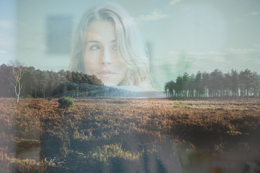
We make Metalura’s major benefit tangible, although it is practically invisible: shield yourself from rain and wind while your garden view or 6th floor terrace panorama remains untouched. Showing subtle reflections of residents in the glass panels, we emphasize the refined design, both on an aesthetical and functional level.
The logo contains a silhouette of the Metallura Tyrianthina, a species of hummingbird. It stands for freedom, elegance and the ultimate outdoor life. By transforming the realistic silhouette into a stylized, angular figure – in addition to the new premium colour scheme – we treasure the above-mentioned values, but infuse the brand with the high-standard quality and elegance that its products are known for.
Metalura offers first-class comfort: welcome the sun inside, count the raindrops on the window or observe the breezy ballet of autumn leafs. To illustrate how changeable weather here in the low lands can be – and, therefore, how convenient a Metalura terrace chamber would be – the website’s homepage displays actual weather conditions in the main image. Another fine feature is the pre-filled form, automatically adjusting the message according to the visitor’s actions. The site itself was built mobile first, seeing most visits come from mobile devices.
Some say a picture is worth a thousand words. However, in this particular case, we believe a wide variety of clear-cut icons can be just as effective and transparent in communication. We use these versatile and easily applicable graphics to structure information on key features in the brochure, but our icons even play a leading role in advertisements, empowering the topical headlines that refer to specific weather conditions.
We think you’ll love them!
Become who you are. Remplissez ce formulaire de contact pour former ou faire évoluer votre marque – ou, au moins, pour recevoir une bonne tasse de café et un accueil tout aussi chaleureux.
Merci de partager votre question