Kunst Aan Zet
Let’s reframe our perception of art.
Servicebranding

branding

“From our wall to yours”
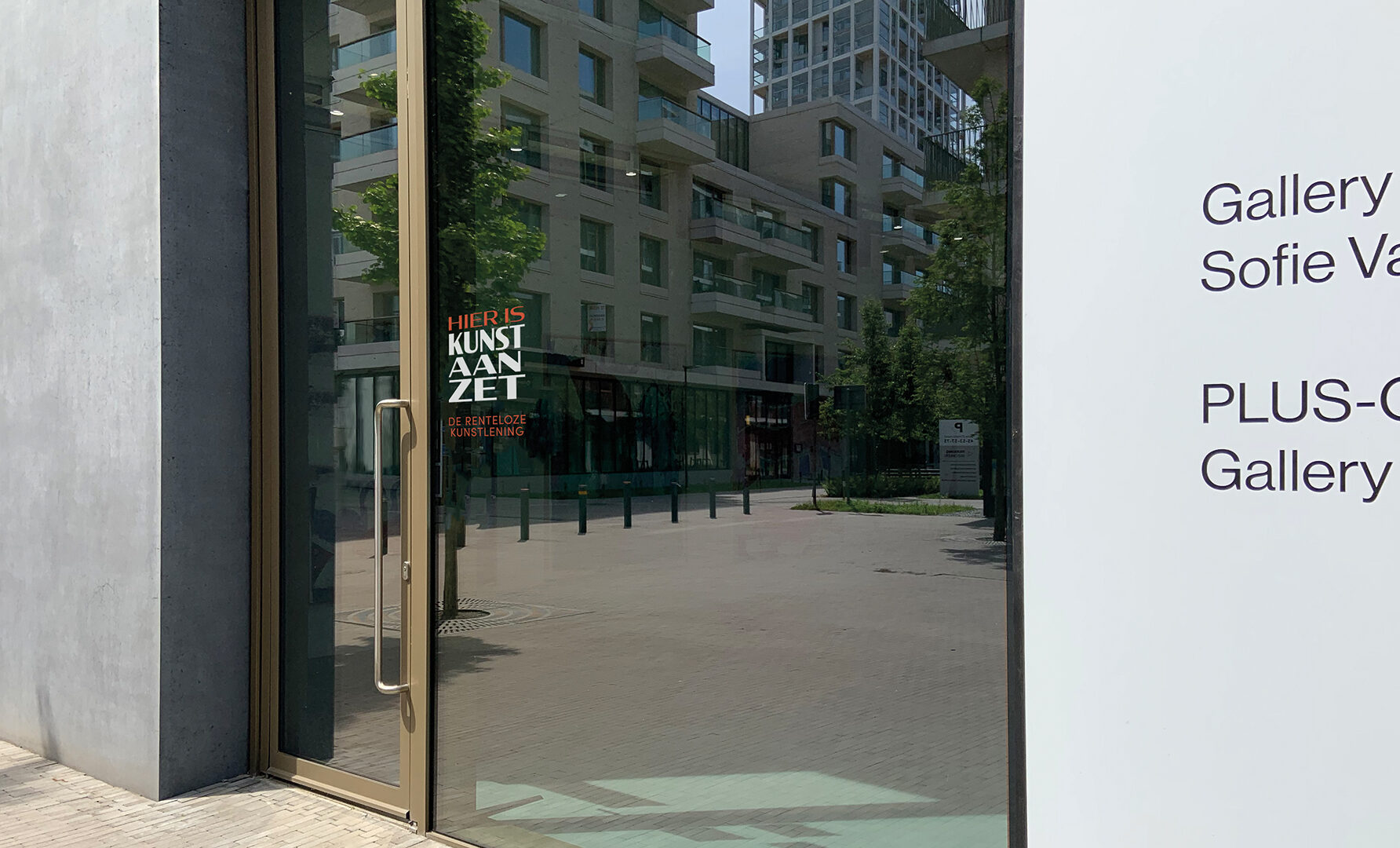
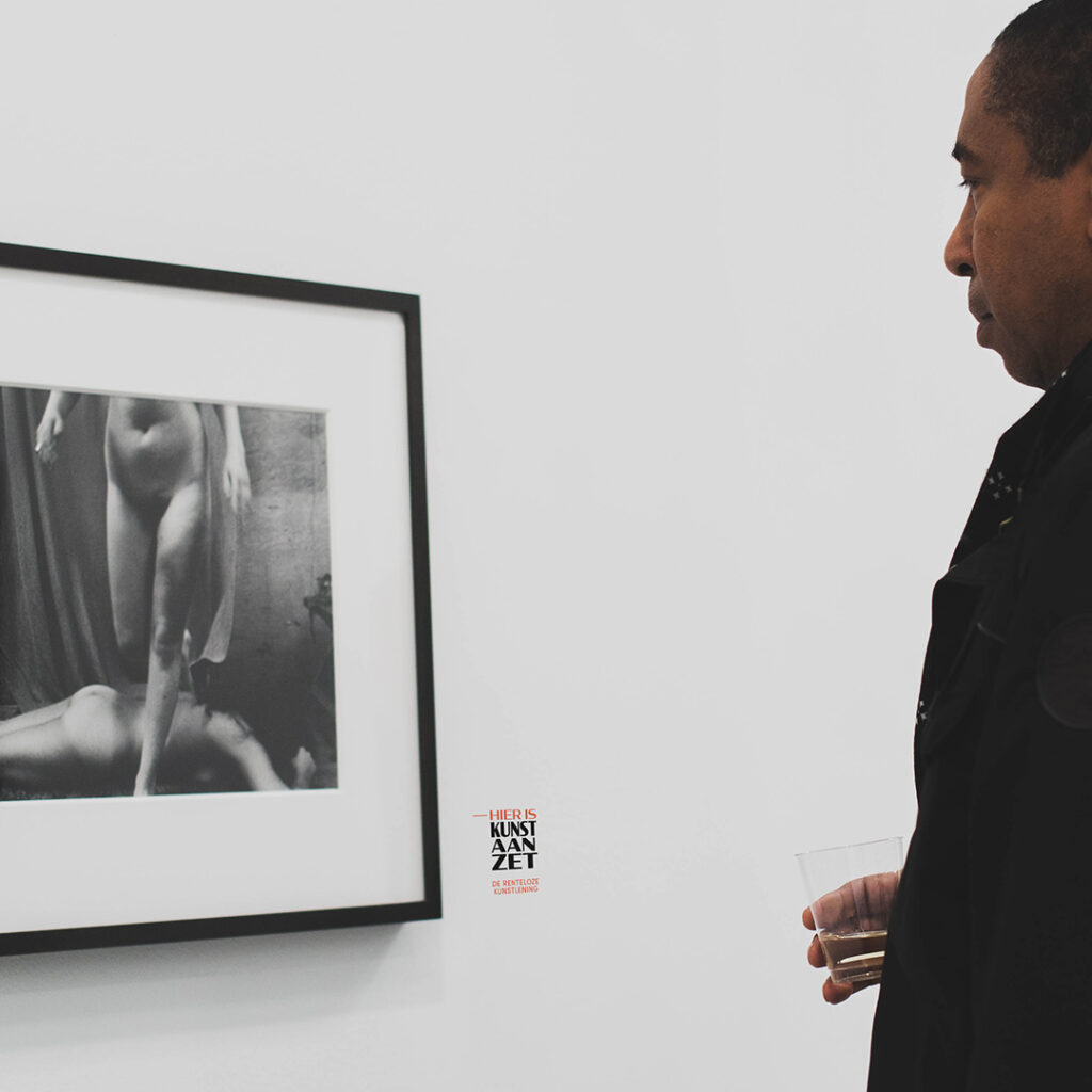
The main goal of this innovative concept is quite clear: make art accessible. Kunst Aan Zet is conceived to challenge art’s high-priced and high-class perception. As a result, artwork will be obtainable through small monthly rent-free payments instead of a large sum out of pocket. And rather than hiding its gems for those happy few, galleries will function as a welcoming location for everyone with a love for creative craftsmanship.
The two partners had their eyes on a Dutch name to identify their mission. Through a play on words, we composed ‘Kunst Aan Zet’, a fusion of ‘aanzet’ and ‘aan zet’, translated into English as ‘approach’ and ‘your move’. Together with the transparent baseline, the public will get the message before the ink has dried.
Buying art is no longer all about the Monet!
Bram, copywriter
To increase clarity, the playful name was molded into a firm wordmark. The versatile Condor font family, offering a wide variety in weight and width, adds a creative quality to any design. Like an artist freely paints his canvas, this typography can be used with the spontaneity of a genuine Pollock. How inspiring! The black coloration gives the logo a timeless trait.

As specified in the brief, we stay clear from a corporate look and feel, developing a contemporary framework. With a minimal design and lively visuals we put the spotlight on the art and the artist. The soft tones of blue and red endow the brand with a welcoming and warm character.
Become who you are. Vul dit contactformulier in om je merk te versterken en vorm te geven – of, ten minste, om een degelijk kopje koffie en een even warm welkom te bemachtigen.
Bedankt om jouw vraag met ons te delen