nexuzhealth
A fresh new flow for the healthcare of tomorrow
Health Care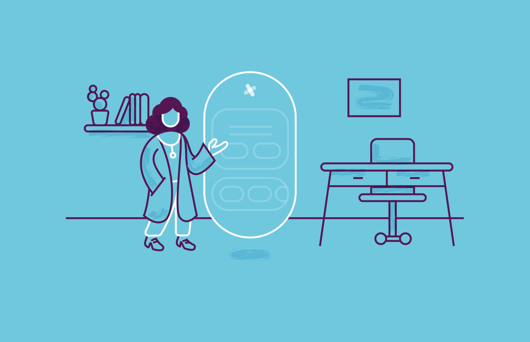
When it comes to the electronic health record and its accompanying solutions, nexuzhealth is Belgium’s chart-topper. Their investment in the healthcare sector motivates and supports many care providers to move from a maze of data to a collective platform that enables collaboration across the entire ecosystem. As the fastest-growing company in their field and with only more growth on the agenda, their well-built strategy deserved an equally solid branding. Our first order of business was to realigning the overarching brand and then tackle the different audiences step by step. A long-term project, which resulted in much-needed breath of fresh air for care providers, patients and the nexuzhealth team.
To find the vital features on which to base the branding, we first put our heads together and took a comprehensive look at the brand landscape. Every word that got penned down had to be in line with the story and the target audiences. The care providers’ side in particular needed some extra clarification. Because to get healthcare professionals excited about centralised care, we surely needed to stay away from an overdose of information. Instead, we put clarity and straightforwardness on the prescription. Because admit it, paperwork and hours of research are such a thing of the past. In particular, in view of completely relieving the burden on the caregiver, who can therefore pay more attention to the patient once again, it was a smart move to reshape the current communication strategy.
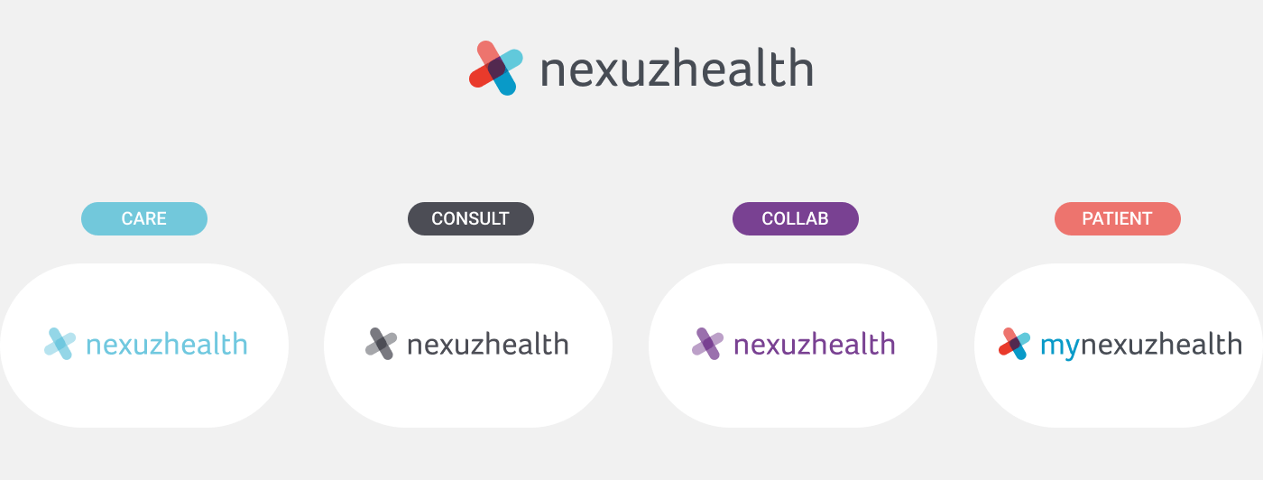

As their organisation is constantly evolving, they will be able to offer more and more tailored services to various care profiles. One of the reasons for this rapid growth, is the added value of an ecosystem that contributes to the bigger picture. However, this does not make it any easier to structure. After all, how do you visualise so many platforms and target groups in an orderly fashion? After several brainstorm sessions with both of our teams, we came up with an overview that no longer breaks heads, but brings peace of mind.
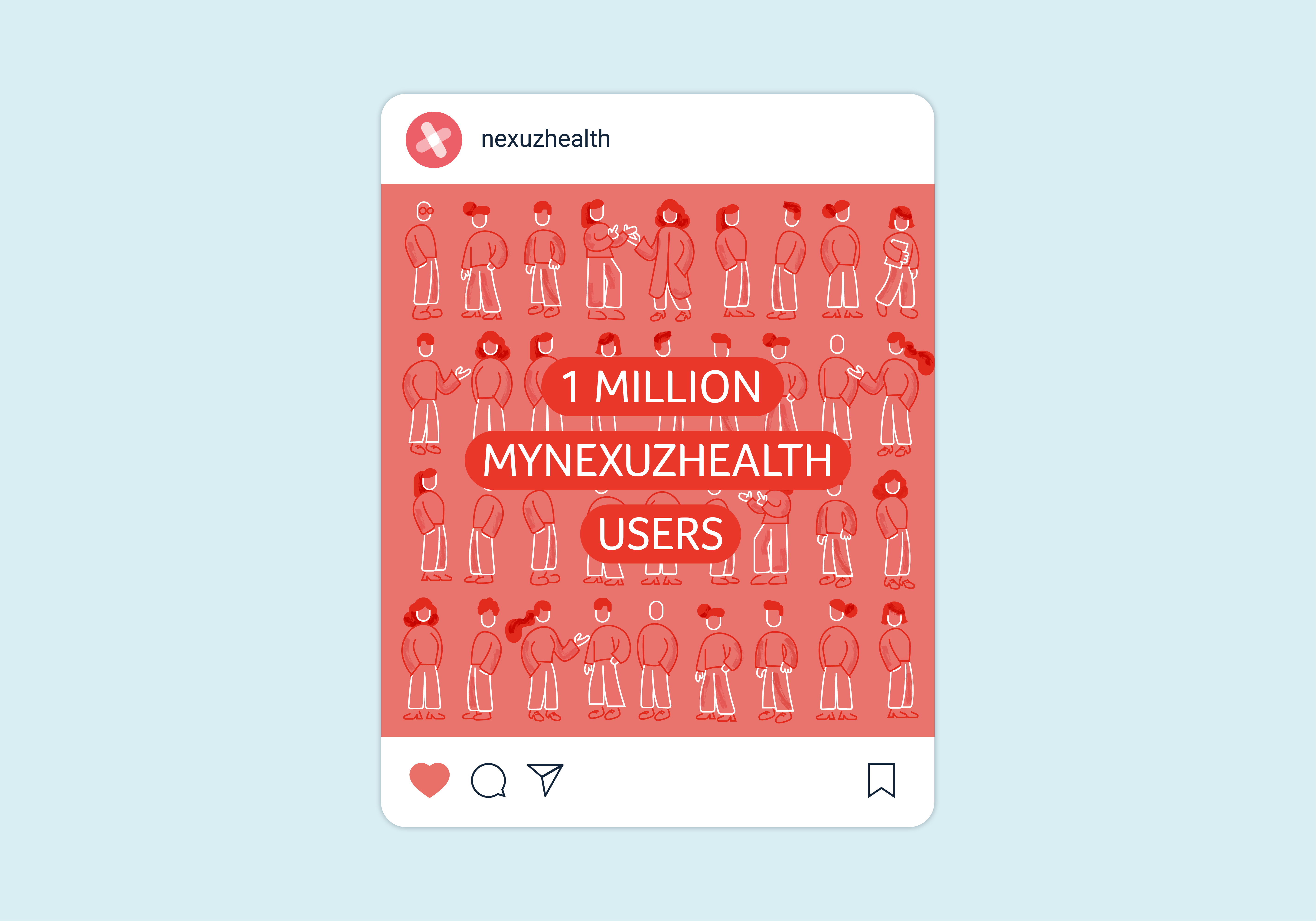
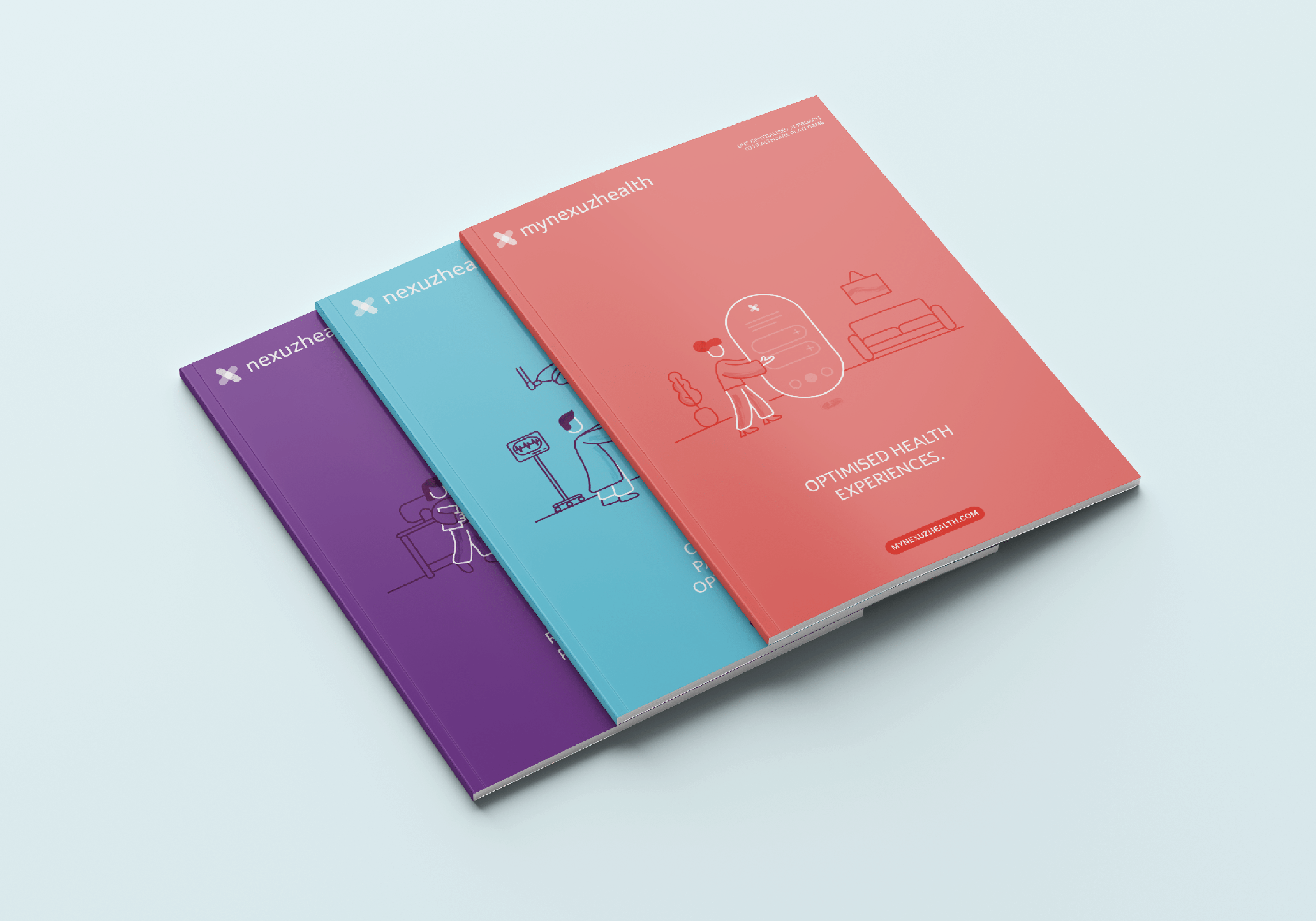
Since the link between the different platforms and target groups is so closely knit, umbrella concepts and use of colour were very important factors. Thus, we grouped the different target groups under four products; care, consult, collab and patients. In addition, the three platforms are represented by three colours; blue, purple and soft red. As the beating heart of the entire operation will always be the electronic health record for patients, it was positioned around the other three elements like a warm embrace.
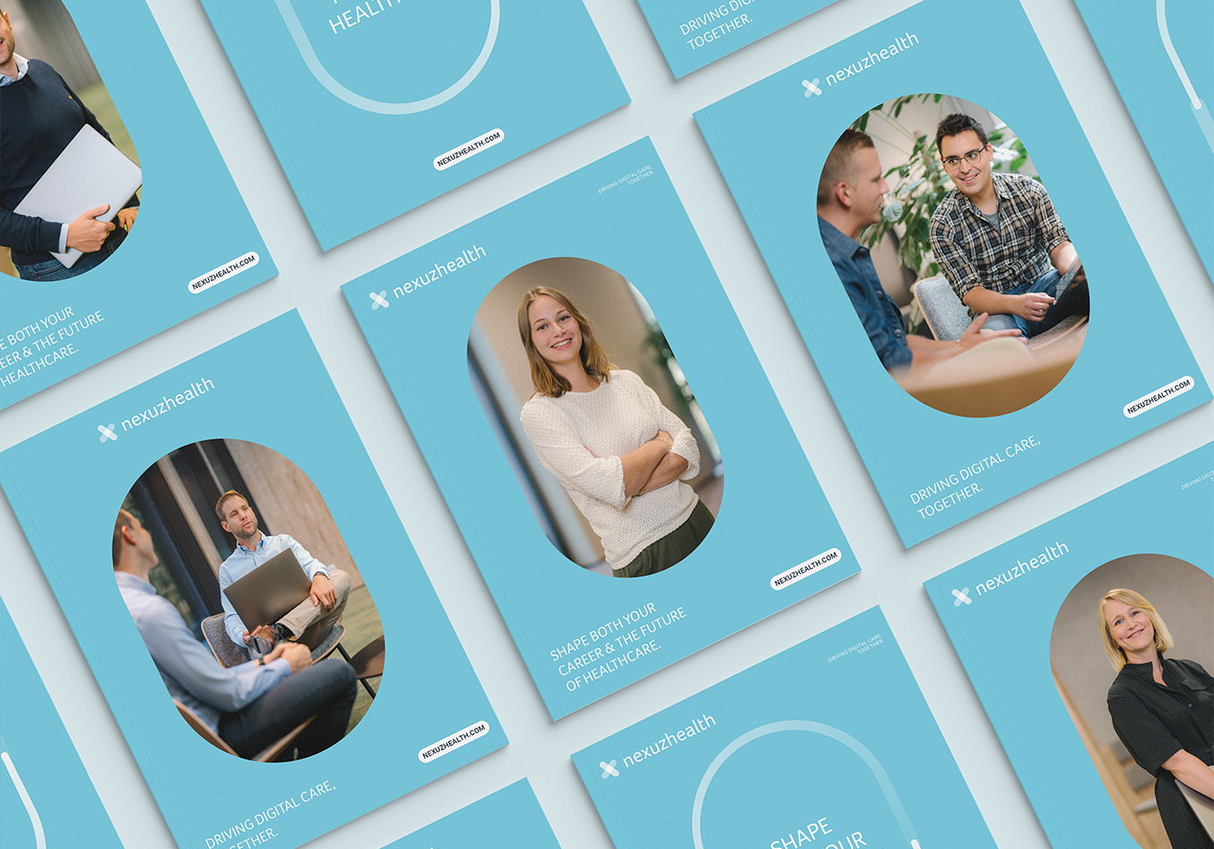
To add a personal touch to the well-chosen stock photography, we organised a shoot for the key images. And to top it off with a distinctive visual style, we worked out straightforward guidelines defining the dos and don’ts. We also added a graphic element to the photography (when it suits). As a result, the Junction is an ideal eye-catcher that highlights technology as well as connection.


The illustrative style supports the sometimes more serious or analytical communication and provides the right counterbalance to maintain the established tone of voice. We chose one central approach that is felt throughout. Therefore, in every illustration, we always keep the technology in the centre and the same size. As a result, only the environment and the people change.
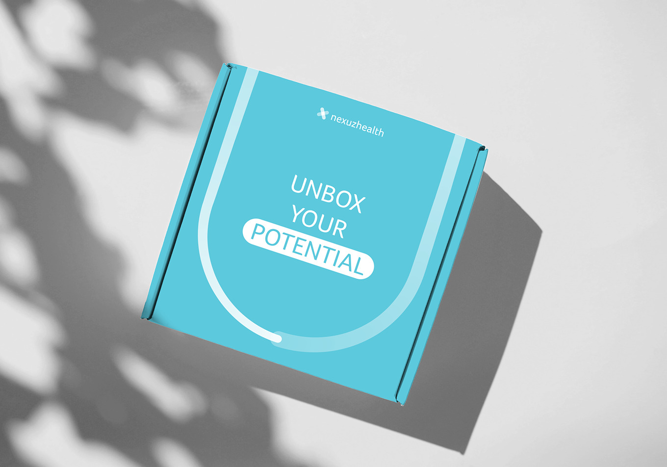
The tech side of care certainly is fulfilling and purposeful. But in order to find the right employees, especially sought after IT professionals, we needed to fine-tune the employer branding a bit. From the simple additions like a motivational campaign line to the bigger challenges like trying out new channels. No stone was left unturned. Because this target group gets approached very often, we wanted to do something new and intriguing besides just tweaking the must haves.
We think you’ll love them!


Become who you are. Vul dit contactformulier in om je merk te versterken en vorm te geven – of, ten minste, om een degelijk kopje koffie en een even warm welkom te bemachtigen.
Bedankt om jouw vraag met ons te delen