Broes Ingredients
A question of quality
Food & Drinkbranding
branding
Total control is crucial to guarantee uncompromising quality in food products. At Broes Ingredients, they understand the importance of full transparency in the supply chain as well as a personal approach in partnerships. Over three generations, they have become much more than just the intermediate; even when they talk about E numbers, it is the human factor that leads the conversation. To enable this direct communication, we created a rebranding that revolves around reliability and reassurance. A recipe for growth.
“We bridge the gap between professional partnerships and personal relationships; between long-term alliances, a proactive approach and day-to-day agility; between real-time monitoring and just-in-time deliveries. We master the entire process to make products better, checking off complete shopping lists and preserving peace of mind.”
If we consider this (excerpt from the) brand promise to be a copious 5-course dinner, the tagline is an irresistible snack on-the-go. With just a few words, it captivates and activates.
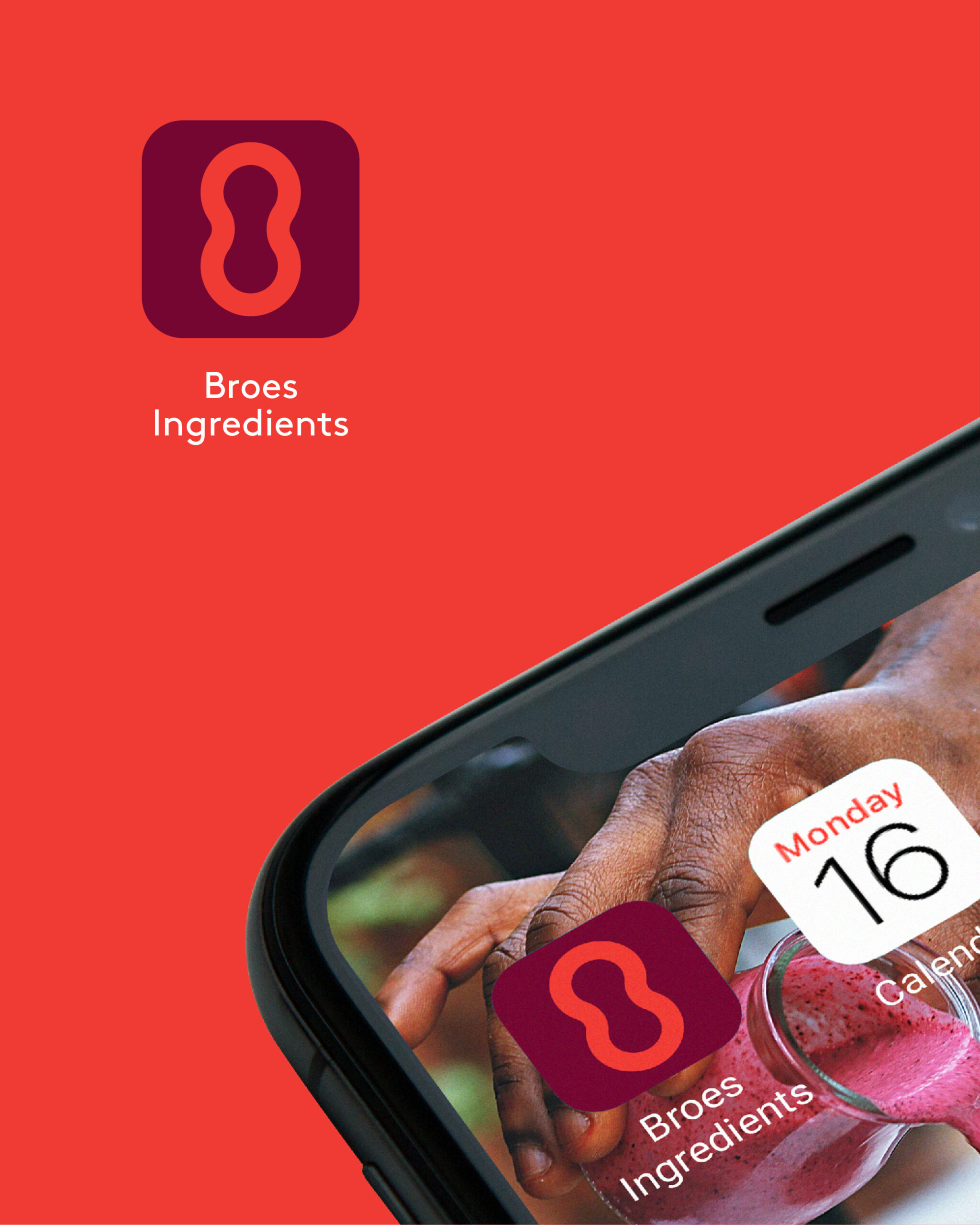
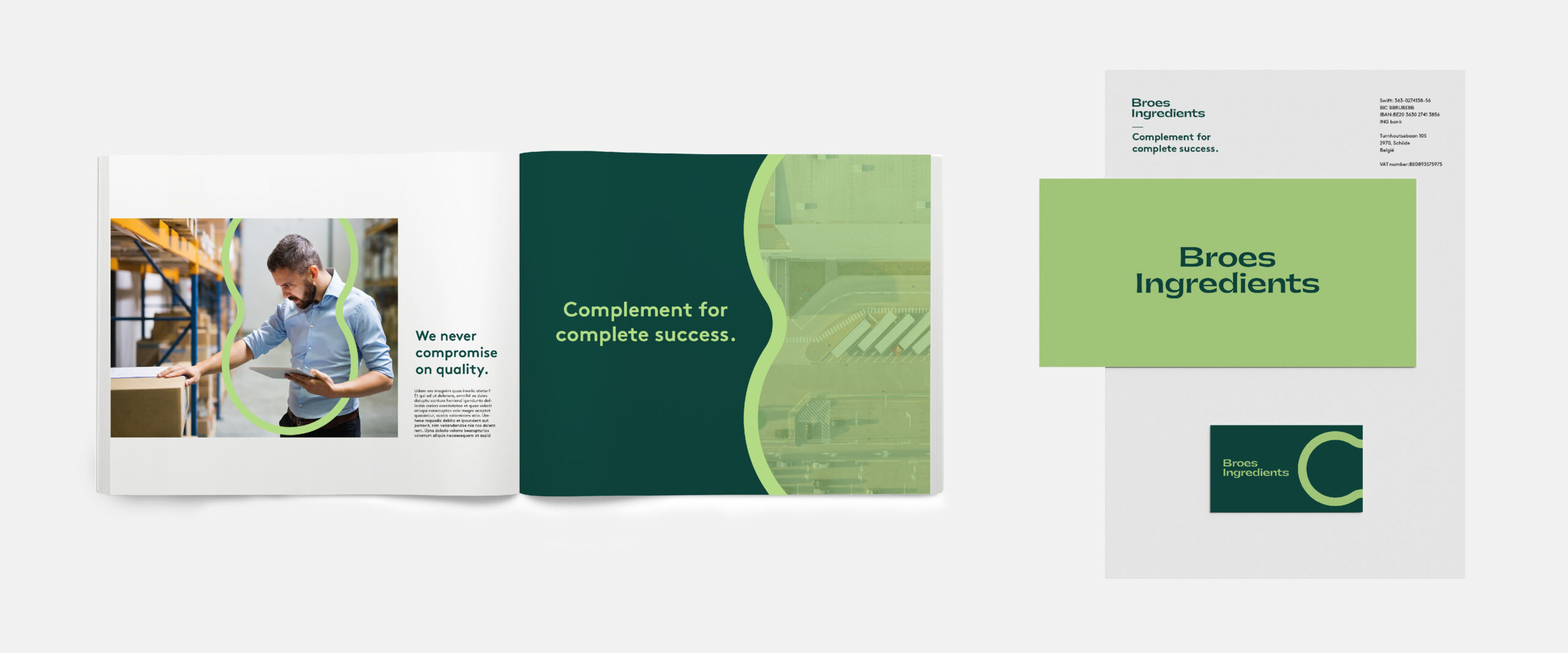
Gatwick ultrabold gives the logotype a vintage feel, referring to the rich heritage of the family company. The wide letters with stylish details display a dynamic character that truly ‘complements’ the ambitious team at Broes Ingredients.
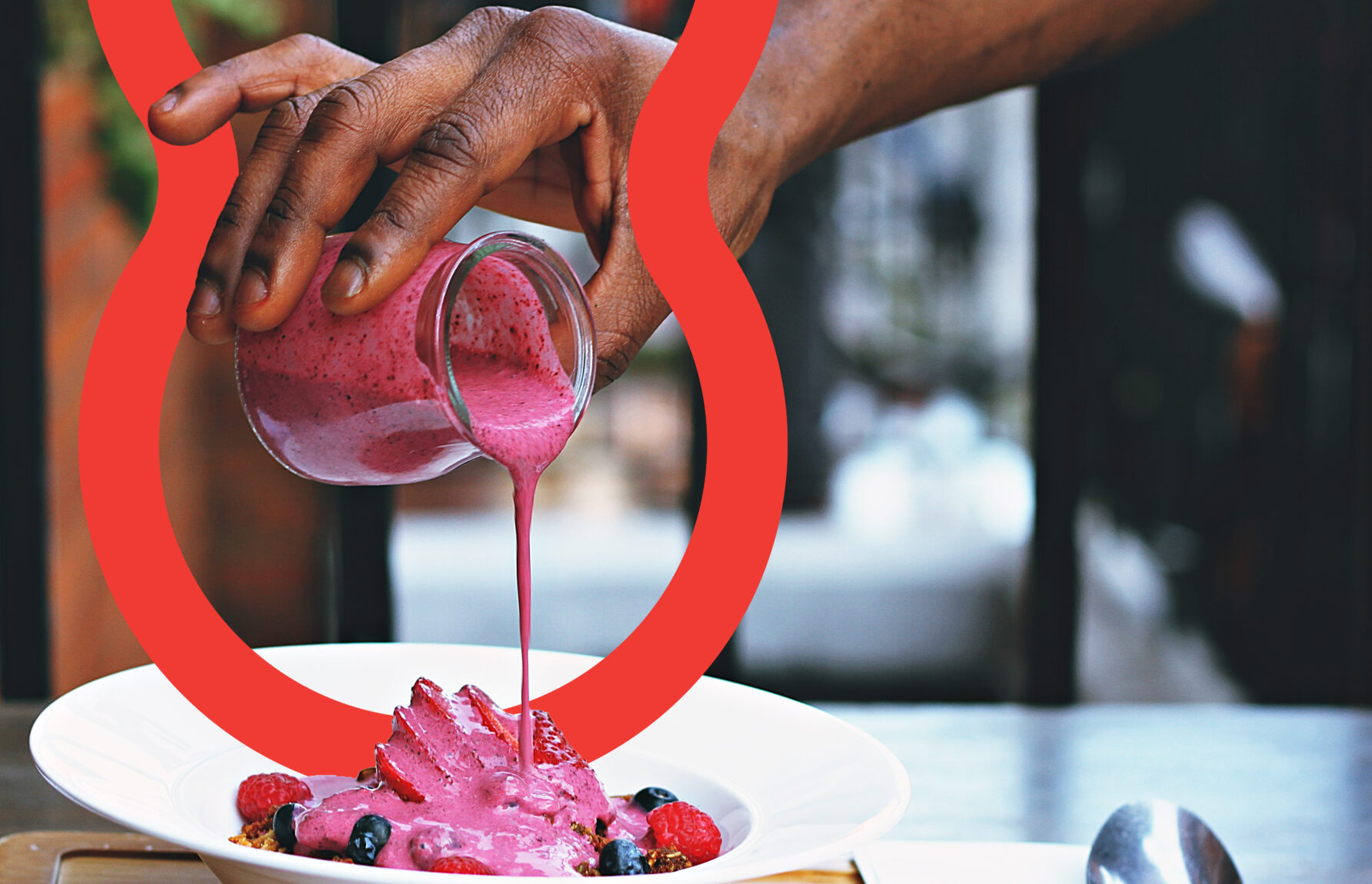
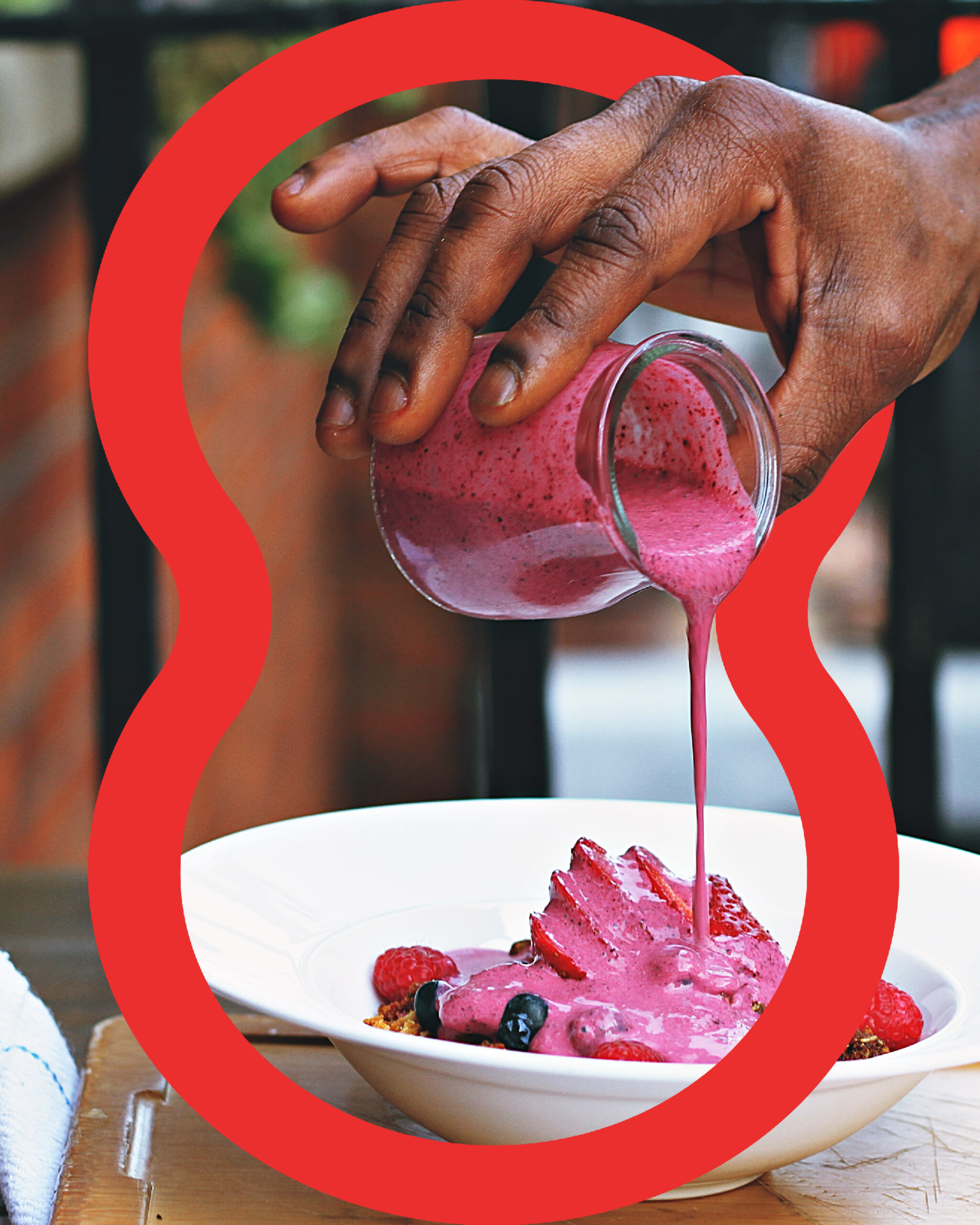
As we tend to ‘eat with our eyes’, it is crucial we make the logo as visually appealing as possible. So, we add colourants. The Juicy Burgundy and Tasteful Red are used specifically in a nutritional context (ingredients, dishes). The Sweet Pea logo should be applied in a logistical context: « We are green and lean! » From colour palette to taste palate, we carefully create powerful connections.
To arrange information and focus attention, we present the ‘Binding Agent’. This distinctive graphic element is curvilinear in shape and versatile in application. A fixed form with a wide variety of possibilities, interacting with the imagery. The thickness of its edges is not limited, ranging from an outline to a solid silhouette. It’s as playful as functional! The Binding Agent embodies both chemical connections and long-term partnerships. It’s not just an object: the smooth, organic shape adds a human value to any design.
The proof of the pudding is in the eating, right? These are some samples of the Broes rebranding, demonstrating a consistency both in design and quality.

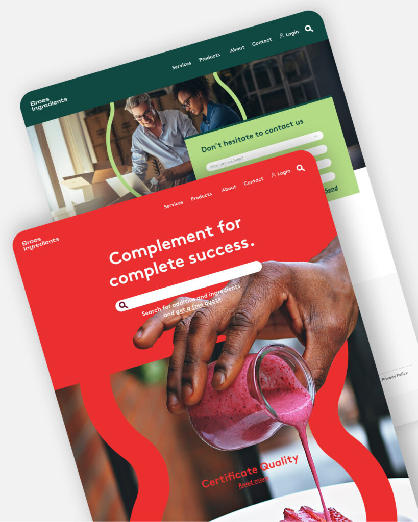
We think you’ll love them!
Become who you are. Remplissez ce formulaire de contact pour former ou faire évoluer votre marque – ou, au moins, pour recevoir une bonne tasse de café et un accueil tout aussi chaleureux.
Merci de partager votre question