Da Giovanni
Tasteful branding made to share
Food & Drinkbranding
branding
Capturing the essence
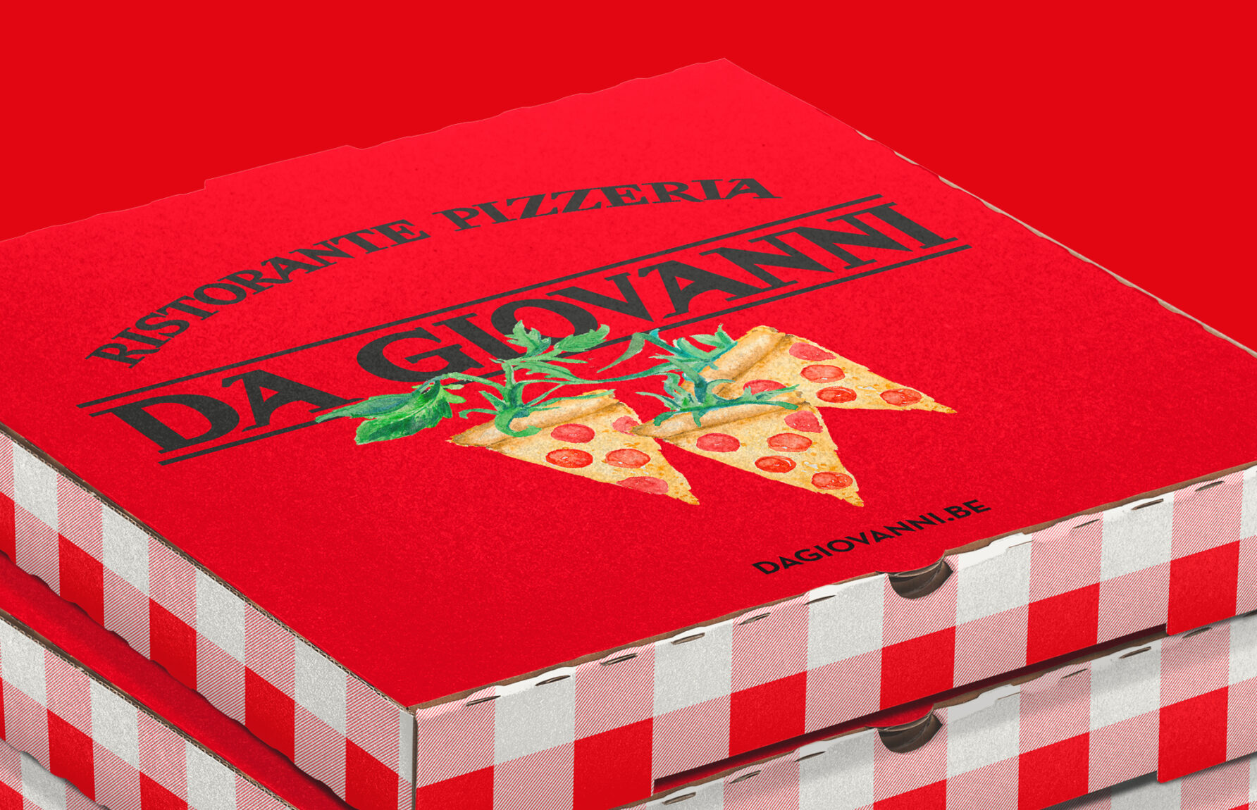
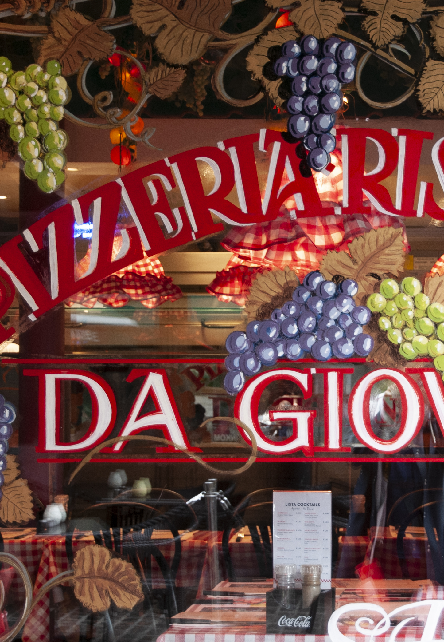
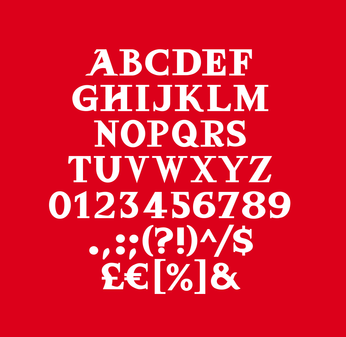
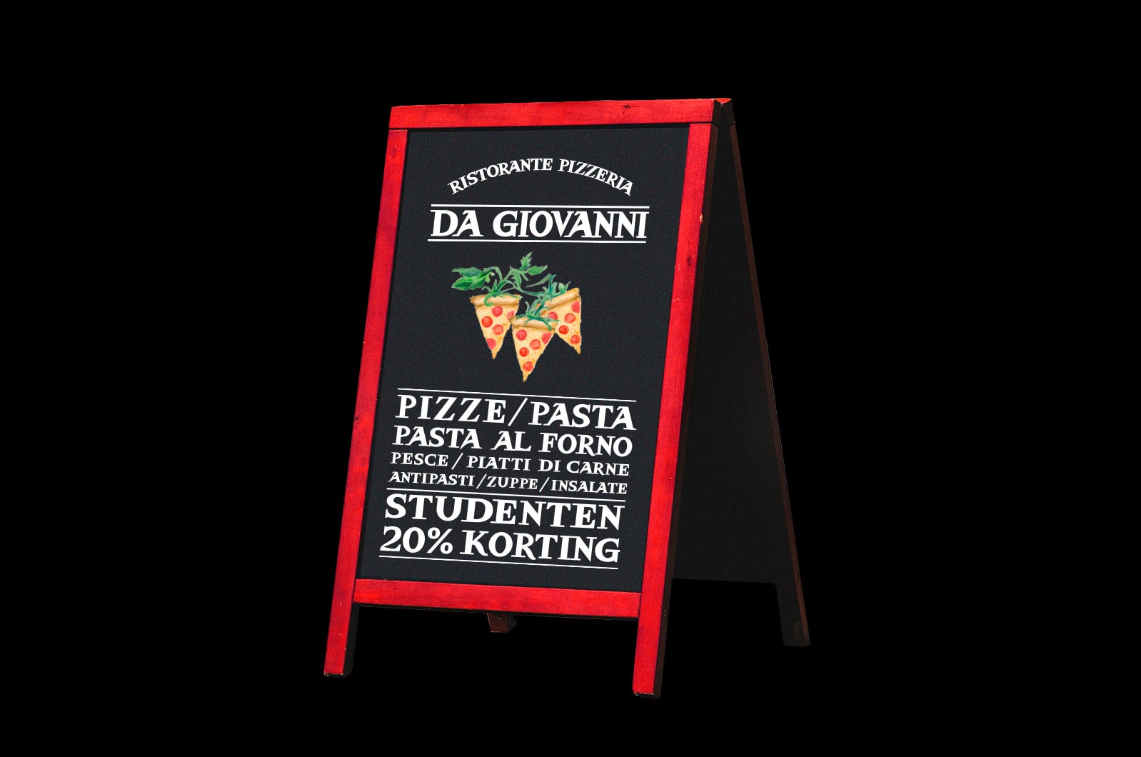
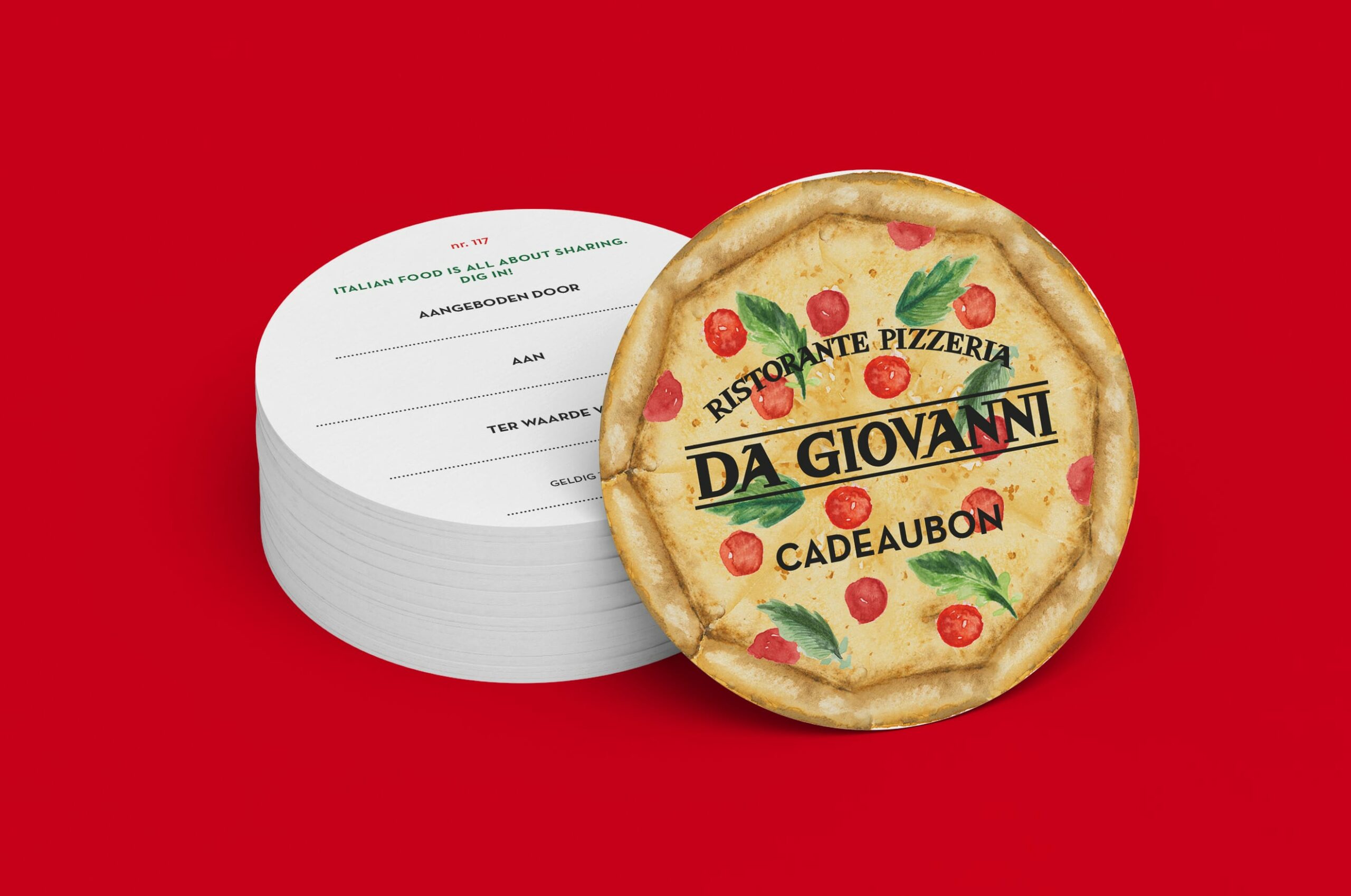
Da Giovanni has become a household name in Antwerp. Although the city centre offers a wide range of Italian restaurants, this particular place stands out. What elements contribute to its success? What makes the audience connect? We pinned down all essential ingredients of the Da Giovanni identity and developed a coherent system by updating and adding elements, such as the custom typeface, inspired by the authentic, hand-painted window lettering.
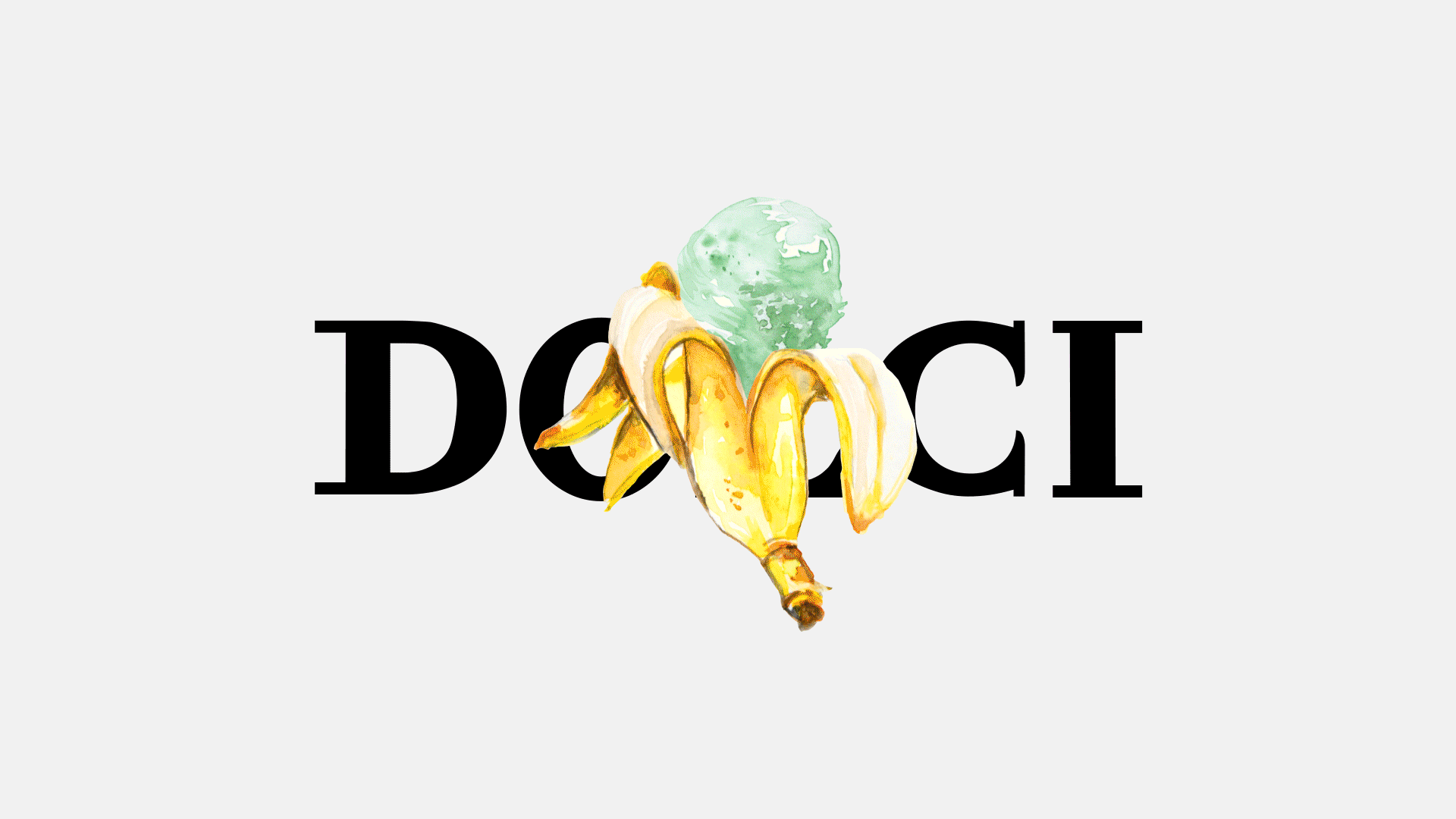

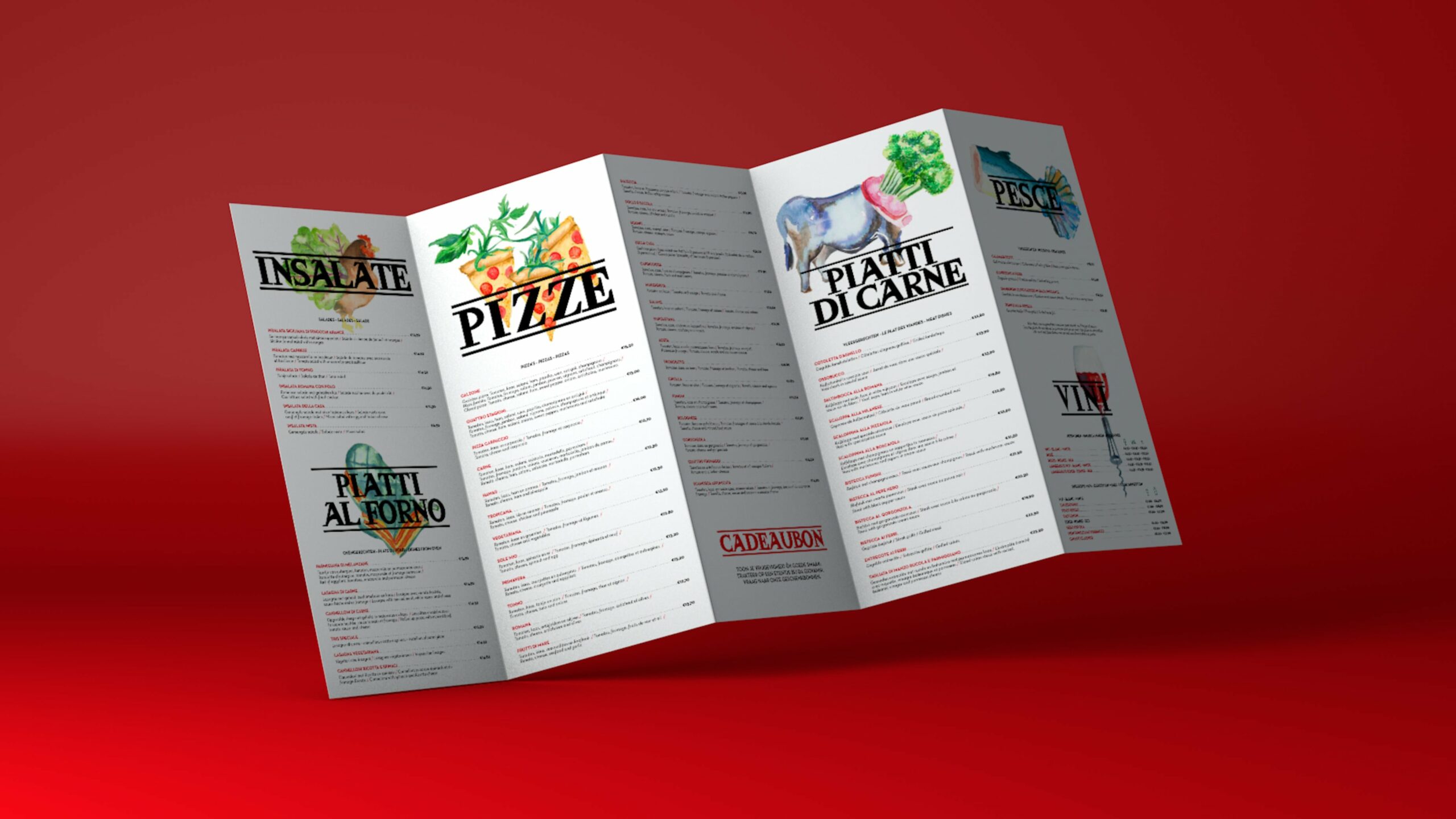
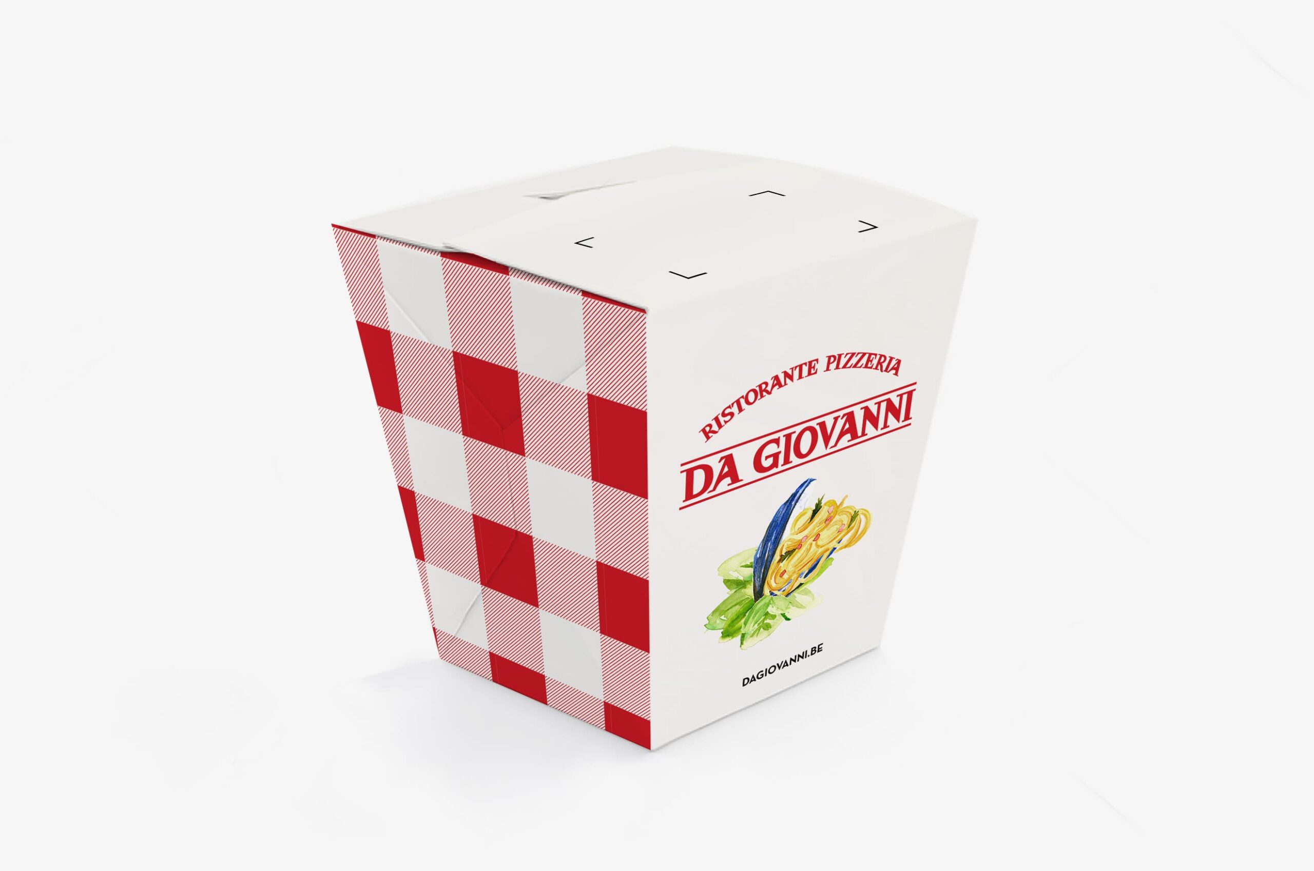
Sometimes you have to get your hands dirty, even if it’s just paint stains. With quirky aquarelle illustrations, pairing food in an uncanny way, we tickle people’s taste buds and curiosity. These images enrich the menu like no photography ever could. We eat with our eyes, right?
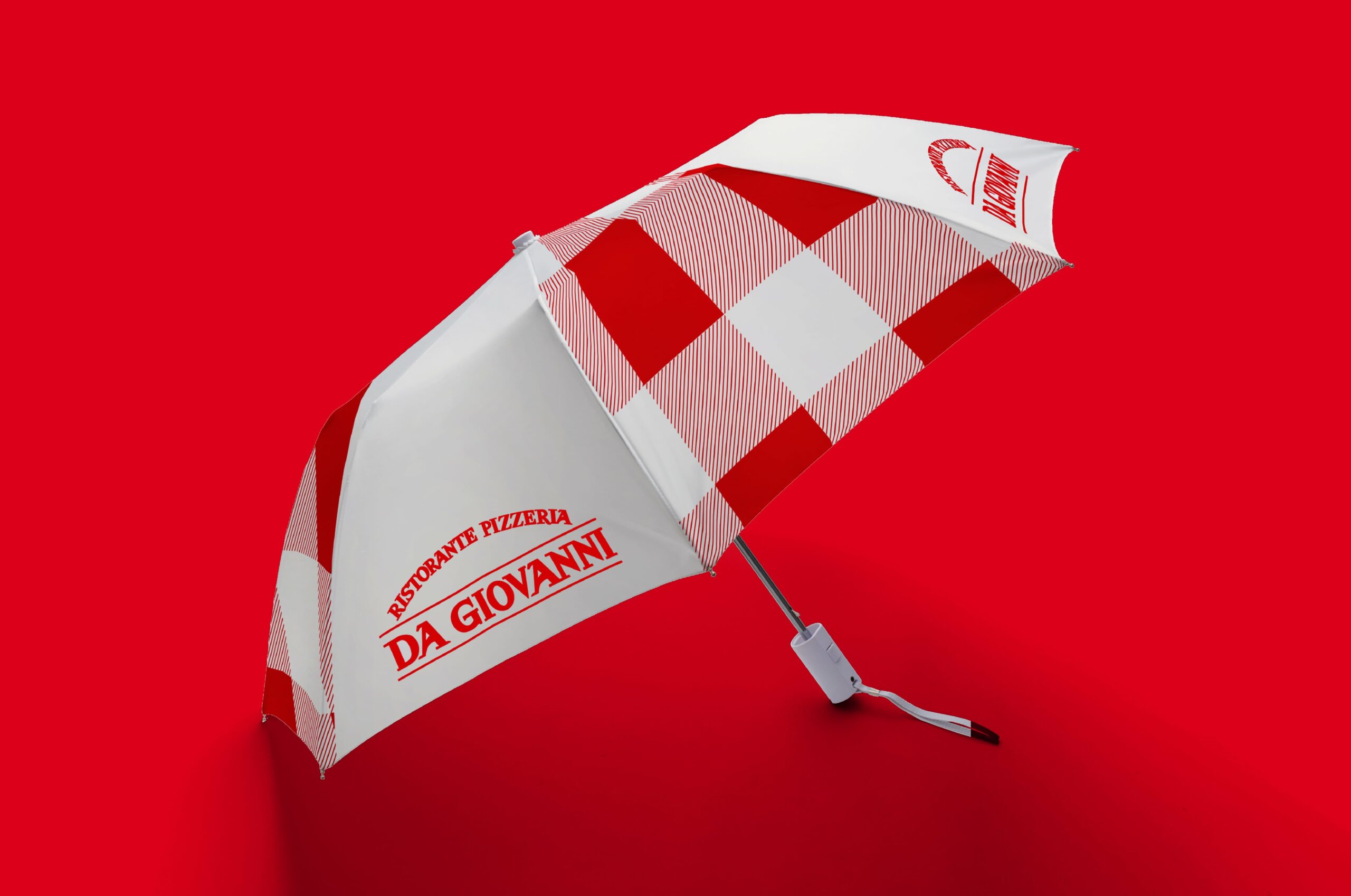
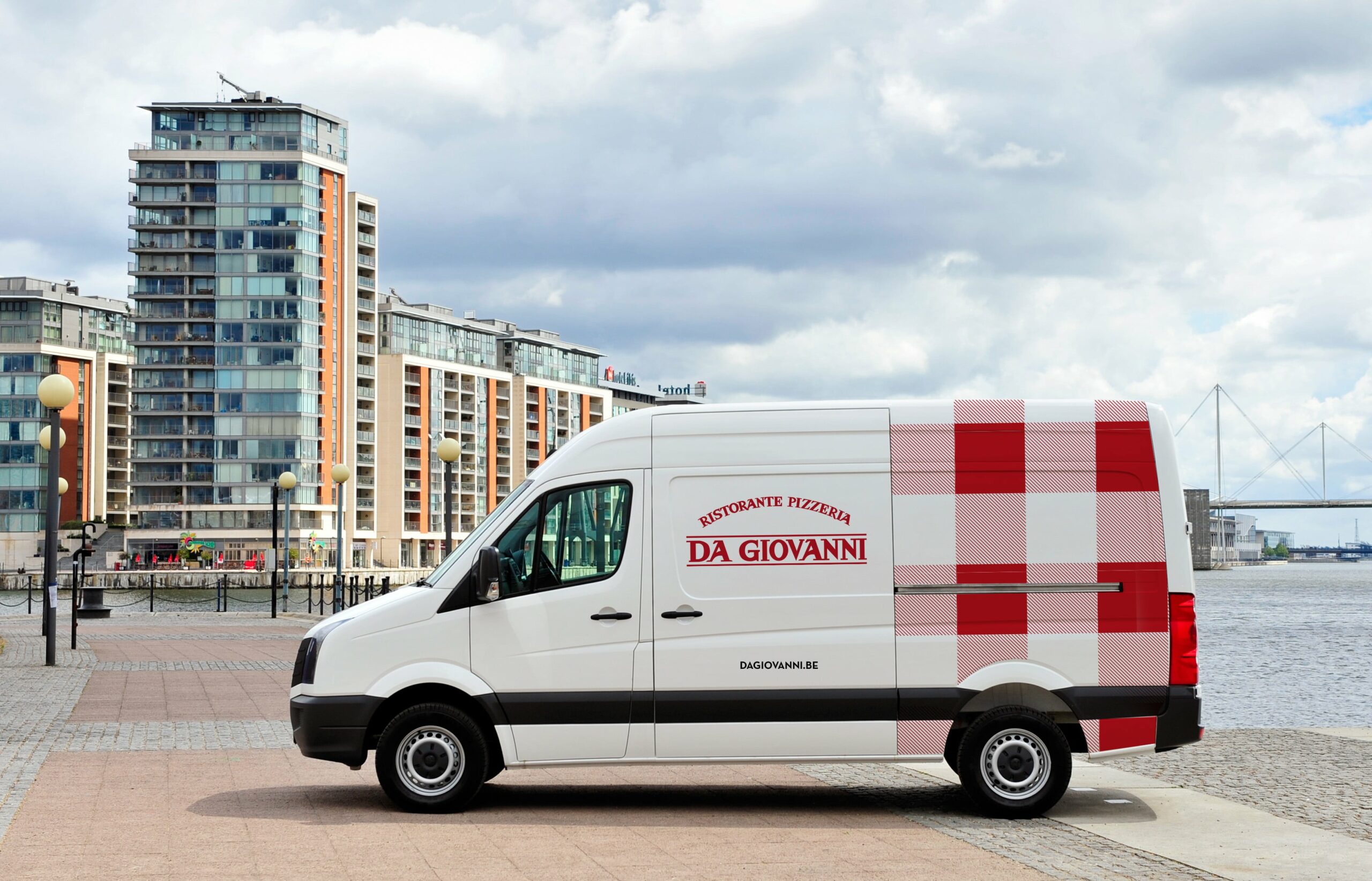
With our classic typeface we pay tribute to the Italian heritage that is cherished so much at Da Giovanni’s. The same goes for the red and white chequered tablecloths, a familiar sight in the restaurant. After some tweaking, we put this pattern centre stage, applying it on pizza and pasta boxes too, and even on an umbrella – tastefully linking Italian food with Belgian weather.
We think you’ll love them!

Become who you are. Remplissez ce formulaire de contact pour former ou faire évoluer votre marque – ou, au moins, pour recevoir une bonne tasse de café et un accueil tout aussi chaleureux.
Merci de partager votre question