Brachot
Building a solidified family
Retail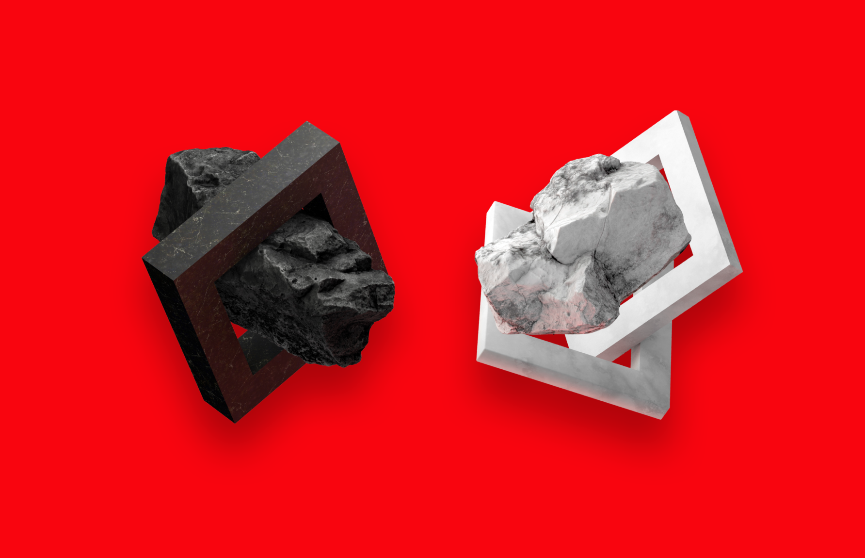

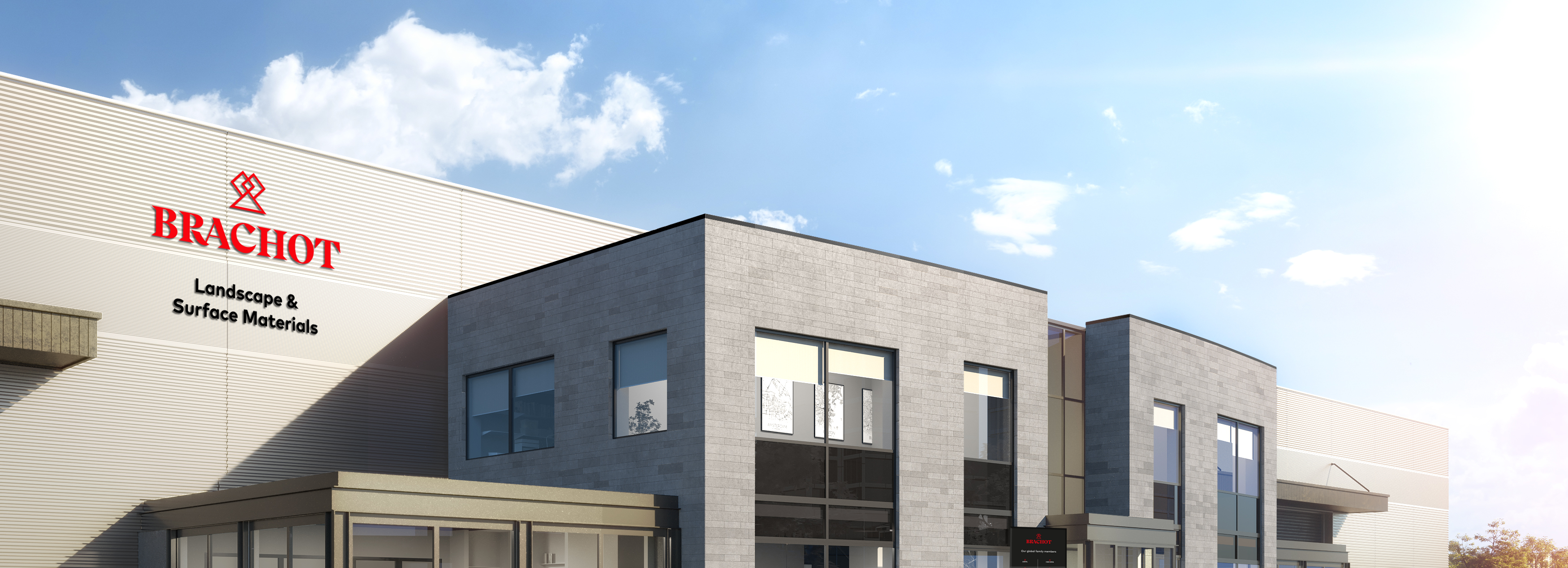
Creating something truly valuable has been Brachot-Herman’s core business since 1901. They produce and distribute surface and landscaping materials – with natural stone, ceramics and composites – that stand the test of time. To consolidate their expanding global network of numerous quarries, mills, warehouses and offices, we have developed a new and solid brand founded on the Brachot heritage.

We have the Romans to thank for serif fonts. One theory is that Romans painted letter outlines onto stone, so the carvers could follow the brush marks. These marks flared at stroke ends and corners, creating serifs. Another hypothesis states that serifs were devised to neaten the ends of lines as they were chiselled into stone. Whatever the origin, to us it was clear Brachot needed a serif font – stately and stylish – connecting profession with tradition.
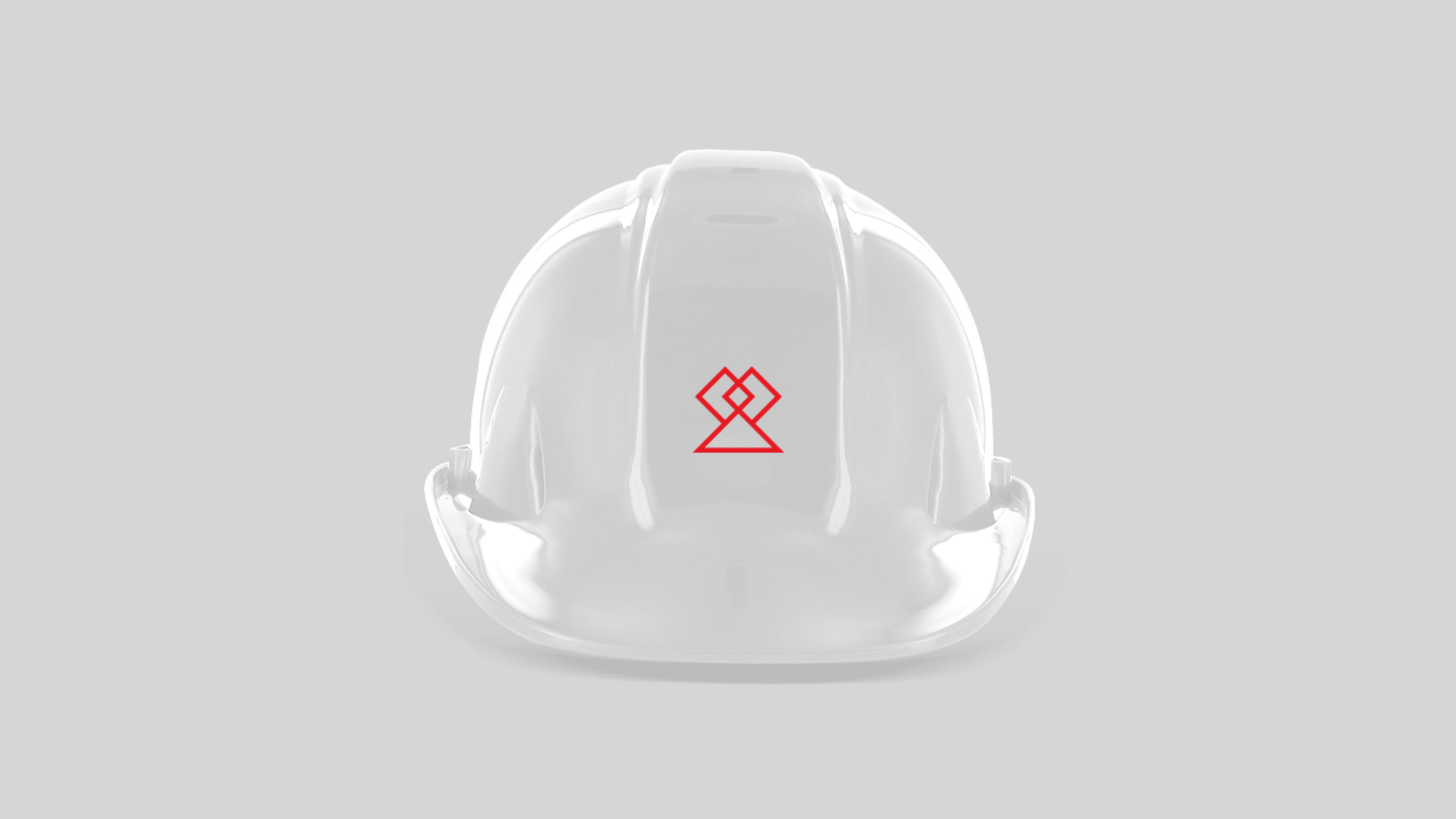
The Brachot trademark embodies a solid and vigorous organisation. The triangle, one of the sturdiest shapes in architecture, supports two diamonds, a material so hard it easily cuts through rocks. Needless to say, we have built a trademark to last at least a few generations. It also represents the various products and activities of the Brachot business. The triangle depicts a mountain, home to our quarries. The single diamond refers to ‘natural stones’, whereas the two joint diamonds symbolise the ‘blended material’ category.

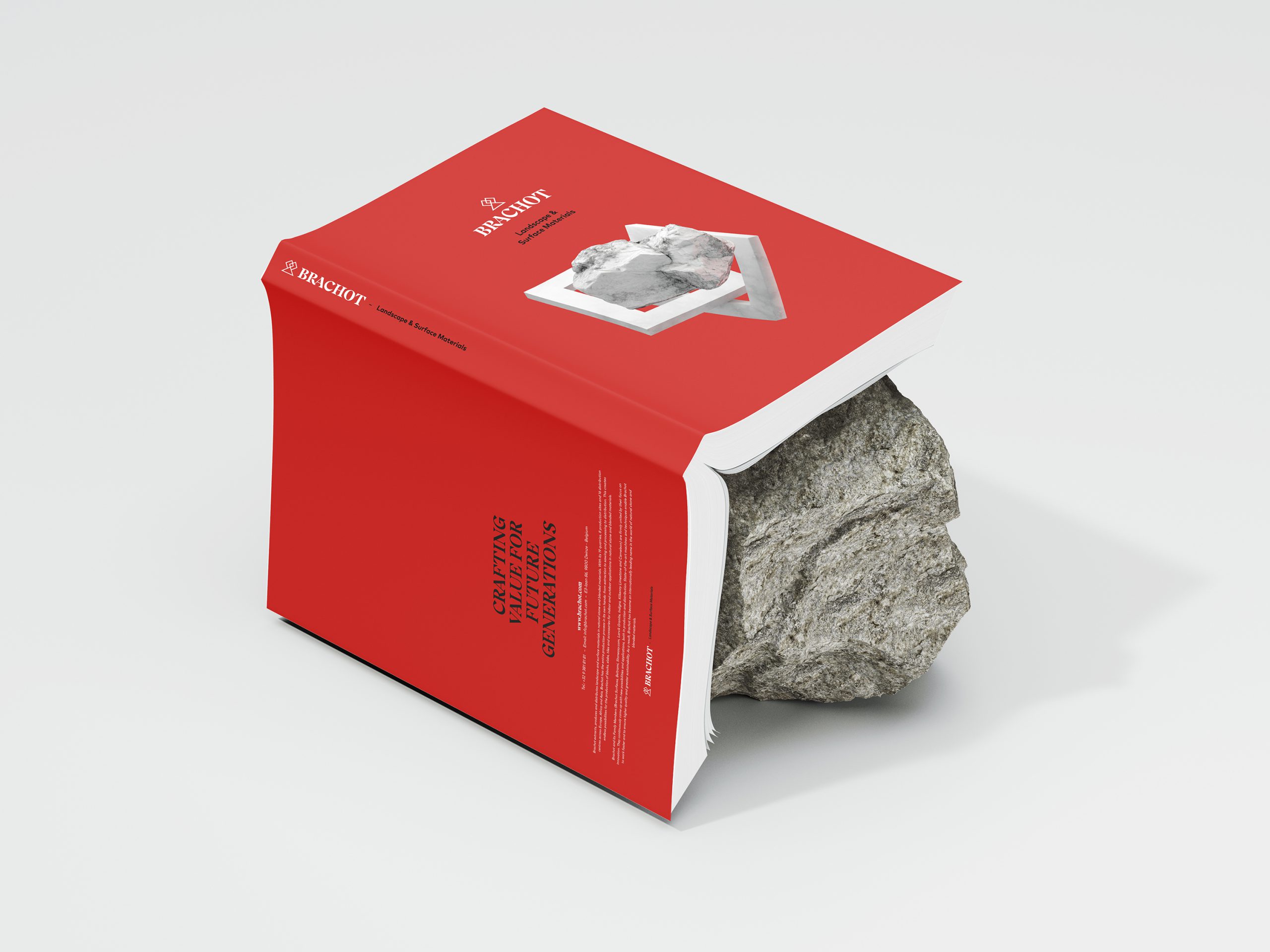
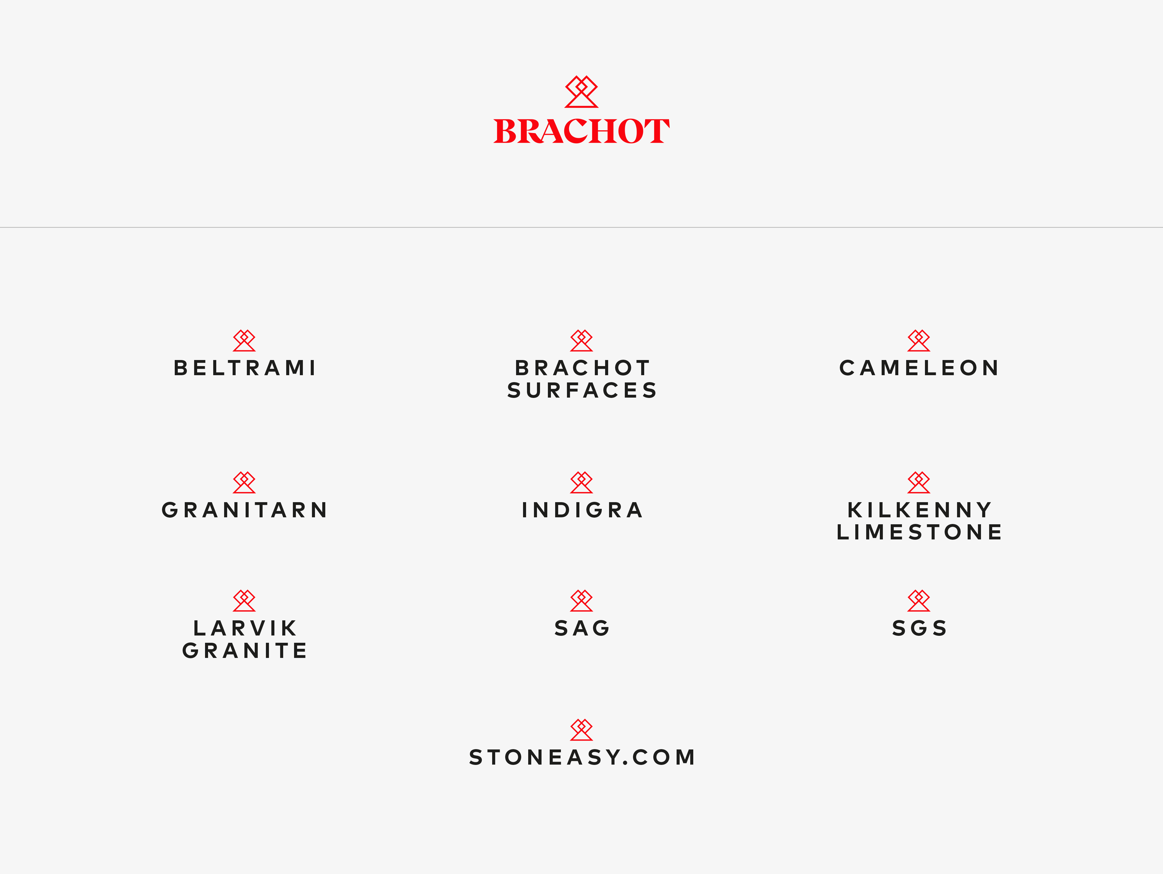
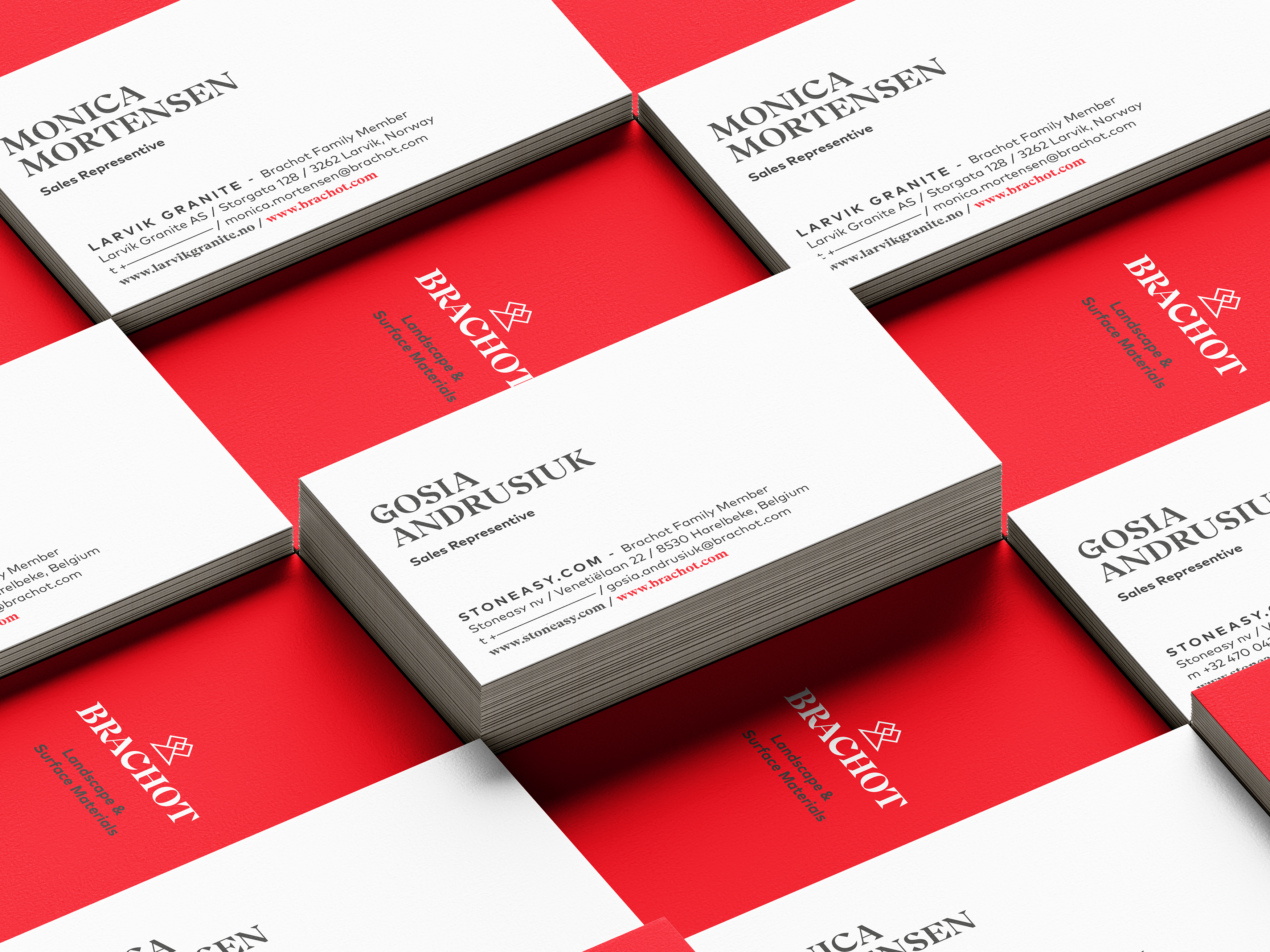
Brachot masters every step of the chain: from quarrying to production, from distributing to servicing. Reinforcing the group’s powerful family connection, all product brands will carry the Brachot trademark. The ‘Brachot Family member’ appellation is invariably added to each business.
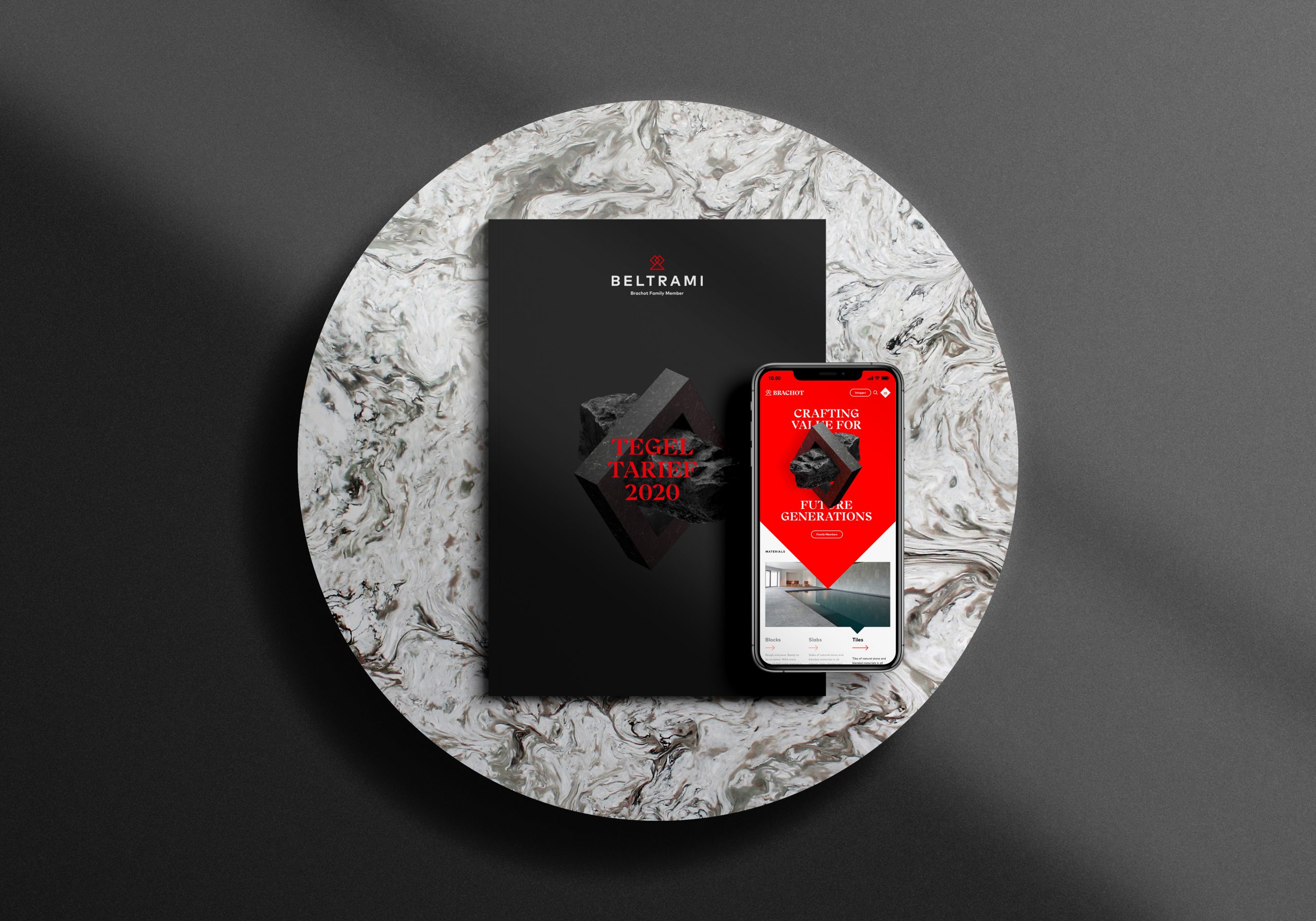
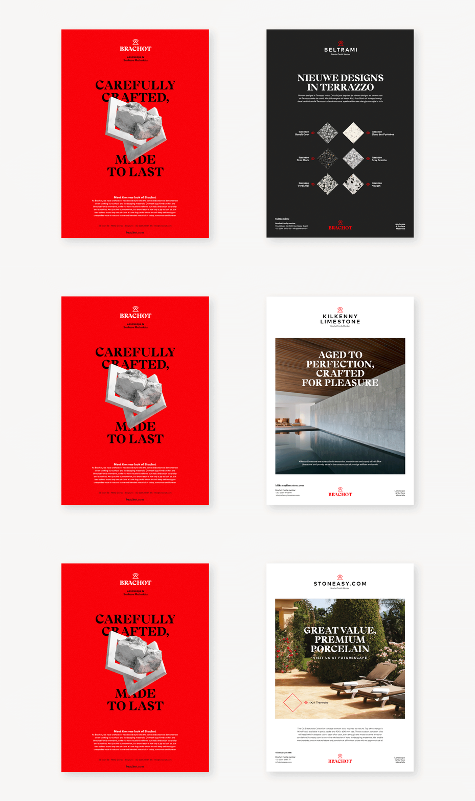
The trademark’s diamond is the foundation of a range of 3D graphical elements, used for conceptual and inspirational communication. The Diamond is the foundation of our range of 3D graphical elements. These 3D visualisations are used for conceptual and inspirational communication.
In animations,
Dirk, Brand Designer
we add a sense of elegance to the robust look and feel.

Become who you are. Use this contact form to shift and shape your brand – or, at least, to get a decent cup of coffee and an equally warm welcome.
Thank you for sharing your question