Compaxo
Tastefully Honest Tradition
Food & Drinkbranding, communication
branding, communication

Compaxo is a family food company that was founded in 1896 in the centre of Gouda, The Netherlands. With such a legacy in mind, and on the occasion of their 125th anniversary, they wanted to set a clear and coherent course for the future. A future where they evolve as a brand and communicate their core beliefs and values as a neat and strong unity. To support this collective sentiment, we crawled in some head-scratching but enlightening workshops. The outcome is a very comprehensive and detailed case.

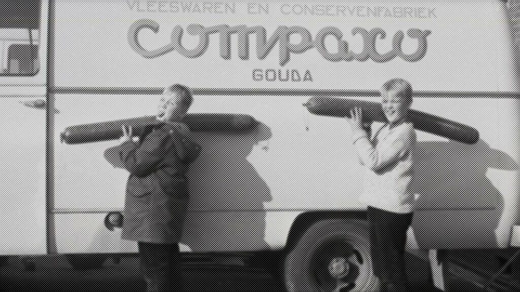
Throughout the years, Compaxo has expanded their business in a wide array of manners. A result of these decades of growth is the establishment of two prime locations; Zevenaar and Gouda. Two sites, each with their own specialisation(s), with at that time also two different websites as well as their own communication. This disconnection, but shared desire for strong, unified external communication, led to several in-depth exercises to reconnect the sites. After sufficient research, we chose to approach things from a corporate perspective where the two branches are part of the chain rather than separate identities.
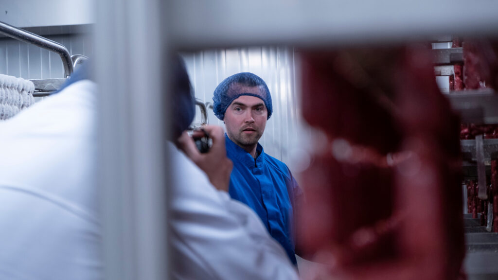
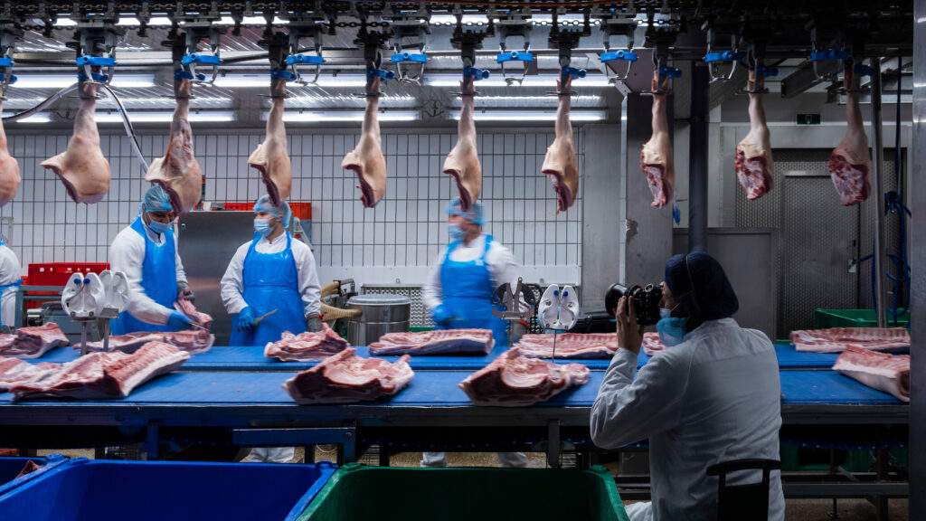
A most distinctive aspect of Compaxo is their A-to-Z control over the entire chain. From farmer to delivery, they have got it covered. Such versatility and straightforwardness are something we had to emphasise to the full extent. As a focal point, this unique selling point immerses the target audience in the Compaxo story and their impact on the meat and meat-free market in Europe and beyond.

“Companies are often so engrossed in their day-to-day business that their core message is no longer clear. As a result, they often overlook the distinction between internal terminology”
Daniëlle Gorter – project manager
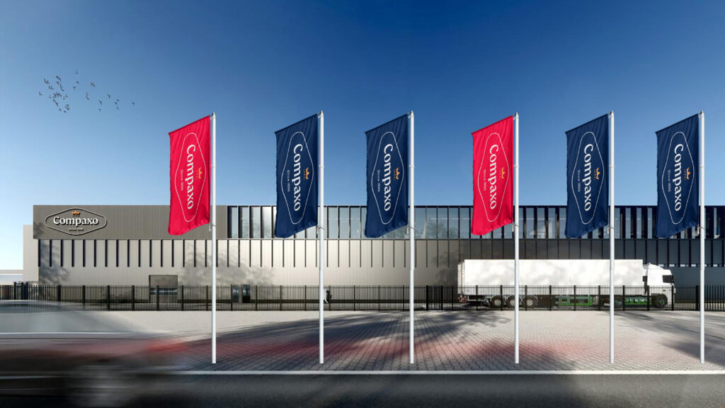
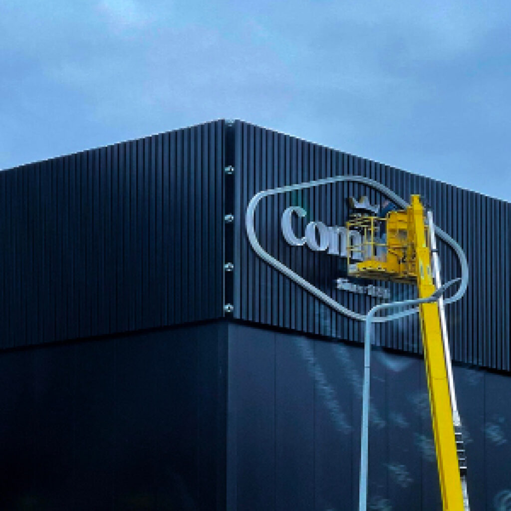

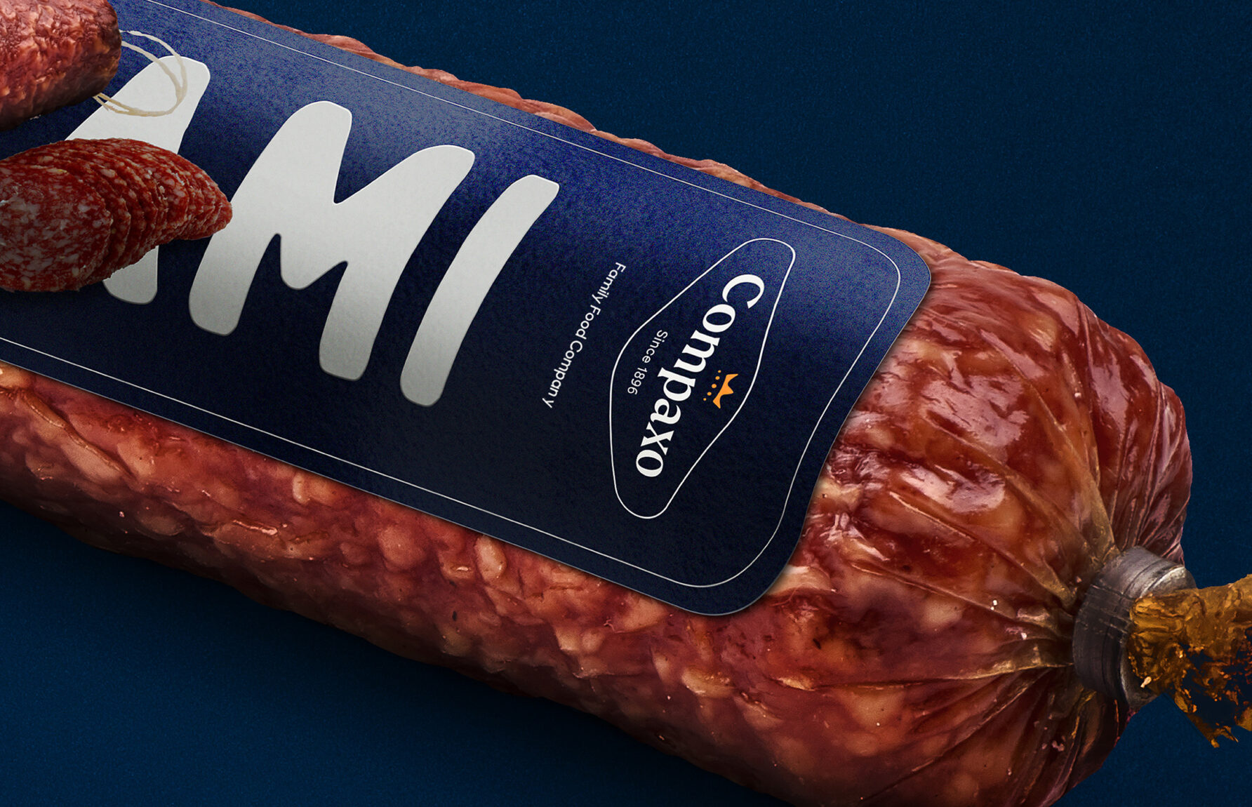
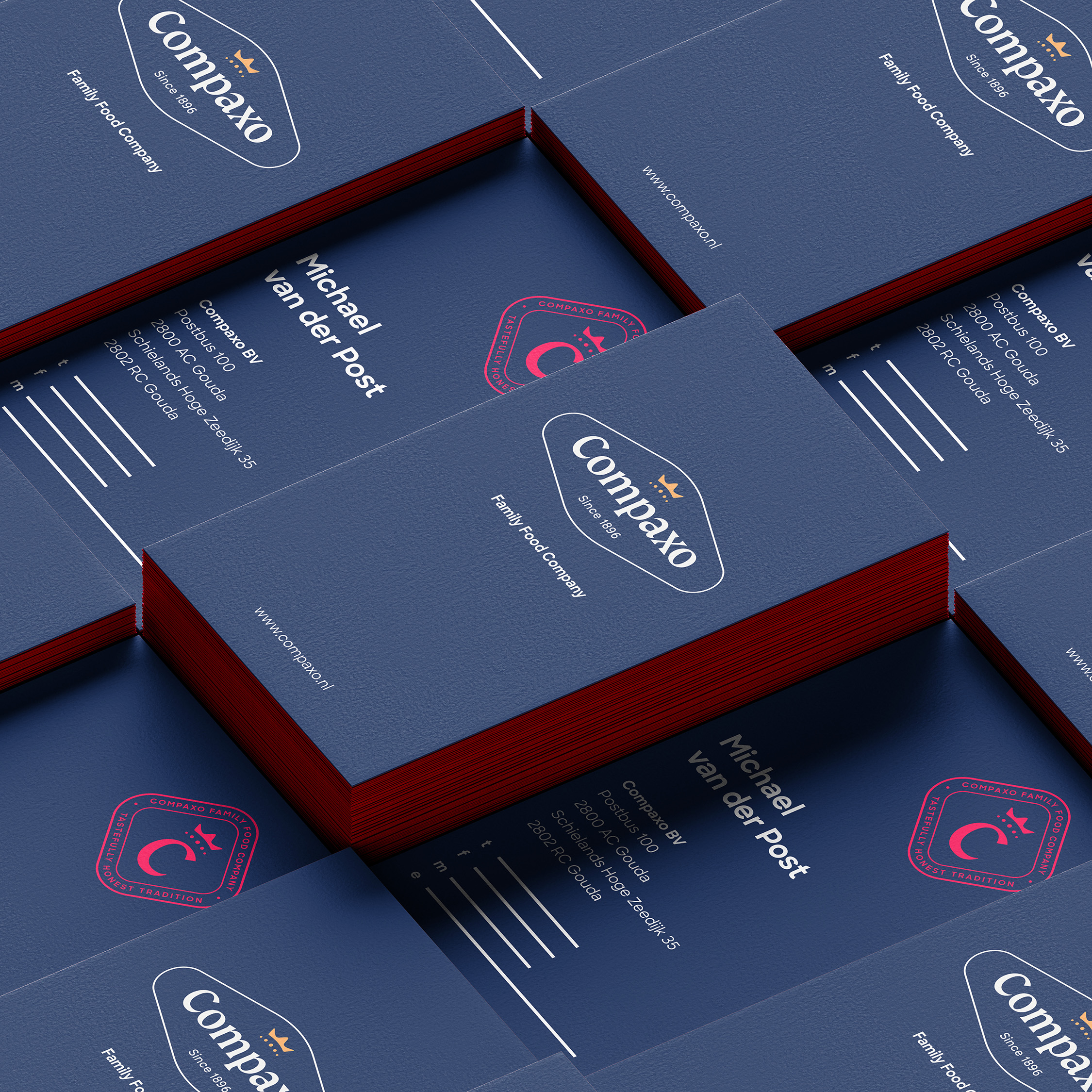
After the workshops, we immersed ourselves in the company’s outlook and personality to produce several brand elements such as a refreshed corporate logo. The spanking new version is completely in tune with modern times without losing the connection to the family’s heritage. We also rolled out logos for the three product groups, which include fresh pork meat, cured meat and vegan & veggie products. Together they form a beautiful ensemble that offers clarity and connection to the different target groups.
Cured Meat
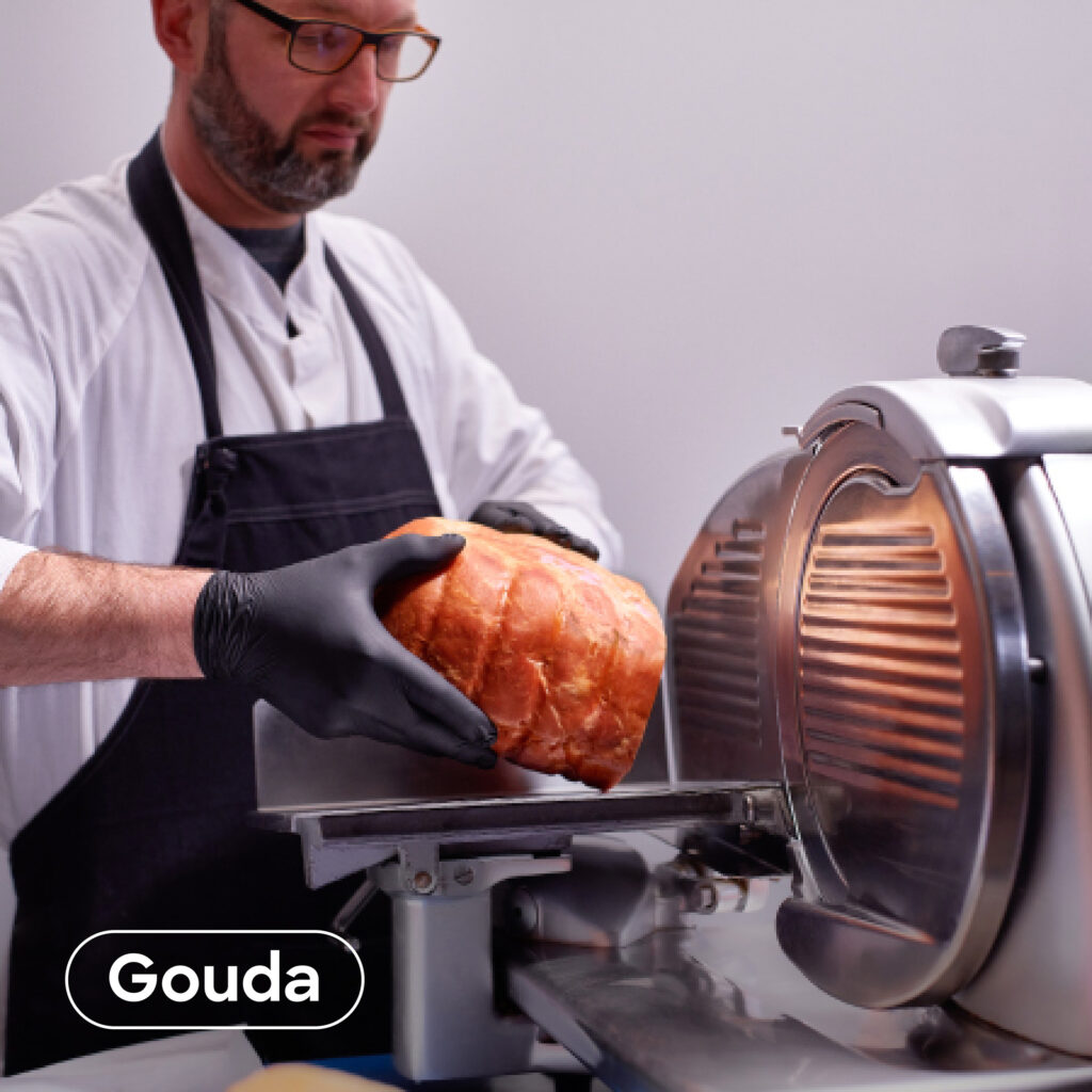
On the left you will find the logo of the Gouda Branch and its cured meat products.
Veggie & Vegan
For the Veggie & Vegan logo, a leaf is added to the logo.
Fresh Pork Meat
For the fresh pork meat, which are part of the branch in Zevenaar, a red logo is employed.

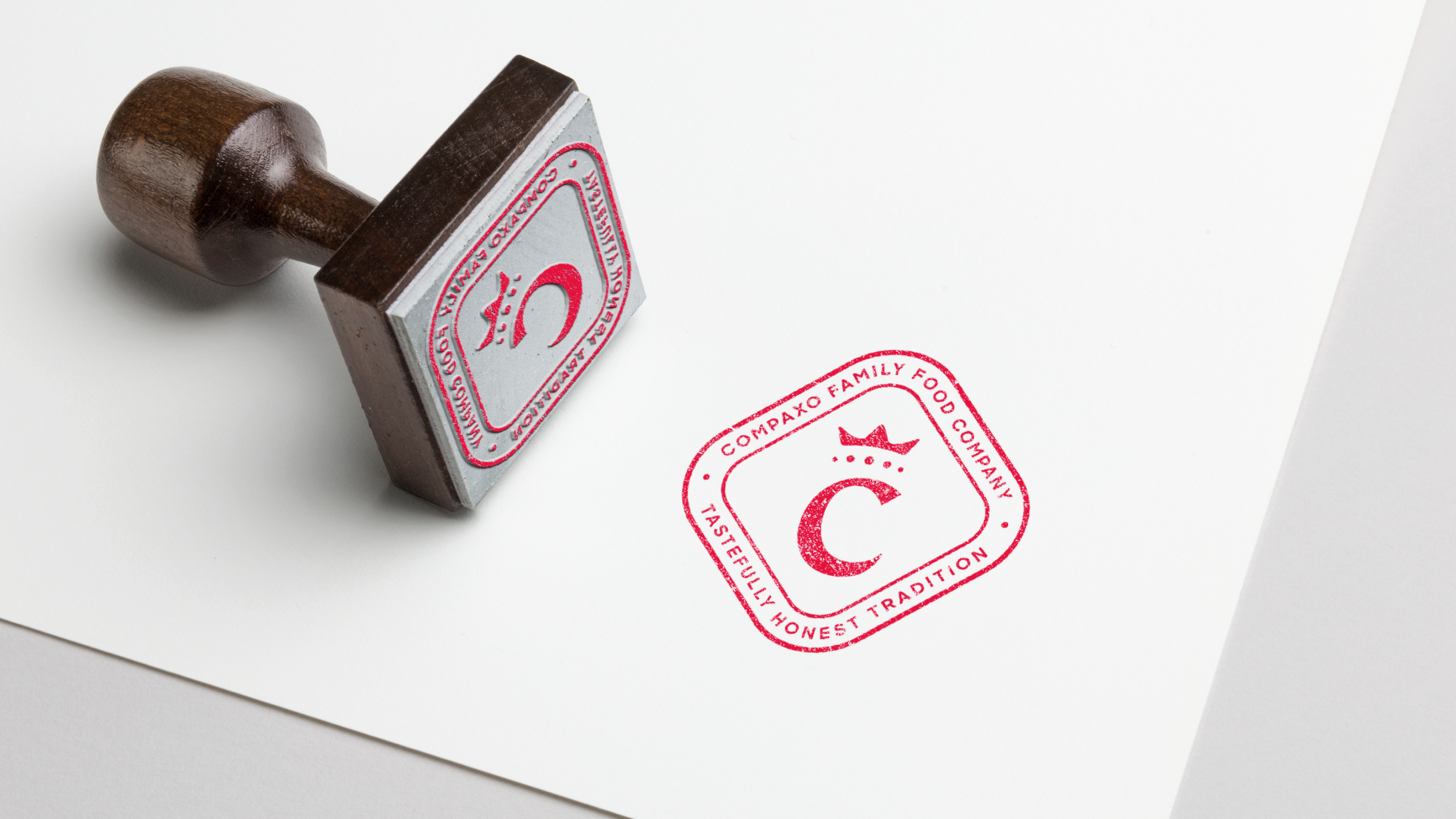
Nothing tastes better than a well-chosen tagline and nominator that, in their simplicity, encompass everything. “Tastefully honest tradition.” clearly represents the family’s heritage and straightforward character that has won the respect of their stakeholders for centuries. The nominator “Family food company” follows the same approach and gives additional clarification to new customers and third parties. Remarkably enough we assembled two times three words that completely grasp the essence of Compaxo’s business.


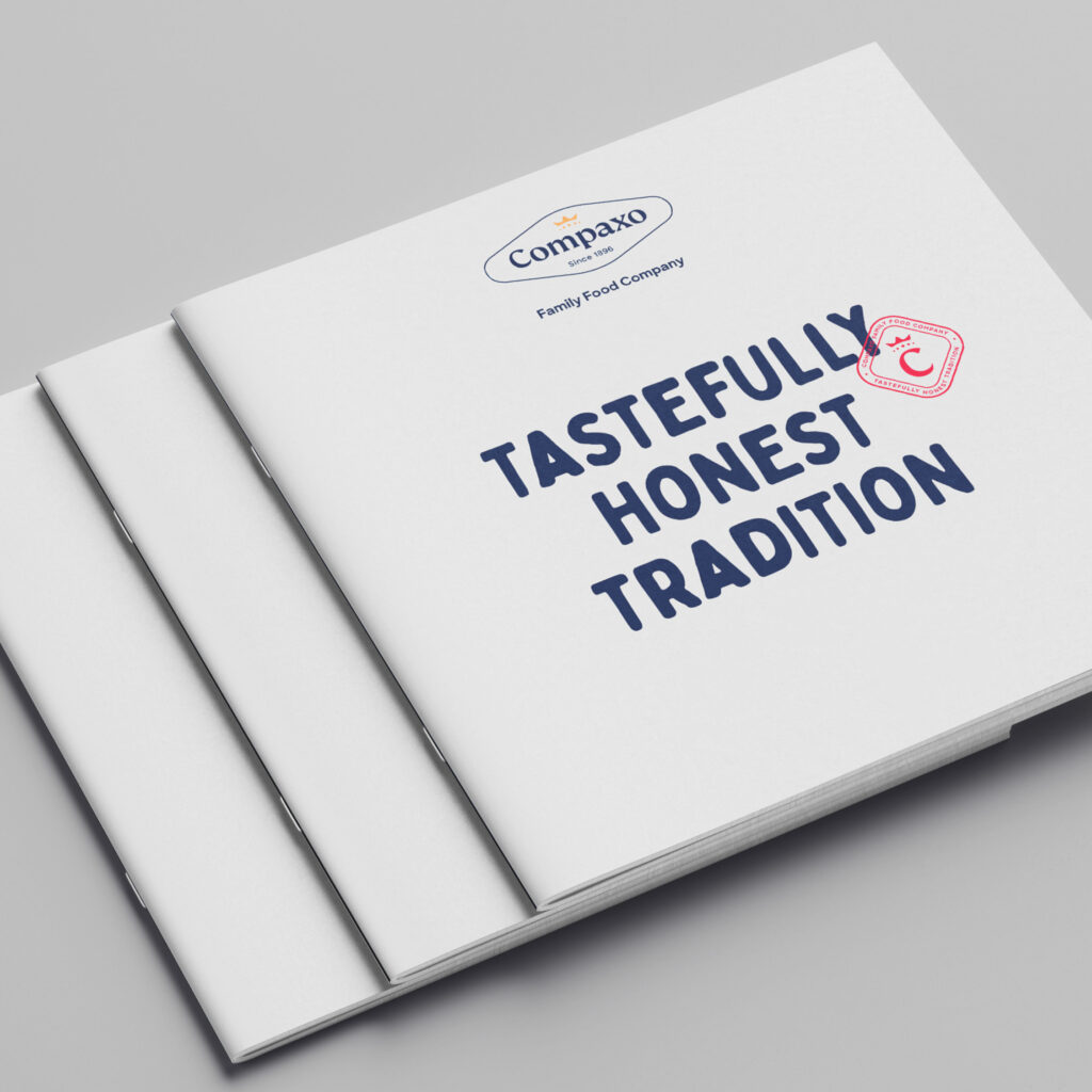
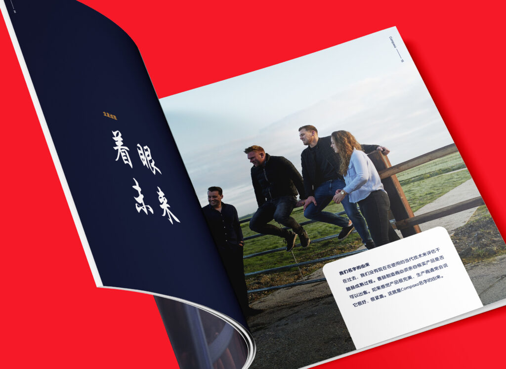
Actually, our cooperation started with the assignment to compose and communicate Compaxo’s anniversary book. On the occasion of their 125th year of existence, their newest generation wanted to try out a different approach. However, with our concept of meaningful brand engagement in mind, we proposed much more than a book. By digging deeper and presenting not only what they asked for, but also what they truly required, a deal was struck for a full-fledged branding project.
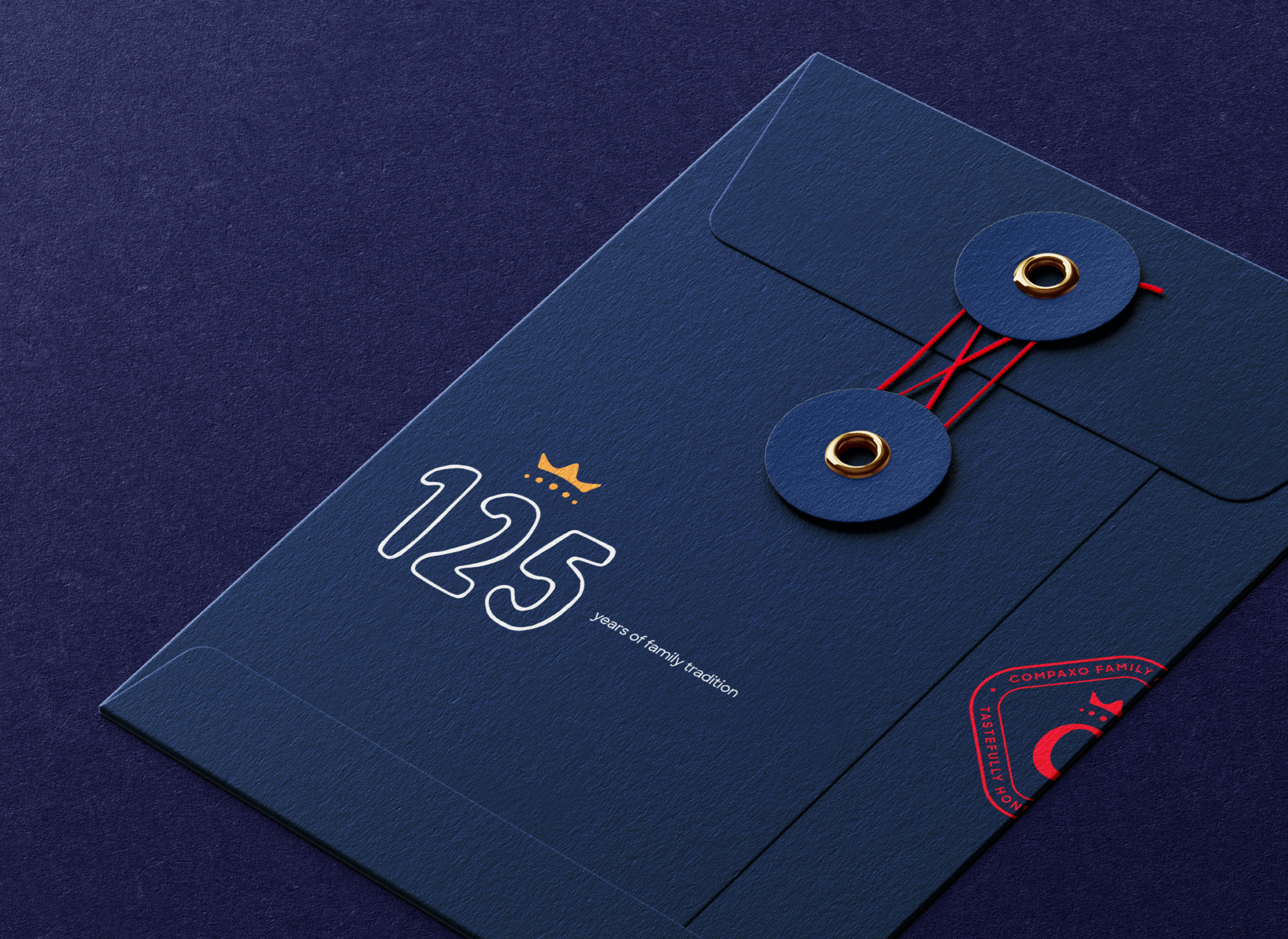
The beautiful composition of all the brand elements is served on a digital tray. Whereas originally there were two websites for the two locations, we opted for a more all-encompassing approach, as mentioned earlier. With one single, well thought-out website, we achieve this objective. Via the homepage, the target group can discover both the general story and the most important USPs before moving on to the relevant product range that suits their specific market. Where necessary, a distinction between Zevenaar and Gouda is provided to avoid barriers and confusion.
For the brochures, however, we disassembled everything down to the last page in order to achieve a better overall representation. Through a general folder containing Compaxo’s corporate information, we extract repetitions from the other brochures and at the same time provide a handy folder to put all the leaflets, folders and papers you require in.




Is rebranding taboo in family businesses?
A total repositioning of a centuries-old heritage is definitely not on the agenda of most family-run companies. Although sometimes it is exactly what they need.
Discover the pros and cons of branding for family businesses in our blog.
Become who you are. Use this contact form to shift and shape your brand – or, at least, to get a decent cup of coffee and an equally warm welcome.
Thank you for sharing your question