Challenge MC
Not just a pretty typeface
Servicebranding, communication
branding, communication

The perks of our outgoing spirit? You get to meet many interesting people. And as we love to attend events of all sorts, we were bound to bump into the Devillé family sooner or later. For over 10 years, they have been building a name for themselves as Challenge MC, hosting high-end receptions, conferences and fairs across the country. On one occasion, CEO Marie Catherine told us she felt the logo no longer supported their status of hospitality expert and, obviously, we shared this concern – the client’s always right, right?
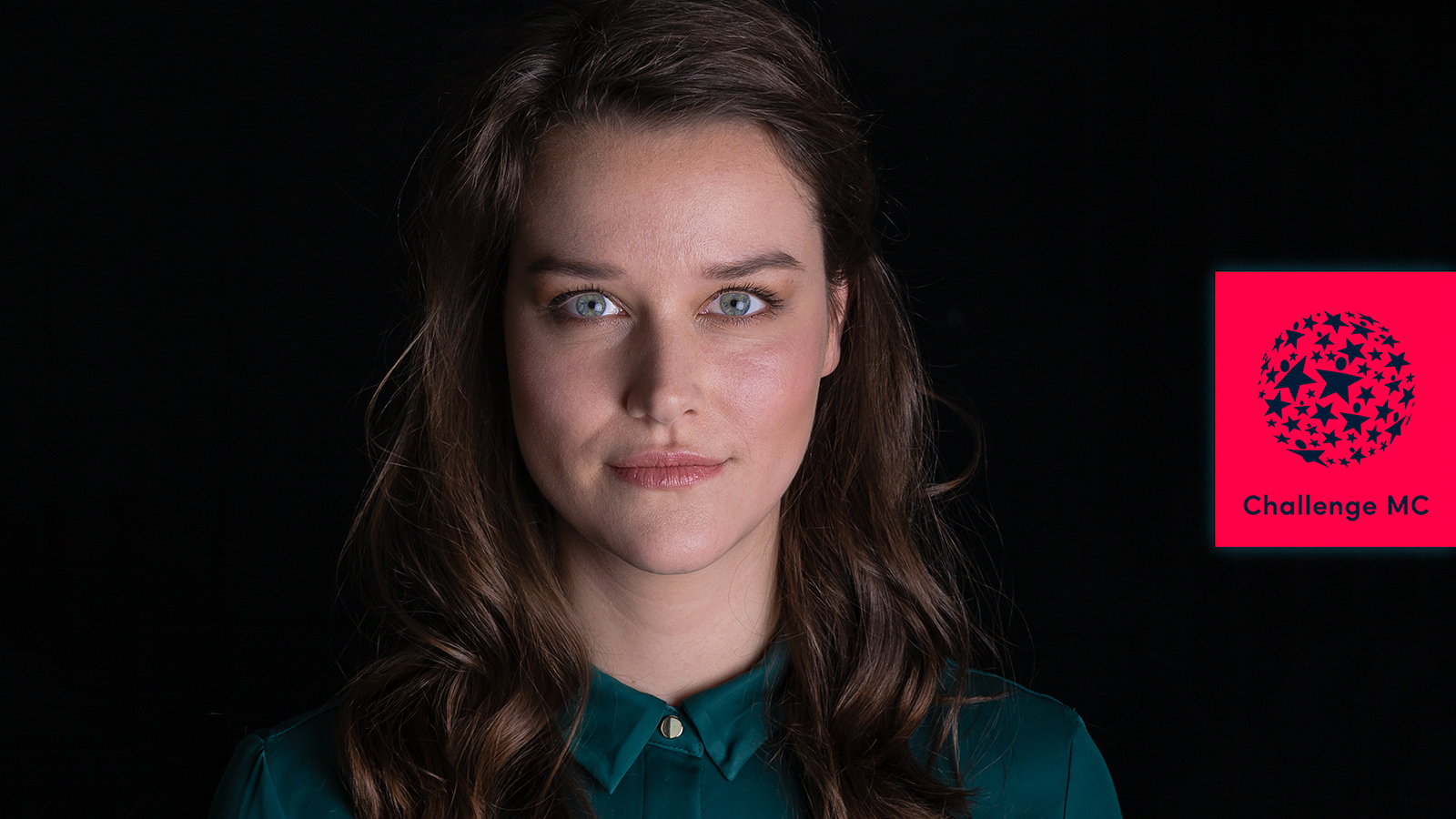
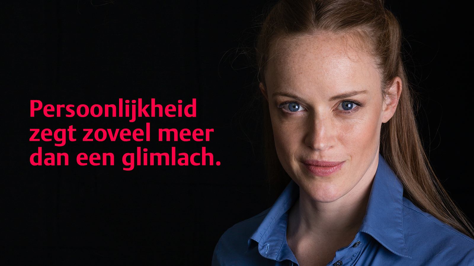
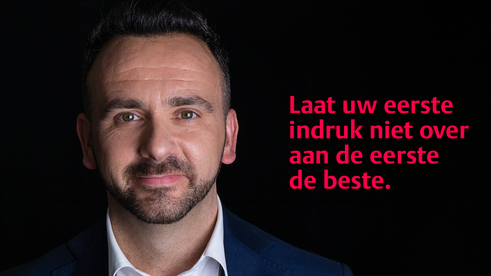
Girls sensually stroking a car or guys selling shirts without wearing any, that’s not the type of hosts Challenge MC is looking for. The photography zooms in on personality centred portraits, communicating this standout positioning to both prospects and candidates.
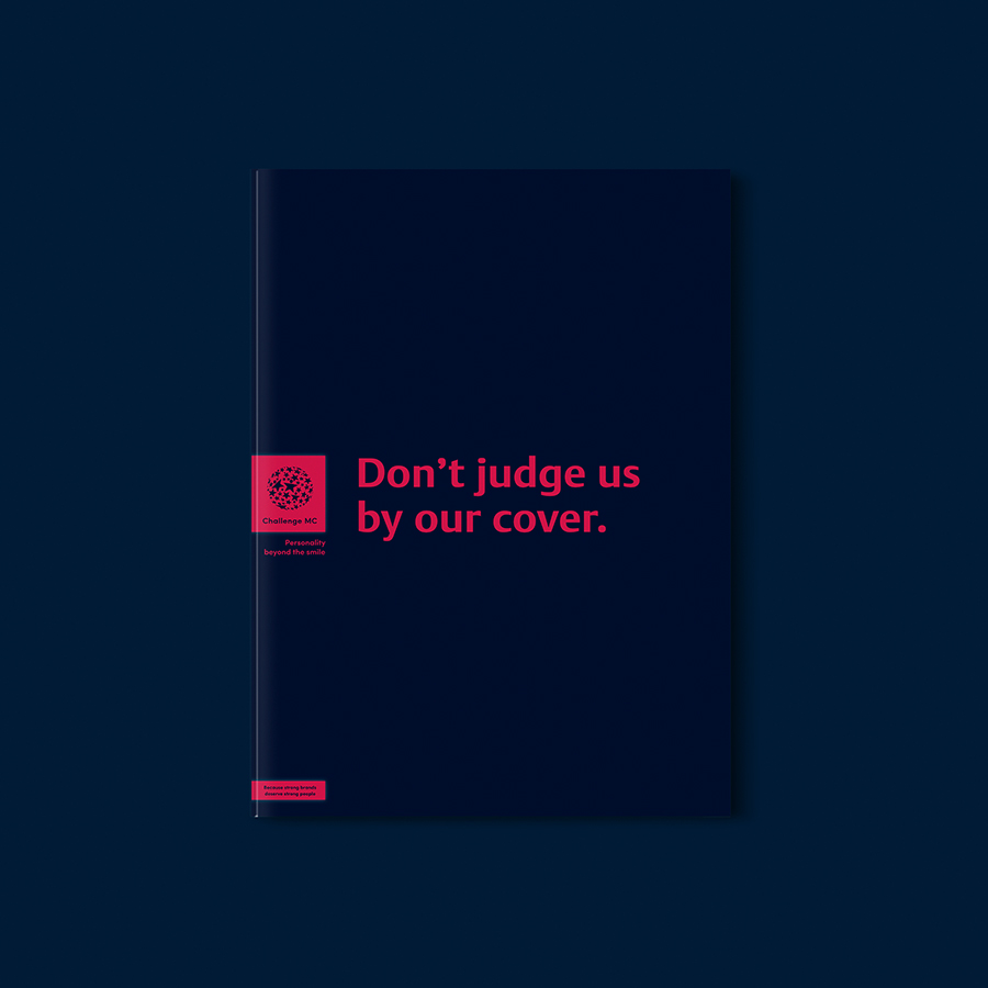
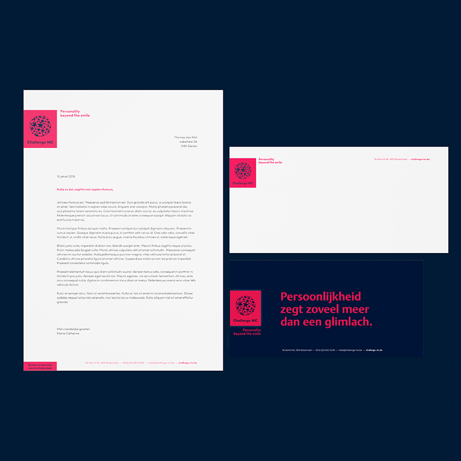
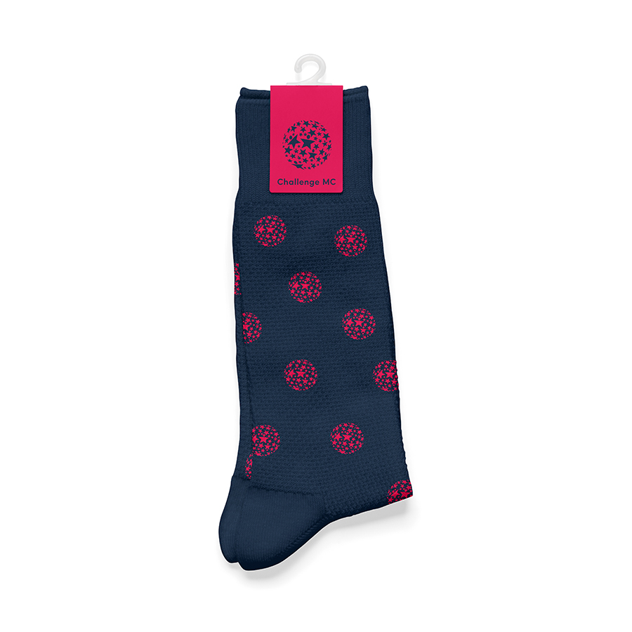
The starry logo was a given. However, to represent Challenge MC’s expertise and dedication to superb service, it lacked authenticity and resolution. Framing it in a tender red square and gently lifting it from the ‘business blue’ background with a fine halo, we established a reliable quality seal.
Welcoming visitors online, we have chosen to directly address the 2 main target audiences: professionals and potential Challengers. This transparency swiftly leads people to the desired information.
« Nothing says ‘hello’ like a delicately designed halo! »
Thomas, designer

Become who you are. Remplissez ce formulaire de contact pour former ou faire évoluer votre marque – ou, au moins, pour recevoir une bonne tasse de café et un accueil tout aussi chaleureux.
Merci de partager votre question