Herbird
Delightful design is the word
Food & Drink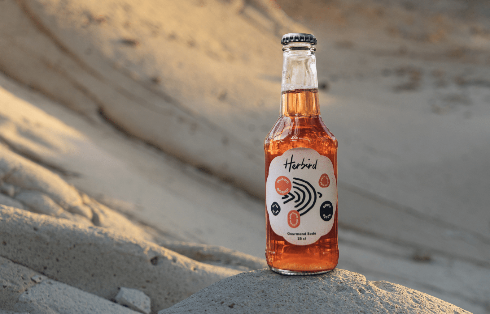
Eldrid and Kevin Vindevogel’s sophisticated soft drink enriches the culinary experience with a masterly crafted sensation, so delicate to savour you forget you are not sipping alcohol. A toast to taste. How could we convey this experience to an audience that is – to say the least – not shy of choice when it comes to aperitifs? A bubbly brief as well as a great excuse to do some research in the local bars and restaurants. Note to management: look for ‘happy hour’ in the timesheets…
Let’s name this exquisite extract. A name that holds (some) meaning, but is not a mouthful. Something that sounds like it has been around for years, and yet still splashes from your lips every time you say it. Try it, with Herbird. A stirring mélange of “herb” and “bird”, where the first refers to the fine natural ingredients and the latter links to the creators’ last name, Vindevogel. Clear and simple, and even pleasing to the eye… Herbird is the word!

We want the Herbird brand to spread its wings, creating a lively avatar as sprightly crafted as the wordmark. From the skies to print deliverables and digital channels, we implement a stylised organic look to communicate craftsmanship with a sense of heritage.

Obviously, the fresh ingredients heavily inspired our visual approach. We derived a colour palette from them, added a granular pattern similar to the texture of rhubarb (for a ‘sensational’ touch) and created flower shapes as framework for the labels – joyful and graceful.

Refined compositions bring both consistency and an eye-catching dynamic. Selecting distinctive pictures is a powerful tool to convey the right culinary ambiance. Foody, but welcoming. Rich in contrast and details, adding substance to the scenes. Pictures, but no still images, so to speak. We also include highlights of botanicals to expand design options.


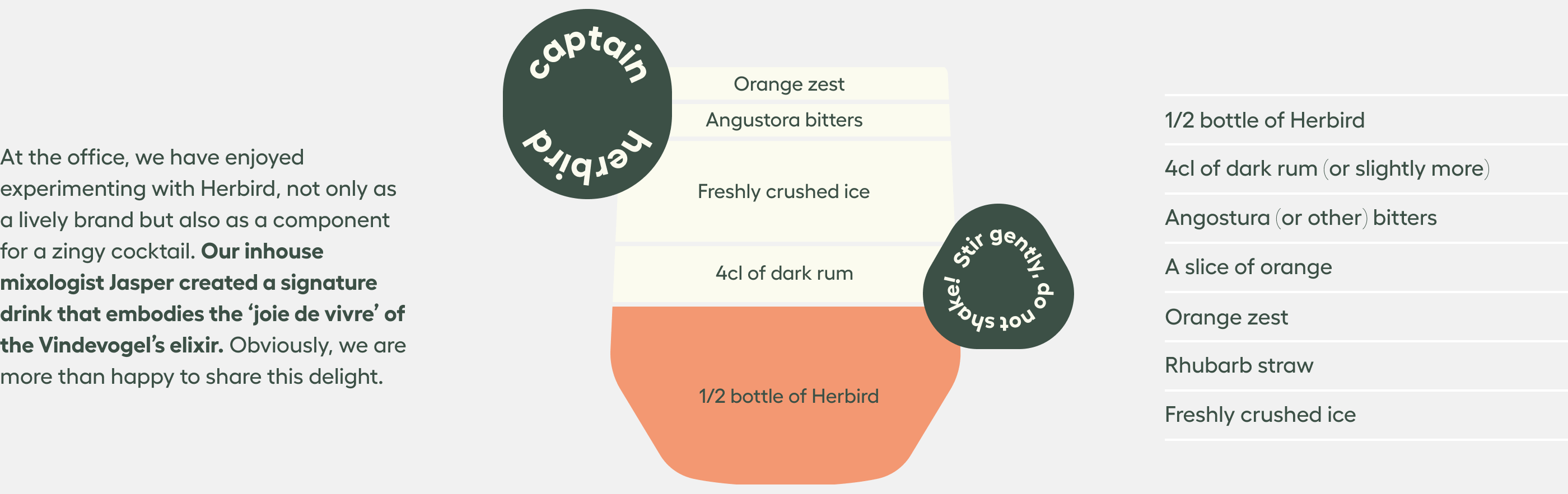
“Where other sodas call for big gulps, we master moderation – the focus is on delight rather than demand.”
We think you’ll love them!

Become who you are. Vul dit contactformulier in om je merk te versterken en vorm te geven – of, ten minste, om een degelijk kopje koffie en een even warm welkom te bemachtigen.
Bedankt om jouw vraag met ons te delen