Parentia
A brand that creates maximum opportunities
Public Servicebranding
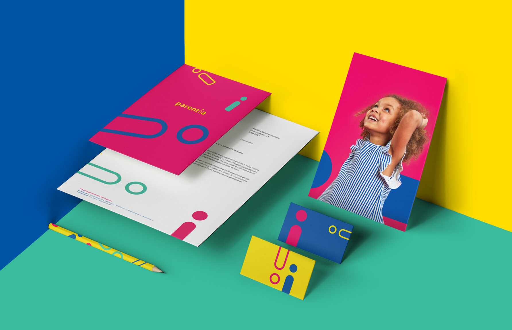
branding

In a world where child allowance funds are seen as functional, administrative and reactive, Parentia wants to be the partner that gives parents correct and comprehensible information, quick solutions and empowering inspiration. A kids information centre that helps create maximum opportunities for parents and their children.
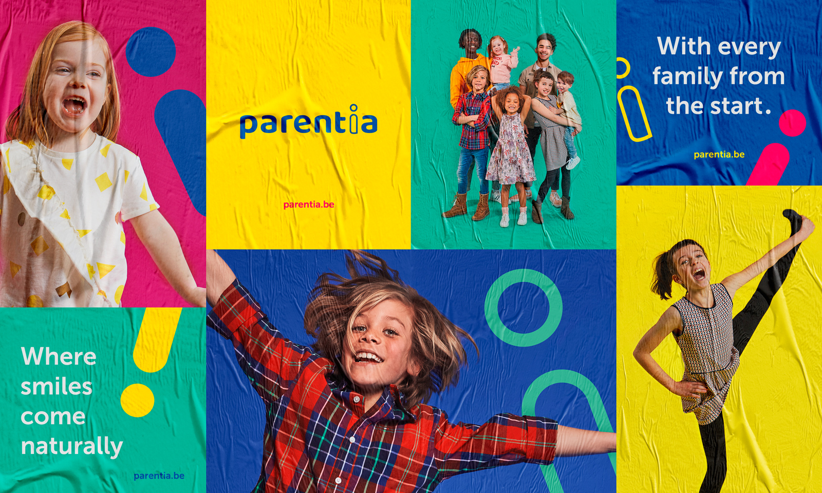
Accessibility is central to the Parentia success. As a consequence, the Parentia brand must be simple and direct with a strong, consistent sense of purpose in all its communications. Less is more. However. Consistency in branding is critical, but consistency has a new way of being applied. Brands are more powerful when they have room to breathe: freedom within form is now best practice.
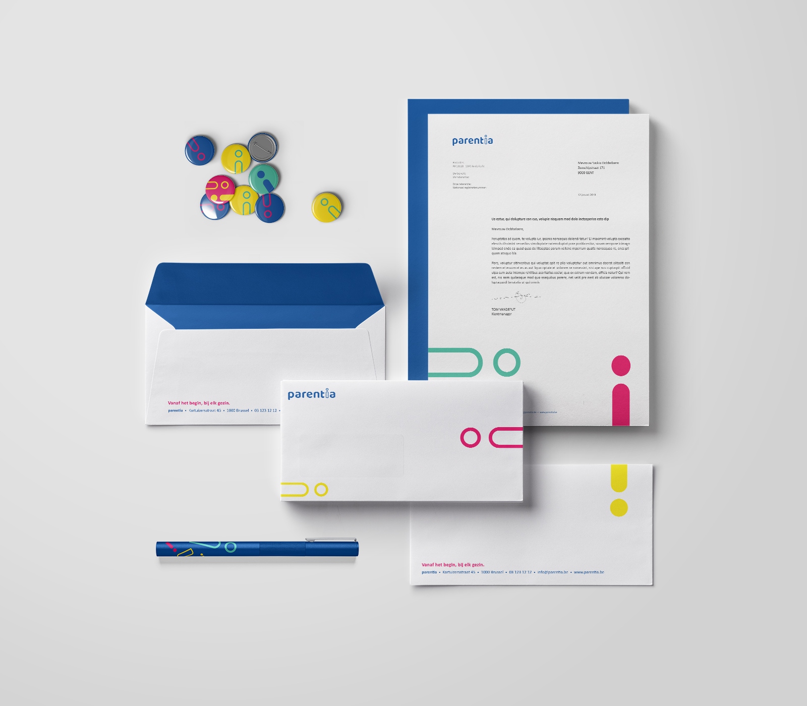
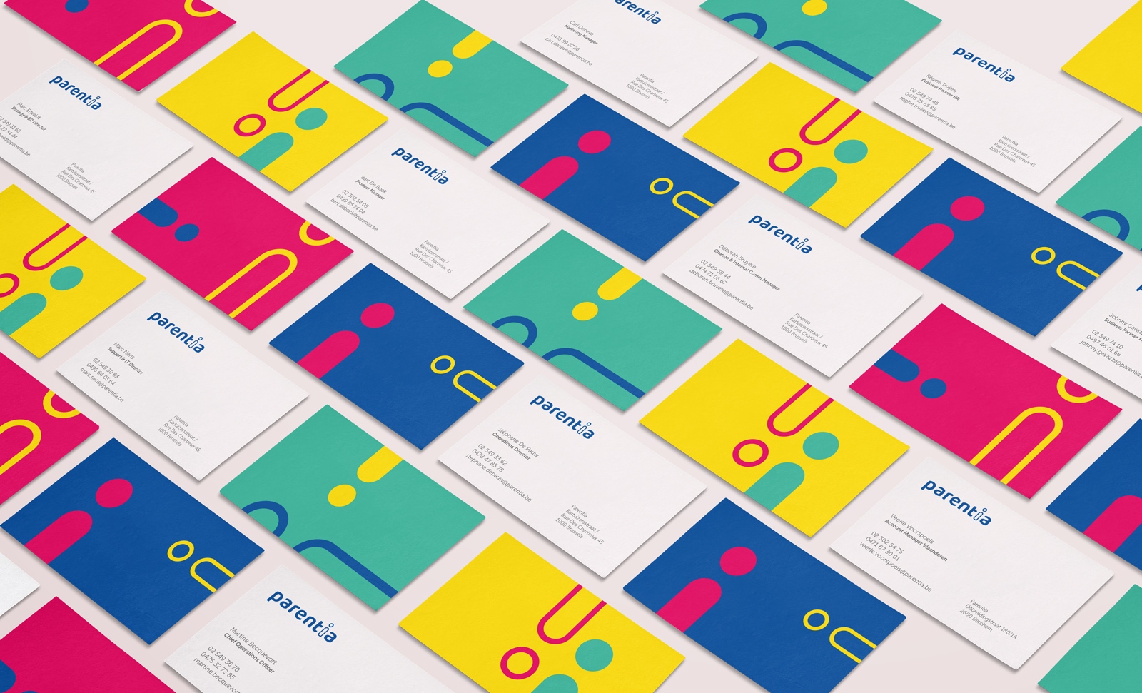
The Parentia mission of information and inspiration is formalized in the symbol, a humanized letter ‘i’ of the Parentia name. It is an open, accessible, fun symbol, entailing a feeling of ease, of happy parenting. This symbol drives and supports the Parentia values, beliefs and behaviours in a single all encompassing statement.
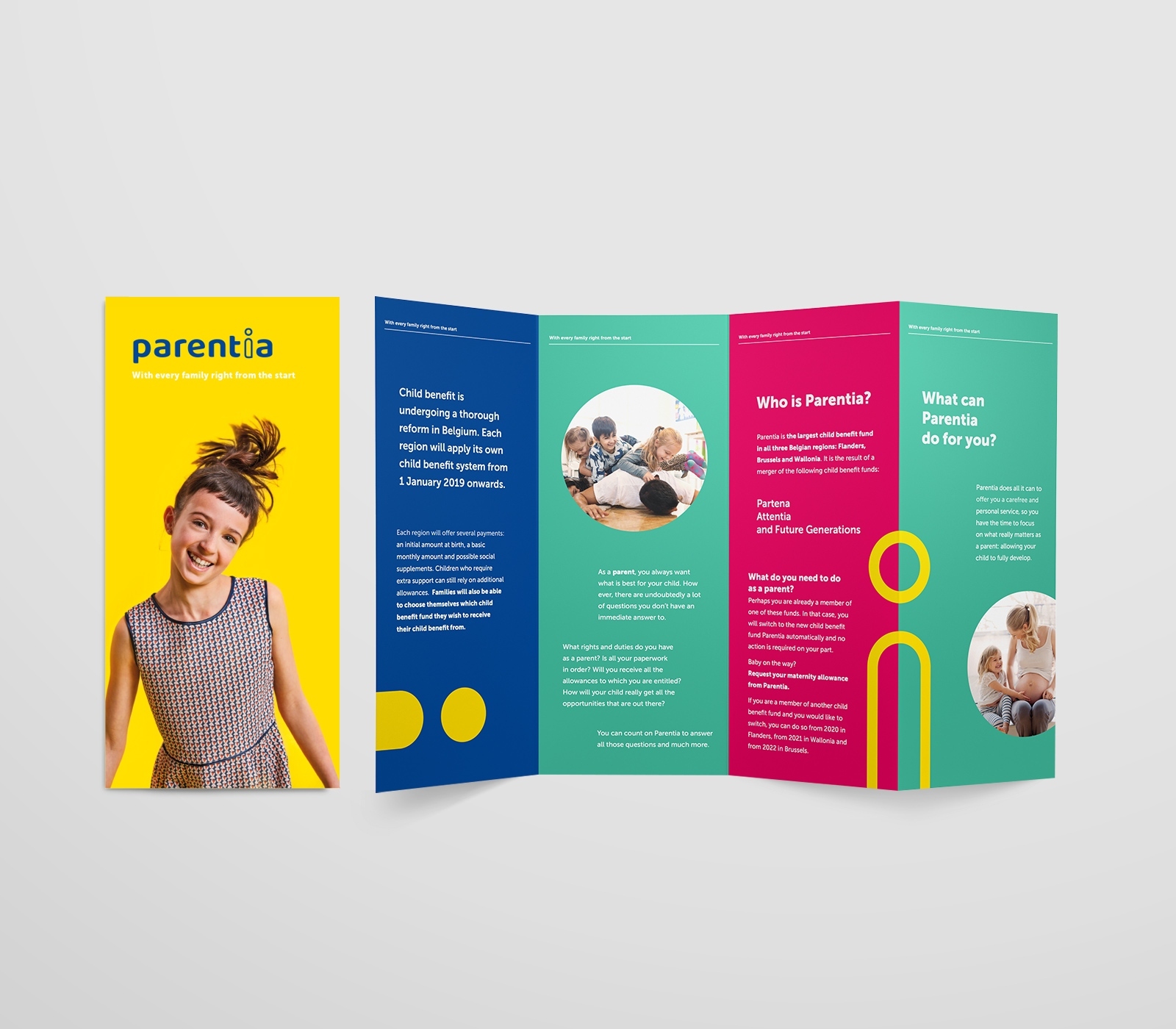
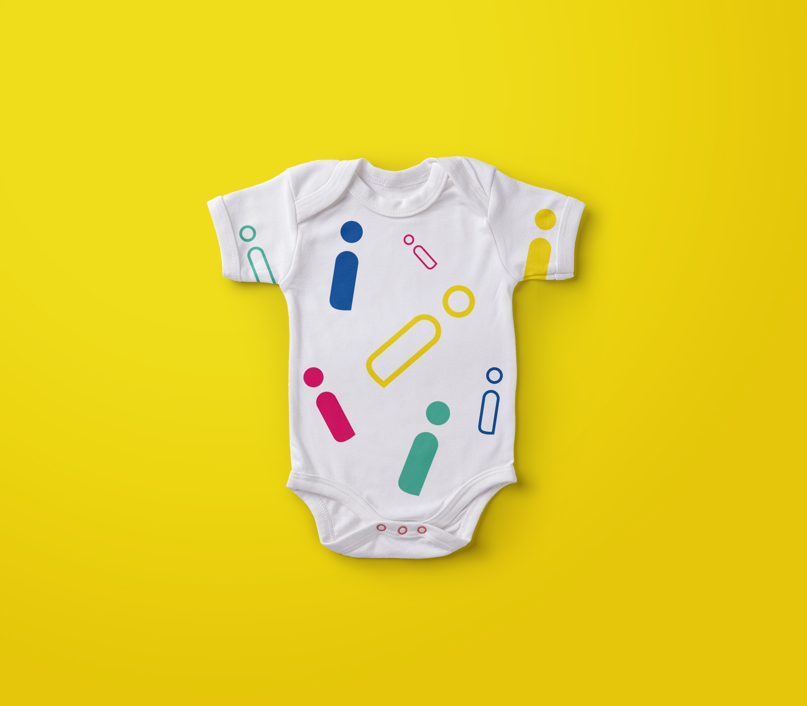
All brand identity elements help to unlock and convey the essential spirit and attitude of the brand. With its utterly memorable logo, its strong, vibrant colours, upbeat typography and iconic symbol, the Parentia brand is just made to be confidently and expressively used across a wide range of applications and brand touch points. Just what kids (and their parents) love.
Become who you are. Use this contact form to shift and shape your brand – or, at least, to get a decent cup of coffee and an equally warm welcome.
Thank you for sharing your question