Partena Professional
Partena. Harmonizing brand with reality.
Servicebranding, communication
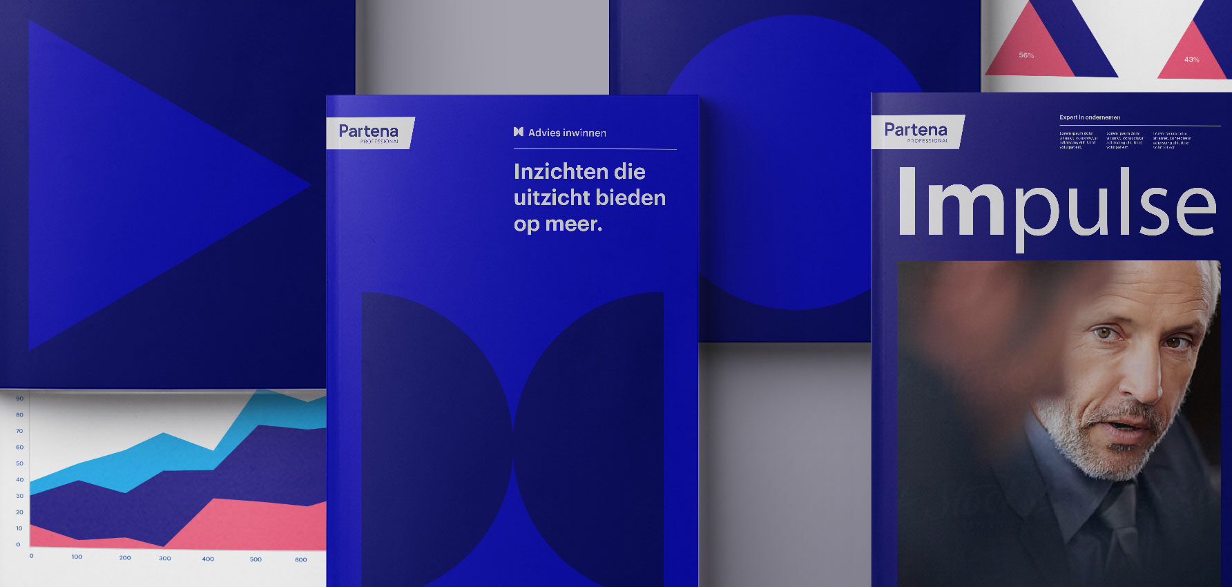
branding, communication

A gap had developed between Partena Profesional’s image, the sector’s reality and the organisation’s ambitions. Therefore, we needed to build a brand universe – positioning, personality, brand architecture, visual and verbal identity – that links Partena Professional’s foundations with its aspirations.
Partena. Harmonizing brand with reality.
While the market recognized Partena Professional as trusted experts, the organisation’s image did not at all reflect this reputation. Furthermore, the transition from a silo-oriented organisation towards an all-inclusive, customer-focused offering had to be reflected in an inspiring overarching promise and matching brand image. Aided by insights from Jung’s archetypes and by the outcome of our core beliefs workshop, we defined Partena Professional as an innovative business partner, daring its clients to fulfil their ambitions and to realize their dreams.
Evolution. Not revolution.
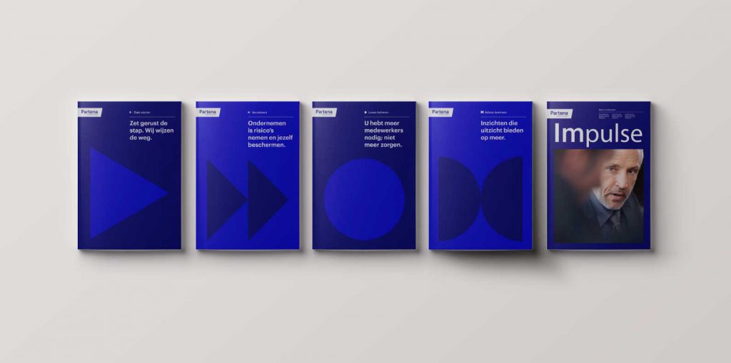
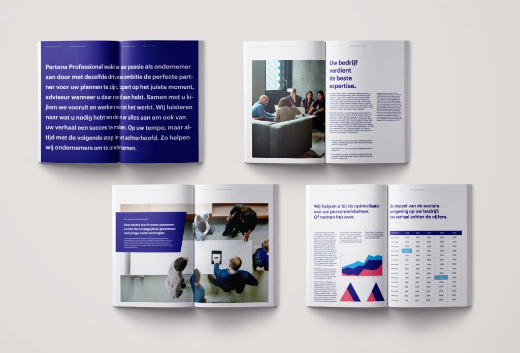
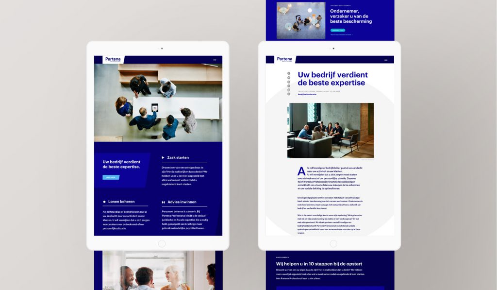
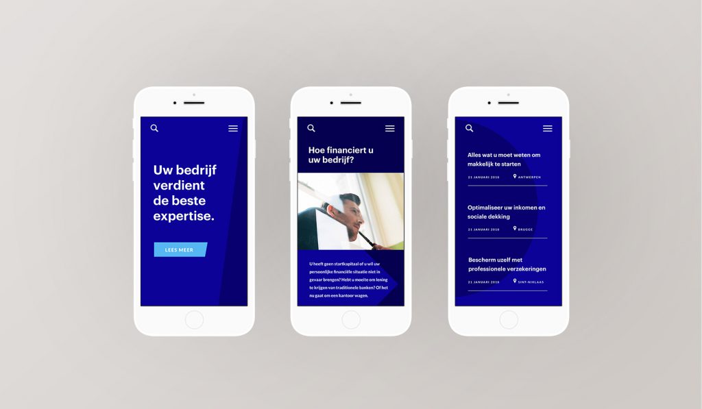
This brand personality was then translated into a verbal and visual brand identity that is clear yet stimulating, vibrant yet airy; with solidly warm yet strong colours and images that trigger the imagination: dynamic, captured in the moment, centred around people and their stories.
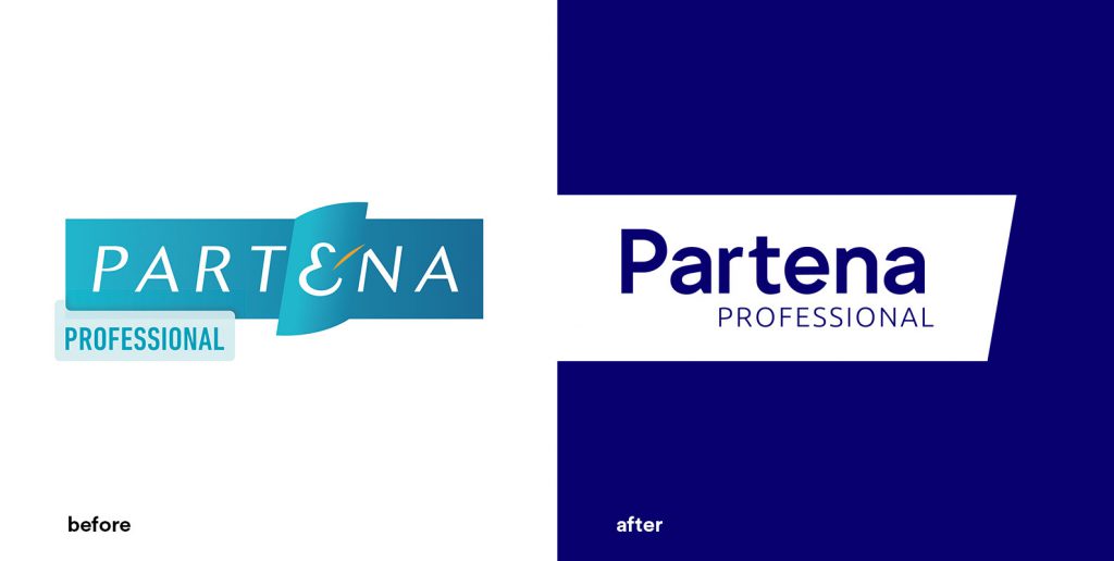
We did not, of course, start from a clean slate but respected a brand / company with a long history. We based the logotype on the Futura font, with its appearance of efficiency and forwardness, but customized it to put the right accents according to the brand’s values. Partena Professional’s primary colour blue (in different tones) is, as research indicates, associated with expertise and trustworthiness.

Brand architecture
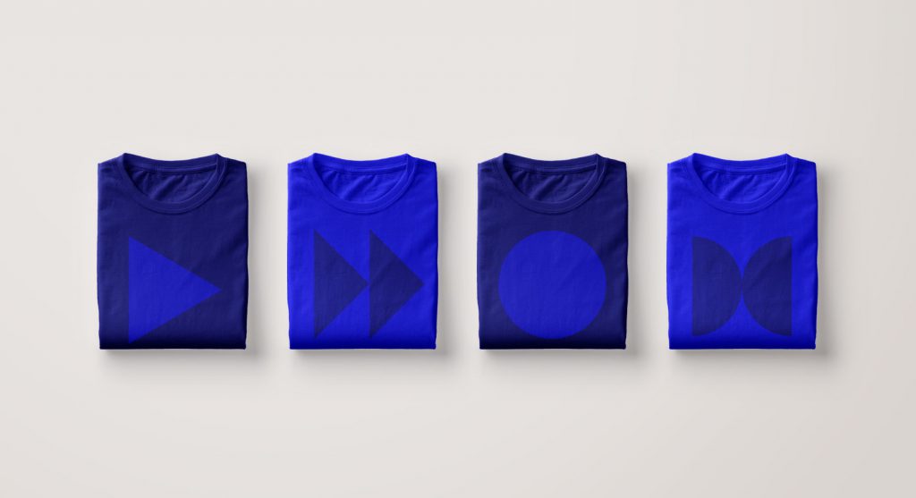
To bring clarity in the seemingly complex Partena Professional offering, we scaled down the sheer endless set of symbols, names, figurines, …. to four simple symbols and clear product category names. Straightforward, efficient, user-friendly: a bit like, well, Partena Professional.
Putting ‘Professional’ back in Partena Professional
The outcome: a brand that accurately reflects the organisation’s strengths, that helps to steer everyone within the organisation in the same direction – stimulating collaboration and providing one overall, common goal – and invites actual and future clients to boldly grasp future opportunities.

Become who you are. Use this contact form to shift and shape your brand – or, at least, to get a decent cup of coffee and an equally warm welcome.
Thank you for sharing your question