Eurotuin
Shop till you crop
Retail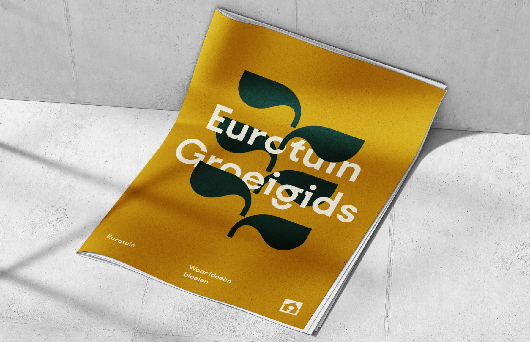
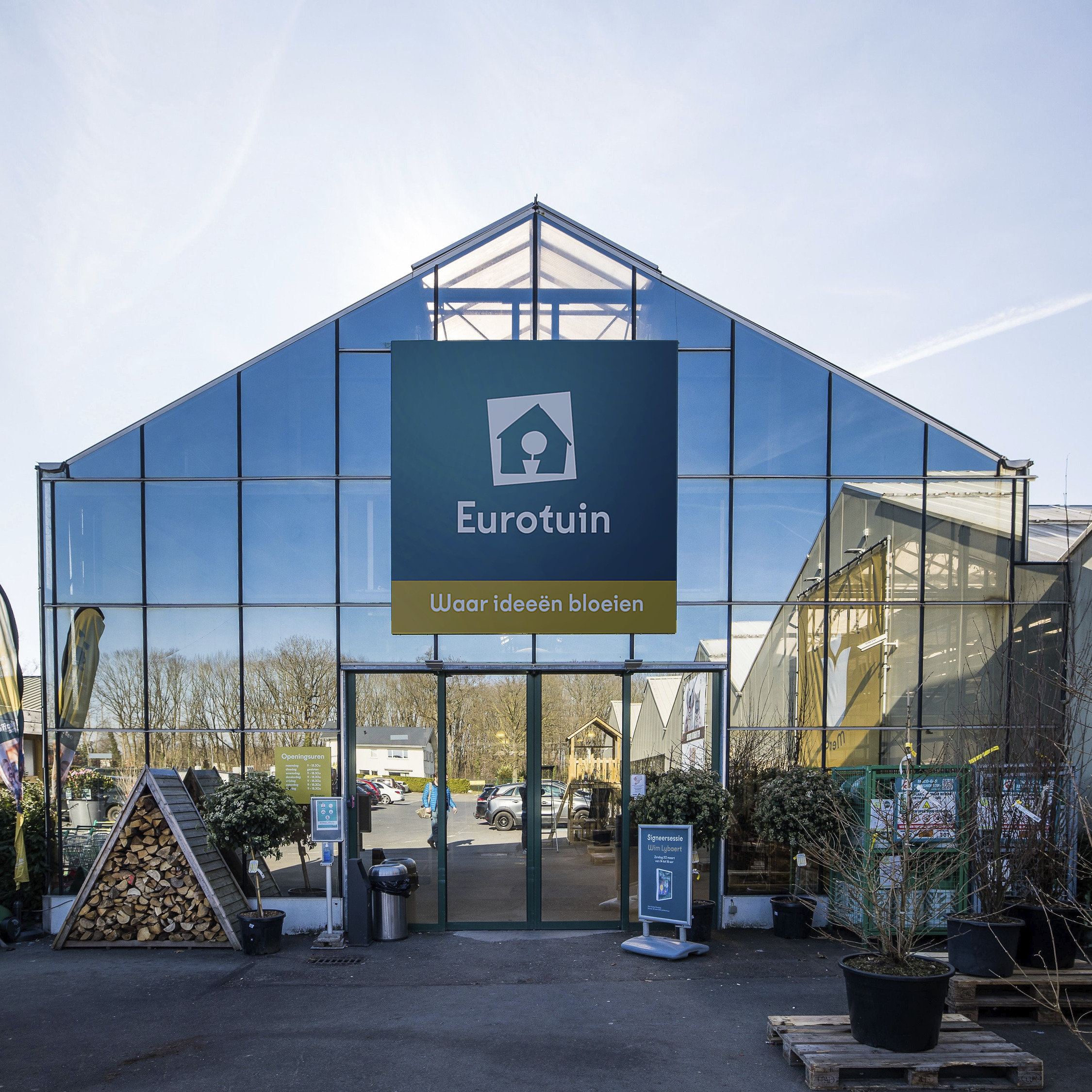
“Forget about your shopping list.” That is what Eurotuin wants its visitors to understand and embrace. Come in and explore, have a stroll and spend a fun afternoon. Updating the existing brand, we reinforce this shift from functional garden centre to inspirational destination throughout the customer journey. Park your car, take a cart and pick up a free greeting card on your way out.
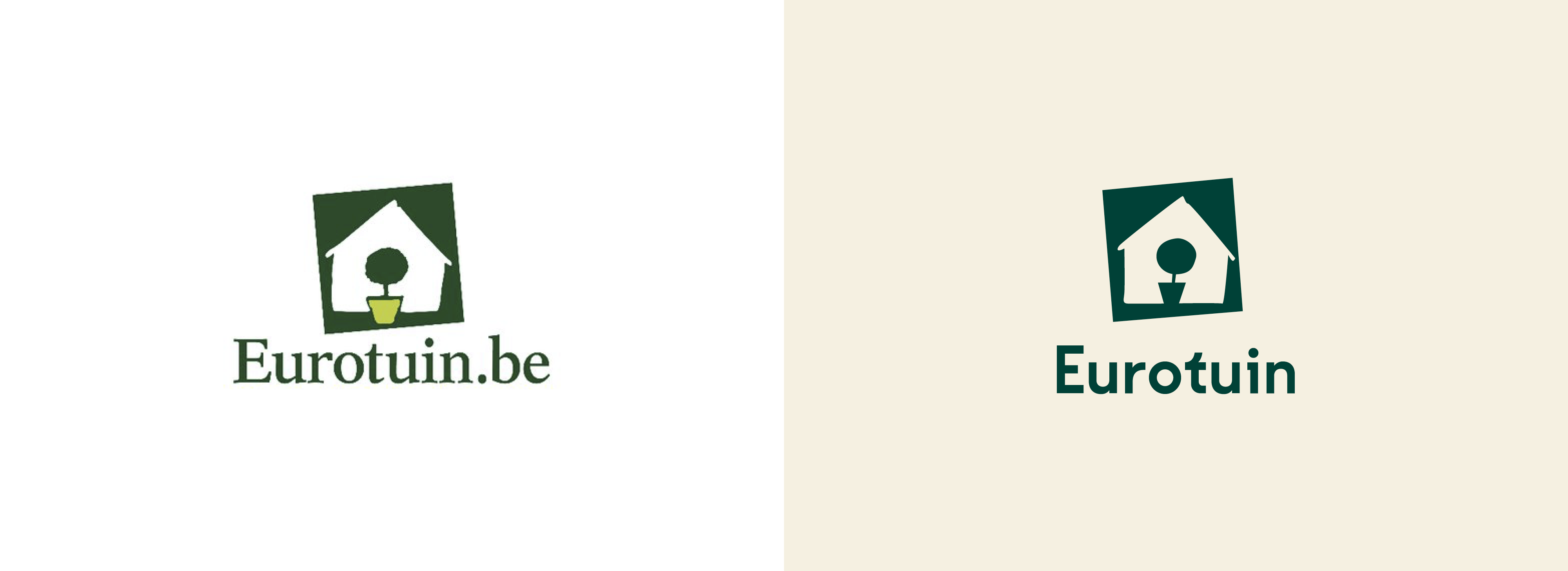
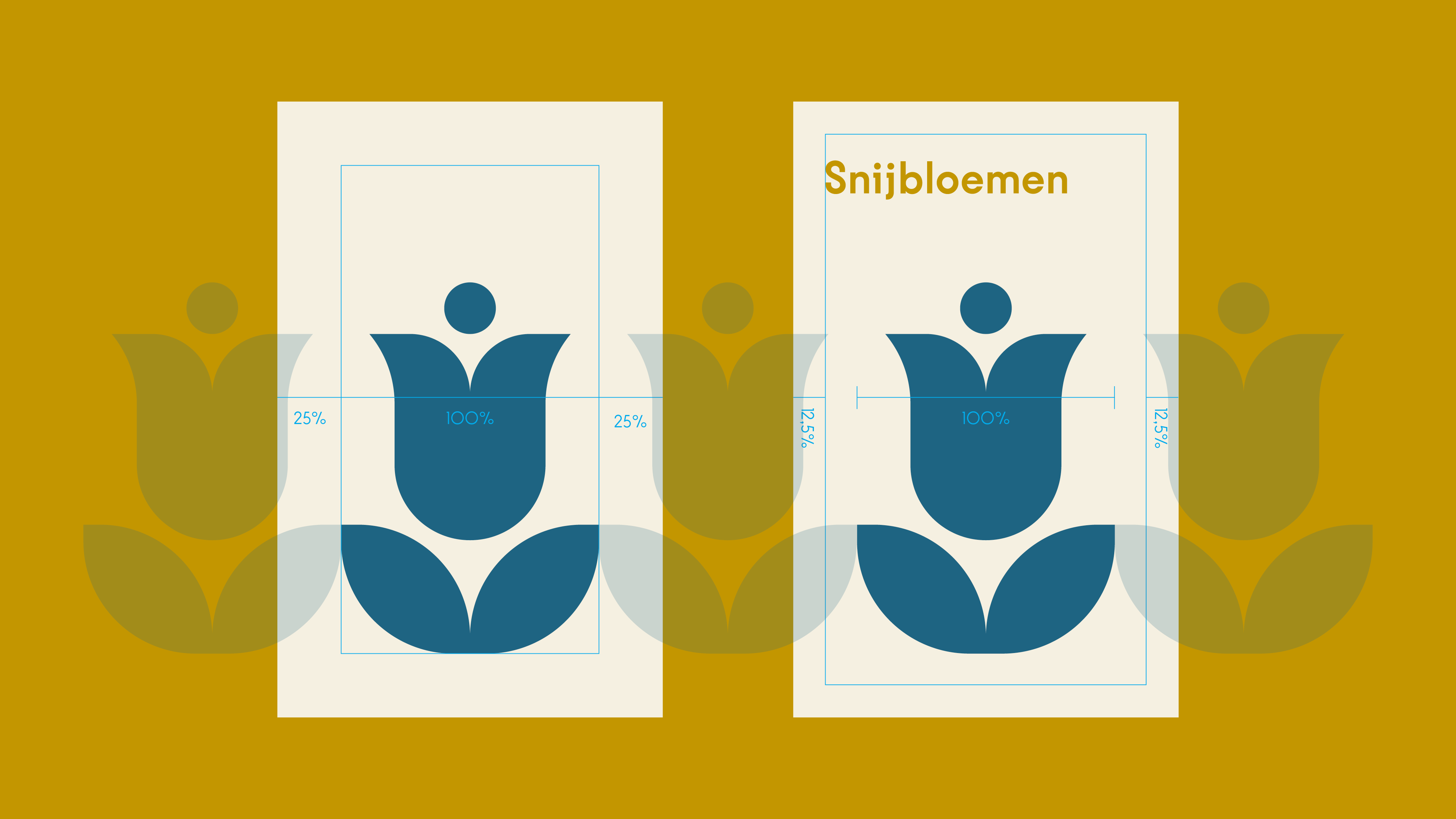
“Don’t touch the logo.” That is what Eurotuin wanted us to understand and embrace. We almost complied for the complete 100%, but eventually we did implement a few upgrades. The wordmark got a new, elegant typeface, the lines of the house and tree were retraced with a sharper pencil and the logo as such is converted to a modern, monotone design. Also notice how the top of the tree now slightly nods to the right, looking forward to a fruitful future.
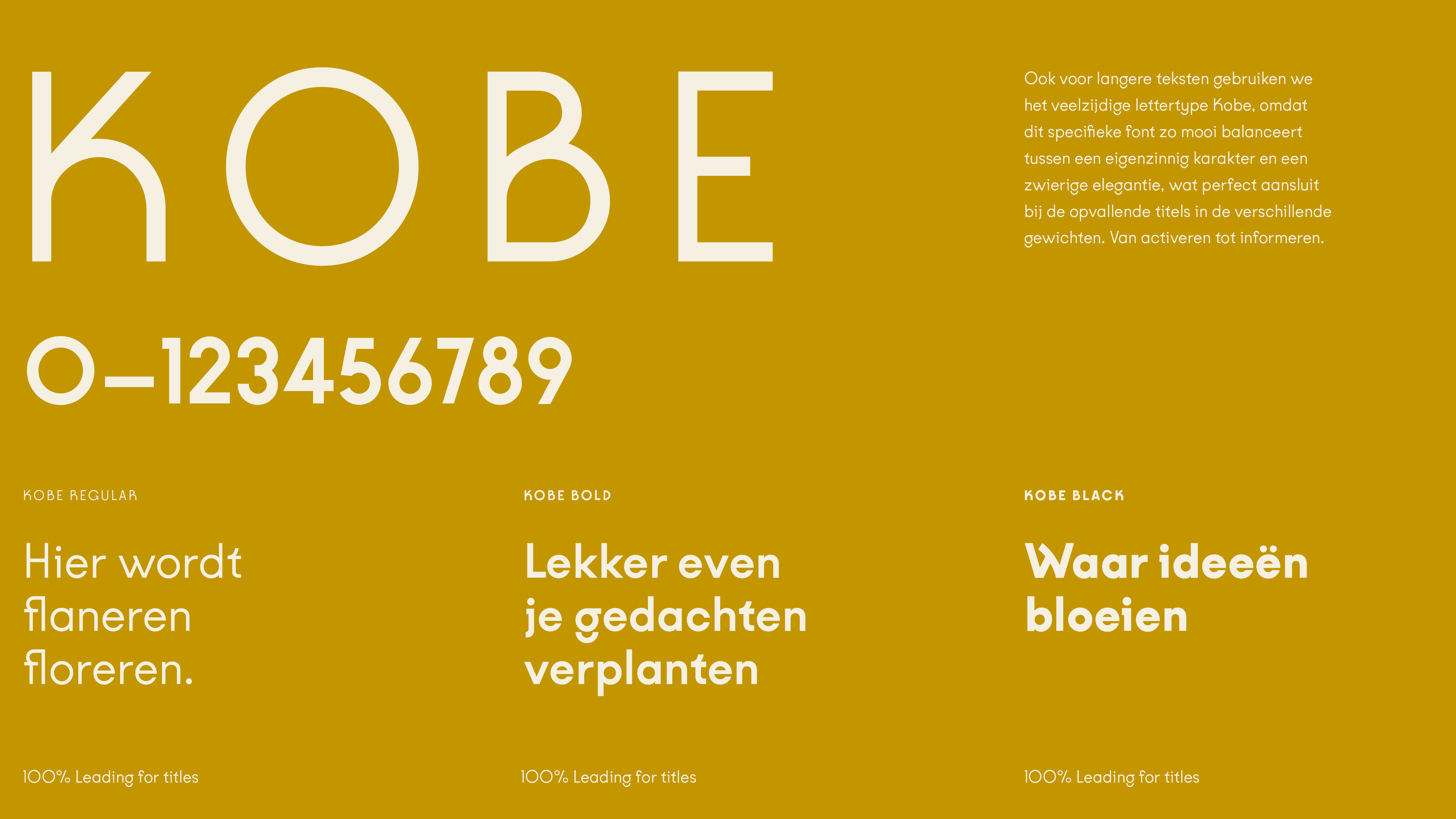
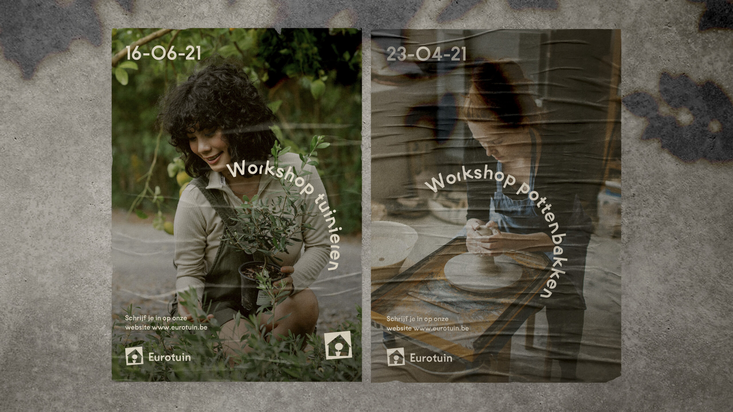
“Hey, look at that wavy W…” And W stands for well-balanced, obviously. At the same time, Kobe ensures optimal readability and adds a distinctive character as well. This typeface translates the ‘element of surprise’ from the shopping experience to every folder and poster. Elegantly organic, remarkably iconic. It makes the Eurotuin brand easily recognisable in all applications.
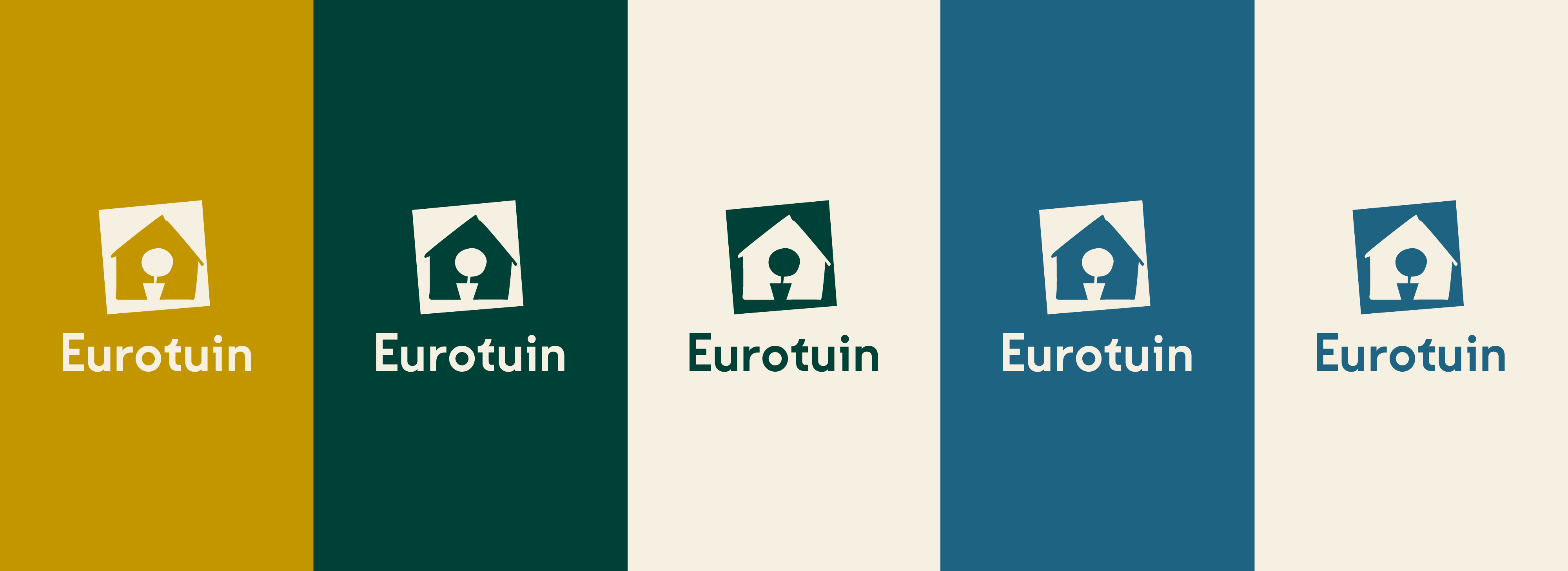
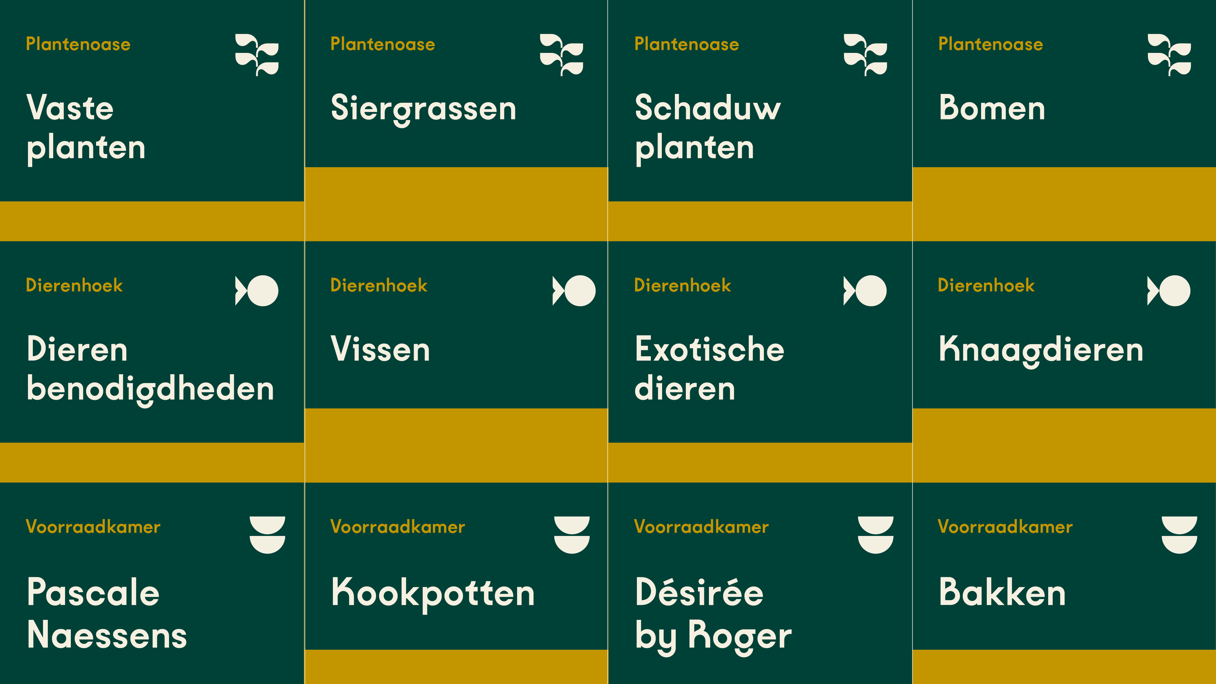
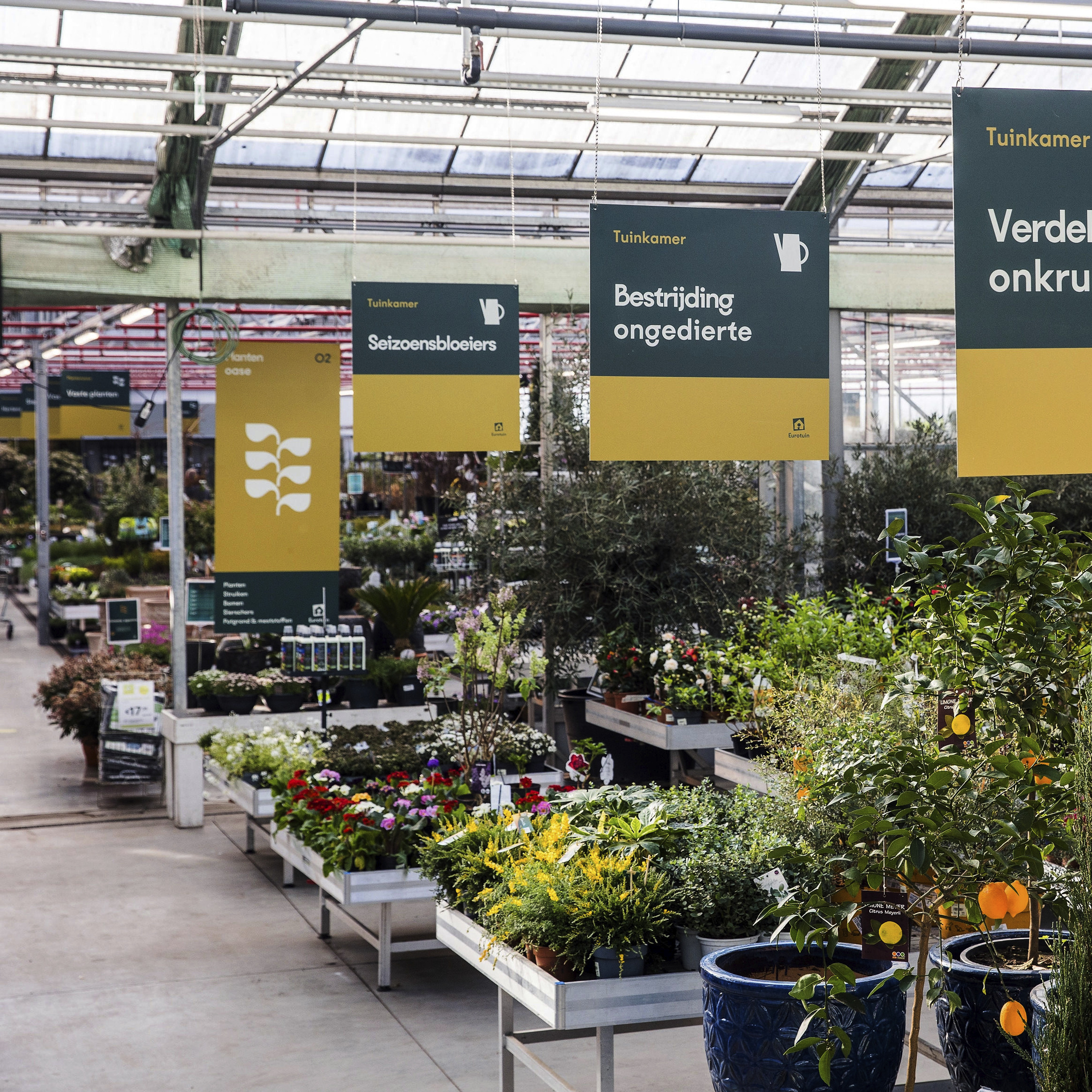
“This is exactly what I’m looking for!” Eurotuin offers a wide variety of products. Where other garden centres sometimes feel like an actual jungle — with plants, pots, scented candles and succulents piling up — we want to clearly appoint categories and guide the curious customer across the well-considered shopping path. We have developed a set of icons, illustrations and layouts to make the many themes and topics stand out, and speak out. The straightforward colour palette supports these vibrant shapes, adding contrast for maximal clarity.
“Water once a week or…?” Both plants and businesses aspire to grow. Being an ambitious brand, Eurotuin looks to expand its network in the near future. We are more than happy to assist them, making sure new team members, partners and investors understand what defines their positioning and personality. We have developed a playbook that explains and illustrates the Eurotuin identity, from a strategic point of view to the actual approach at the point of sale. From a fresh start to a deep-rooted awareness.
We think you’ll love them!

Become who you are. Use this contact form to shift and shape your brand – or, at least, to get a decent cup of coffee and an equally warm welcome.
Thank you for sharing your question