The added value of real estate branding
4 min read
As a property developer, you are dealing with highly important investments, be it business or residential. For some clients, it may well be one of the biggest purchases of their lives. When such large transactions come up, establishing trust with your target group is essential. This is where branding offers a helping hand. Because the core of success is a strong and unique brand image and identity, for your agency and projects, that’s tailored to suit its audience.
The blueprints of storytelling
To build a story that sticks, there must be a deep understanding of the project and what it could offer others. Both external and internal characteristics are important in this regard. Consider, for example, the neighbourhood, design, sustainability and mobility. However, it is important not to endlessly add bells and whistles that may be of interest. No, it is important to depart from the target group and then work your way back to the real estate project. What do they need? Why would they want to move in the first place? Why invest in this project and not another?
Touchpoints that fit and fascinate
Once the foundations have been laid for a strong image and tone of voice, the story must be communicated consistently across various channels. Determine where your target group is active and select the right touchpoints. From a nightclub to a hot air balloon, whatever fits. Whether you connect with your audience online or speak to them in person, your branding should always shine through.
It is essential that the strategy includes:
- your visual identity (logo, website, graphics, colours, and fonts)
- your personality (tone of voice and values)
- brand guidelines
- advertising campaigns/tools to connect to the target audience
Three very different but equally valuable examples
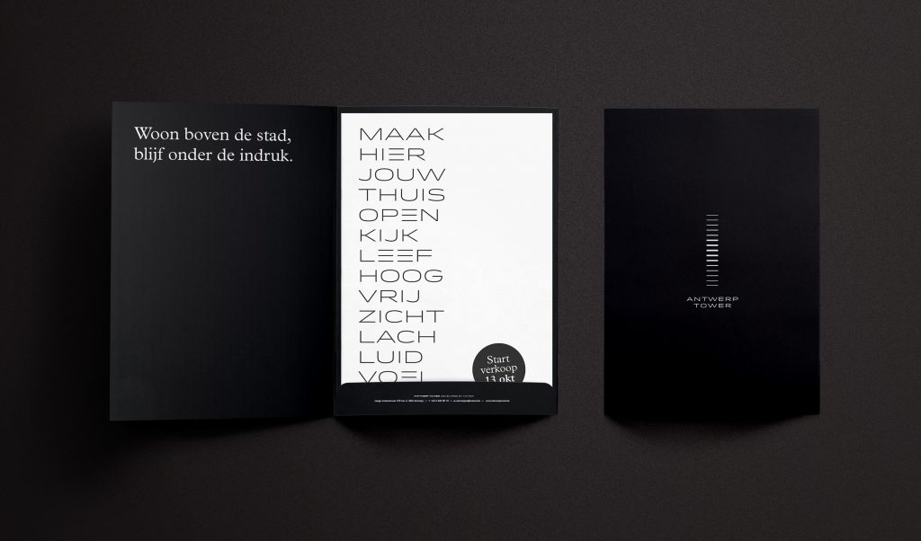
Antwerp Tower
As one of the glistening cornerstones of the Antwerp skyline, Antwerp Tower deserved a special approach. So, we decided to stay away from the run-of-the-mill ads with all too similar renders of all too similar buildings, that fill the pages of today’s real estate advertising.
The first impression audiences should have when interacting with the content, is: Antwerp Tower is an exclusive place for people who want to lead their life their way. A place that (literally) offers a unique view on the sky and (figuratively) on an unseen range of opportunities. Here, people truly have the city and everything the city has to offer, at their feet.

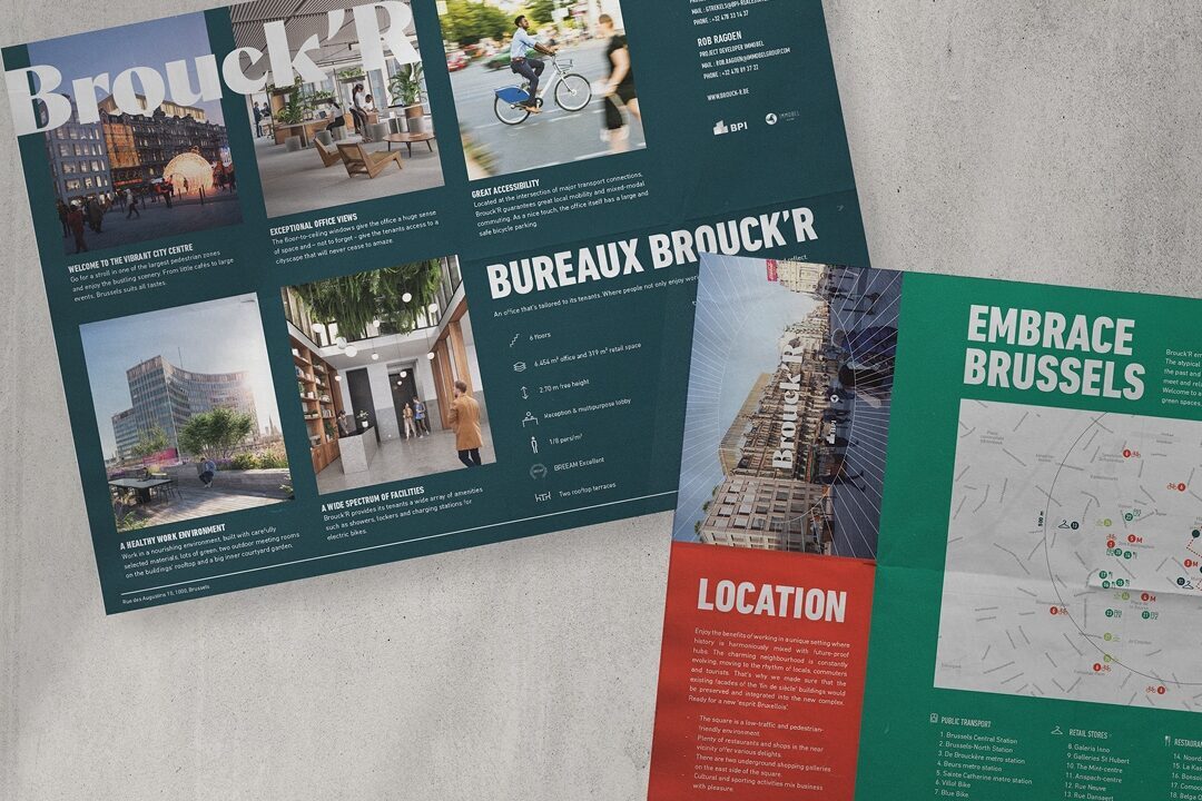
Brouck’R
For the proposal for the new A-class office space that embraces all that Brussels has to offer, we developed a vibrant brand with a people-centric and site-sensitive feel.
As a part of a larger mixed-use development located in the heart of Brussels on Place Brouckère, we wanted to highlight the synergy between work and
private life. Connecting the past and present of this unique location in the heart of Brussels. A place where people meet and relate; where experiences are shared and happiness is just around the corner. A community that treasures sustainability and vitality, elegant architecture and green spaces, big deals and local businesses.
For this project by Immobel, we chose colours that match the bright, vibrant atmosphere of the neighbourhood. A healthy building signifies lots of greens and sleek designs without losing sight of the Art Deco, distinctive elements that define the building and its one-of-a-kind setting.

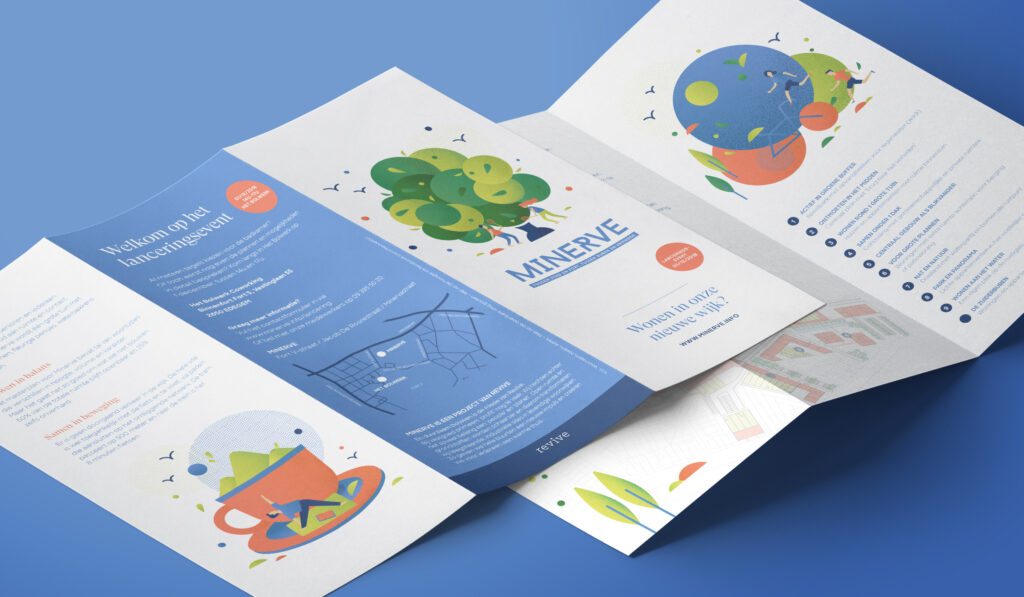
Minerve for Revive
We provided Revive’s innovative urban development project Minerve with a fitting yet distinctive branding that – instead of focusing on glossy 3D rendered images – conveys the unique dynamics and characteristics of the Minerve neighbourhood with lively illustrations.
One drawing is about the park-like open spaces and sharing quality time outside. That soothing ‘home sweet home’ feeling is another important aspect of Minerve. Other illustrations refer to the many recreational opportunities in the vicinity and the accessibility of the site. Obviously, we consistently implemented the shapes and graphical elements of the drawings in all communication. The vibrant colour palette adds to the appeal of this figurative approach.

A few rock-solid takeaways
To receive a warm welcome from your target groups and to convince them of your development – and who knows, maybe motivate them to invest in it – the project needs to have its own identity. A story that builds on the image of the developer, but is essentially based on the target audience and their needs and wishes. This allows the public to connect with the project and provides trustworthiness and an opportunity to stand out in the skyline.
Looking for a partner to brand your real estate project?
Drop us a line via our contact page.
Ready for even more insights?
