CreatonTerreal
A two-brand, one-team operation.
Retail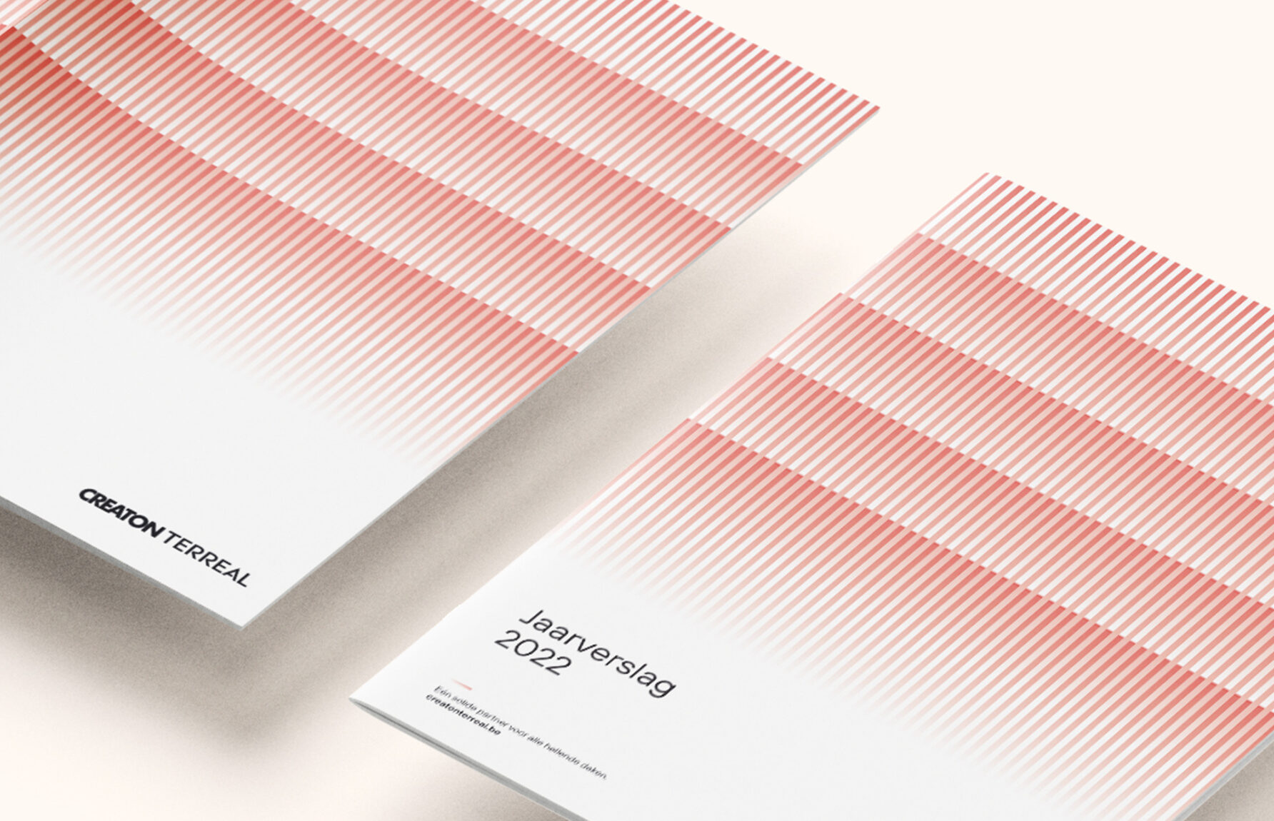

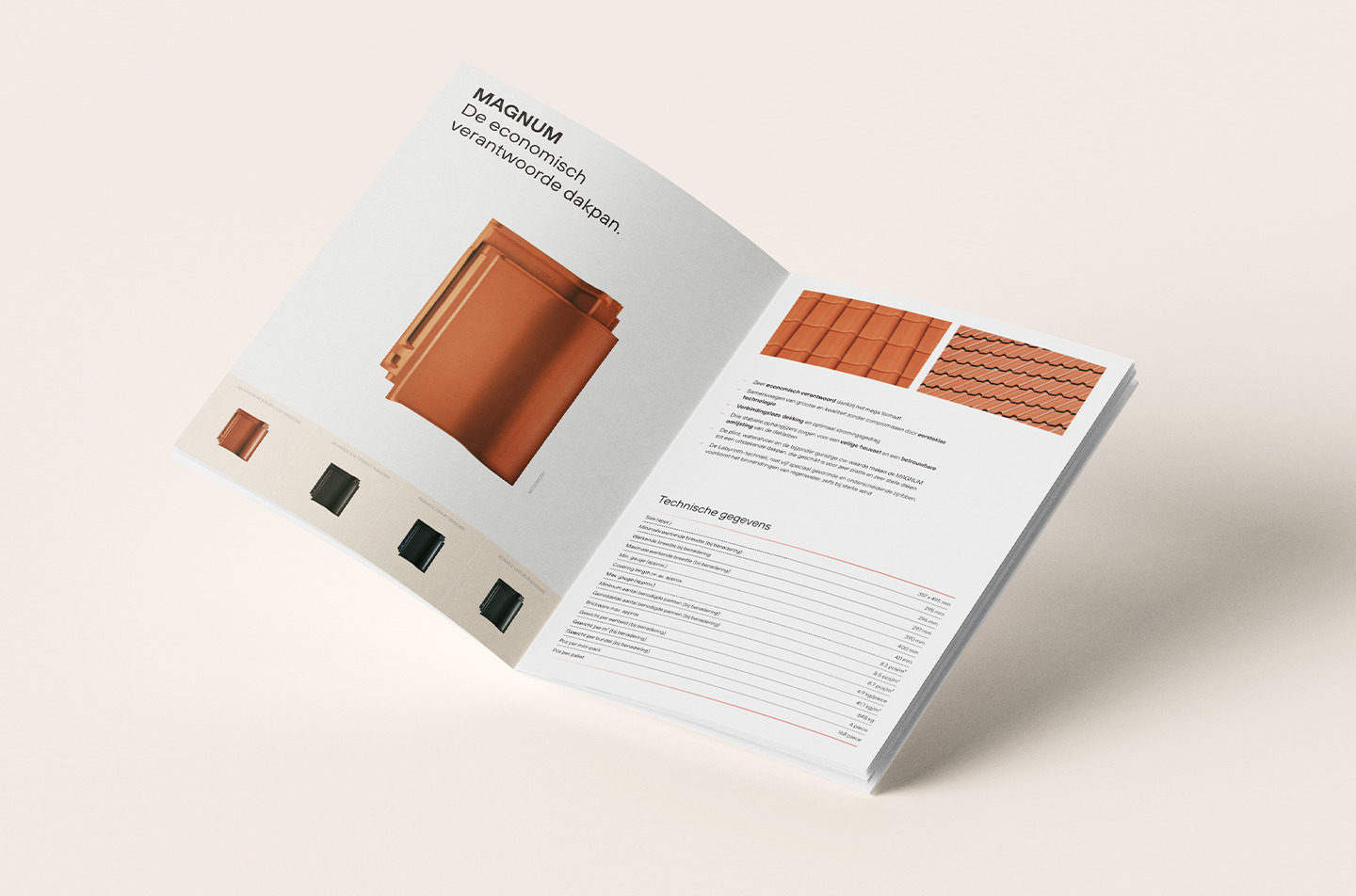
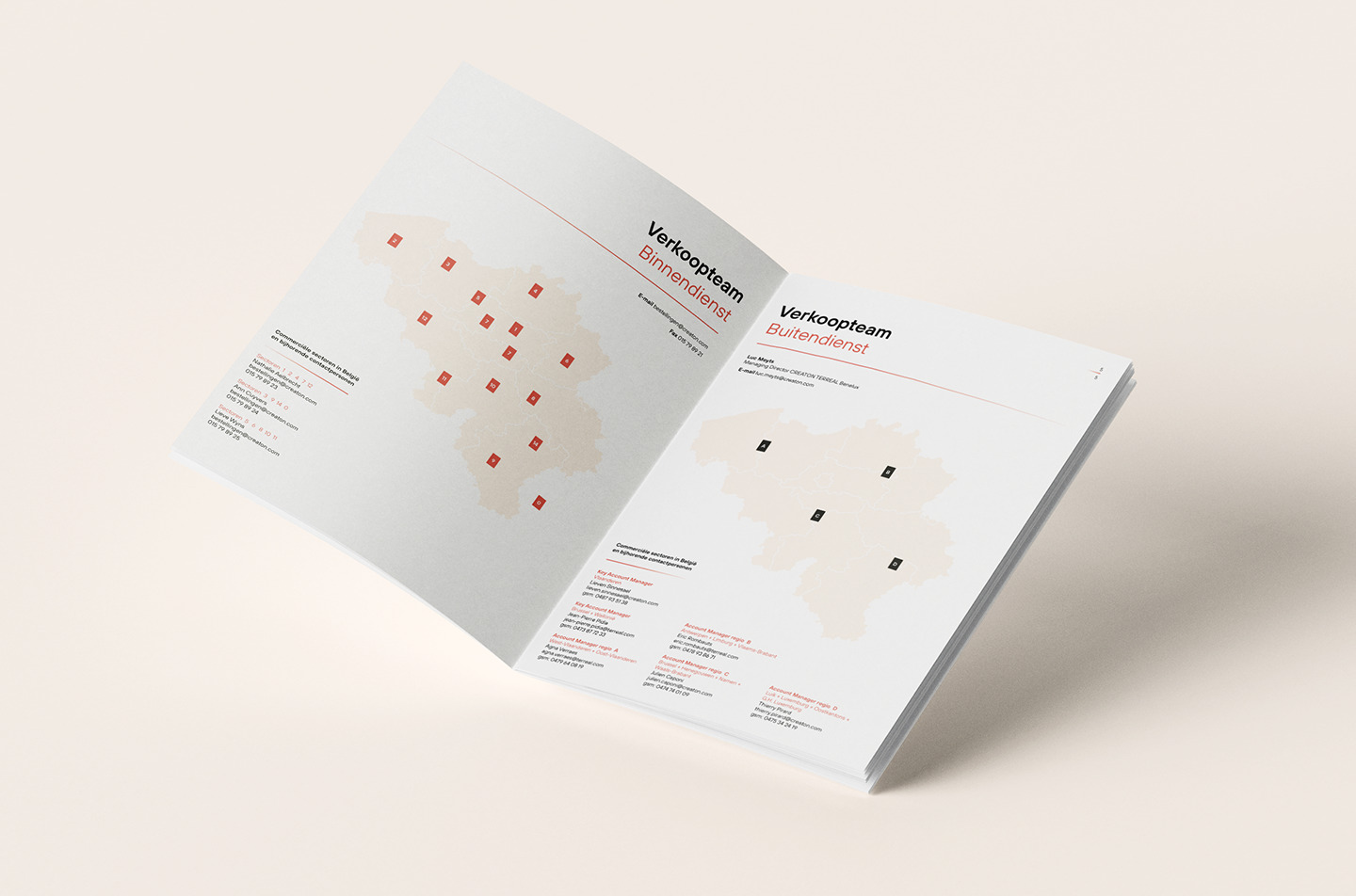
CREATON and TERREAL are both key players in the ceramic roof tile market, each with their own distinctive characteristics. By joining forces, they not only want to unite the various branches into one powerful Benelux headquarter. No, they also have the ambition to become a top-of-mind brand in their field. In order to complete this overarching roof in the best possible way, they called upon our helping hands.
When two brands with a similar target audience, brand equity and offer want to merge, it makes sense to combine the names of both companies. In that way, they retain their customers and brand awareness, respect their current positioning, and increase their reach and market share. So, although they are shaking hands, they get to keep their typical USPs, segments and product categories.

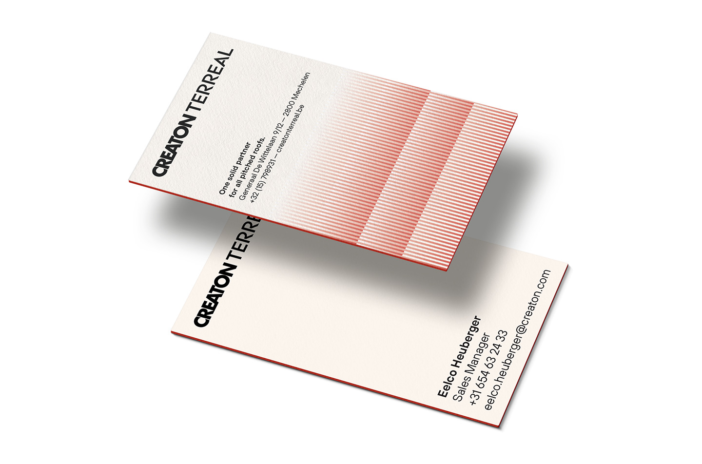
In order to position both brands as one strong and united front in the Benelux through a new, shared visual identity, we first conducted several interviews, a workshop and an in-depth market research. With the insights from our groundwork, we were able to pinpoint the right characteristics and clarify any sensitivities.

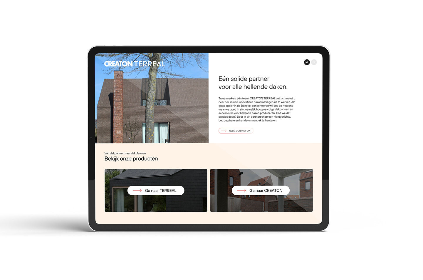
Why go for something totally different when both names already have such a rich history among the target groups? We kept the names, glued them together and obtained – fortunately enough – a very readable and clear structure. The glue between the name change and the visual style is a great tagline that, in addition to the extensive offer, also highlights the personal relationship between sales representative and customer.
When developing an identity that matches the unity, it is also important that both CREATON and TERREAL streamline and improve their storytelling and the way they interact with their target groups.
The visual as is situation made the brands look distant and serious, which did not fit with the warm image that their sales advisors radiated. In order to come across as a trustworthy partner, their identity needed to reflect the following core values: client-oriented, reliable, hands-on.


Become who you are. Use this contact form to shift and shape your brand – or, at least, to get a decent cup of coffee and an equally warm welcome.
Thank you for sharing your question