Winsol
Warmth the way we want it
Retailbranding, communication

branding, communication
For more than 140 years, Winsol has been building up the Gross National Domestic Happiness in Belgium. To give its branding a new drive, the specialist in high-quality doors, windows and sun blinds knocked on another door: that of Duval Branding. Just like Winsol creates a home that matches who you are, we built a brand that completely coincides with Winsol’s personality. Based on a first strategic exercise, we wrote a new brand story and a tagline that simply summarises the purpose of Winsol: “a home to enjoy”.
Winsol stands for an uncompromised pleasure of living. Reinforcing the brand fundaments, we developed a contemporary, warm brand style. The renewed logo – with the avatar ‘W’ as a minimal, highly recognisable derivative – radiates hospitality and positivity. And just as the earth revolves around the sun, the colour palette revolves around the sunny yellow of the corporate identity. Evocative letters and dynamic graphic elements are combined with photography that consistently shows how Winsol brings warmth to every home.
To fully immerse people in the wondrous Winsol universe, we created a brand book, addressing burning questions such as “What is a home?” and “How does Winsol help you to create your ideal home?”. We also put a spotlight on the philosophy of “a home to enjoy”, applying the avatar ‘W’ as a versatile wayfinder. It is truly a book to come home to: bright, warm and inviting.
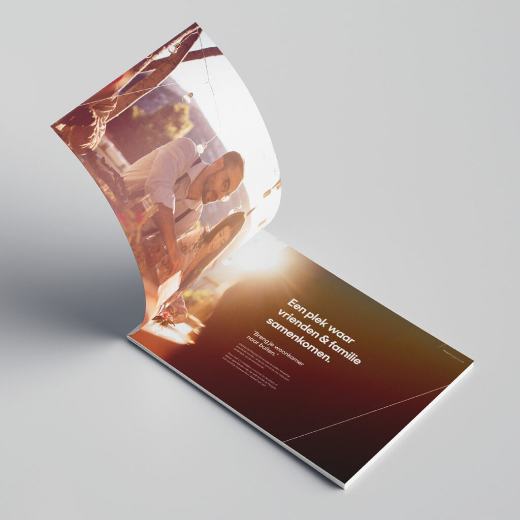
Winsol commits to people’s happiness. Furthermore, the brand is keen to innovate, offering ‘the happy few’ even more comfort and quality of life. Pergola Z!P, for example, is an advanced addition to exclusive outdoor living, guaranteeing shelter in various weather conditions. The brochure, designed with the new premium branding, immediately evokes a sense of indulgence. We treasure the warmth of Winsol and ensure consistency in communication, but at the same time we create a distinctive class for further expansion.
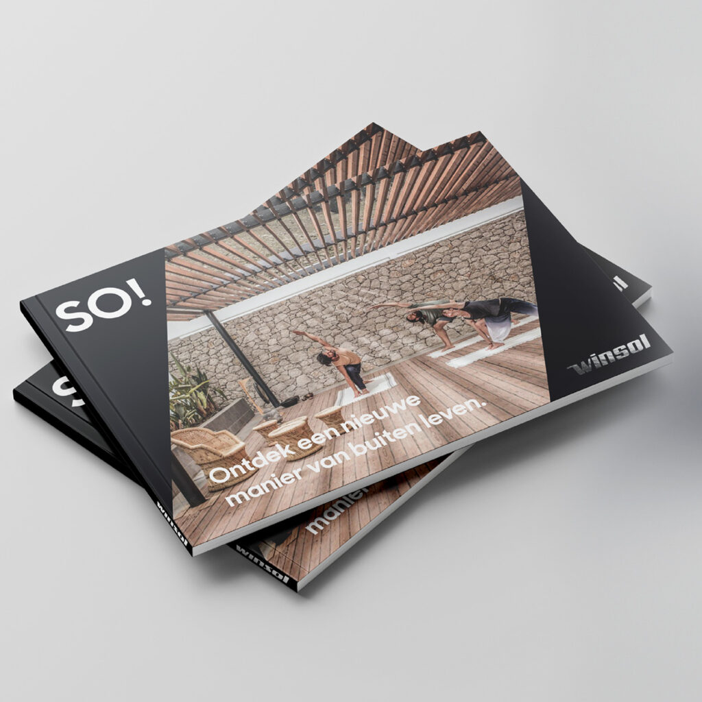
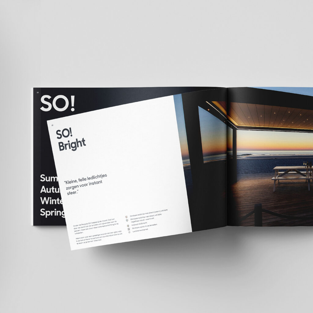
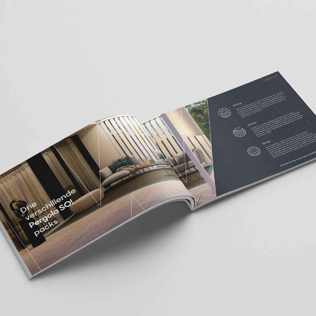
In the SO! product range, we apply yellow in moderation, and strictly in support of the elegant allure of the black-and-white palette. The silver foil logo exemplifies a collection in a class of its own.
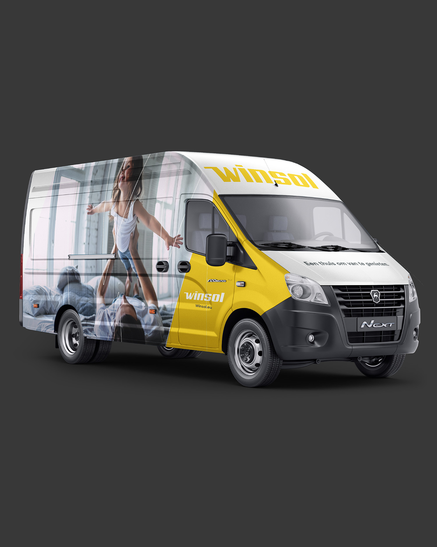
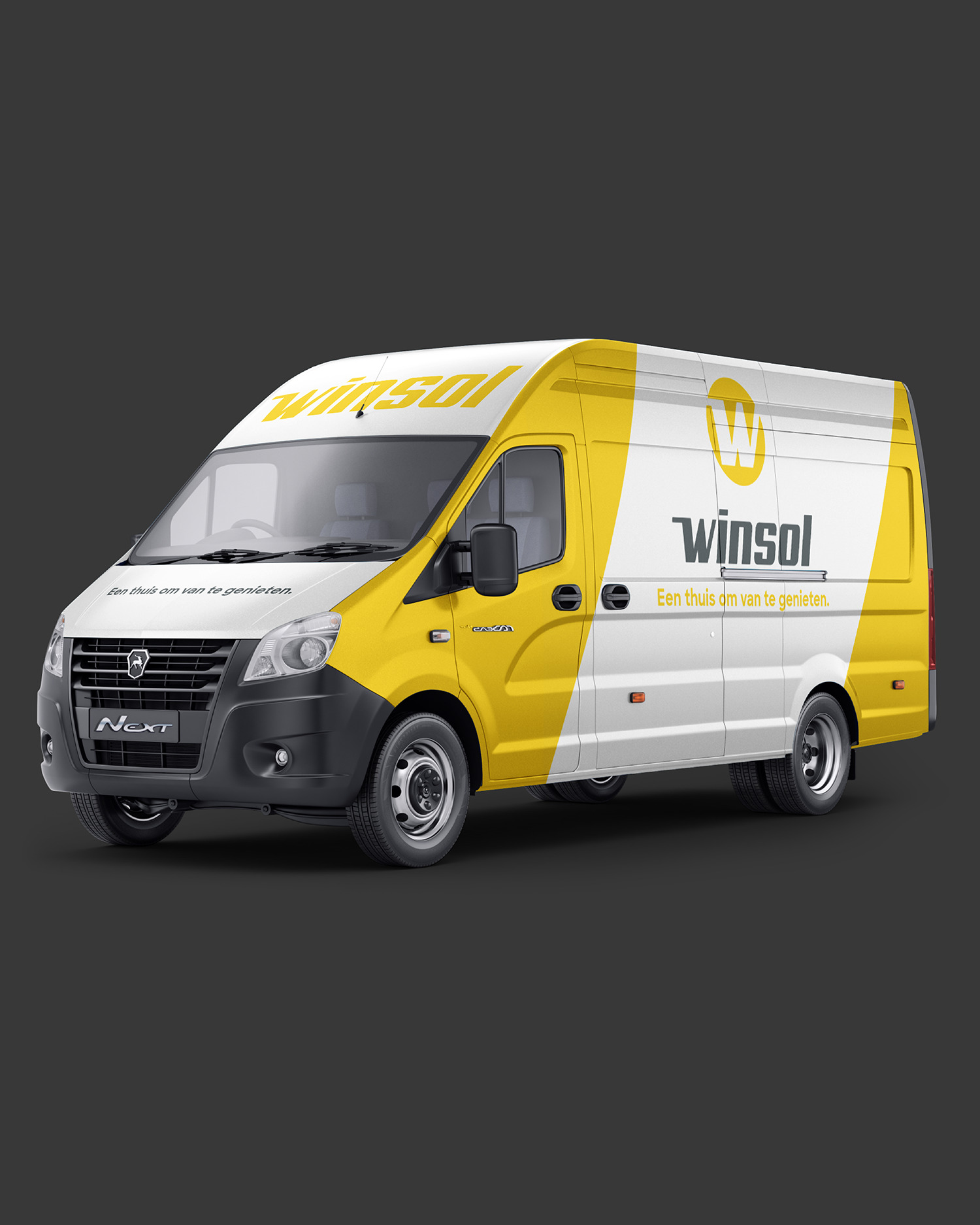
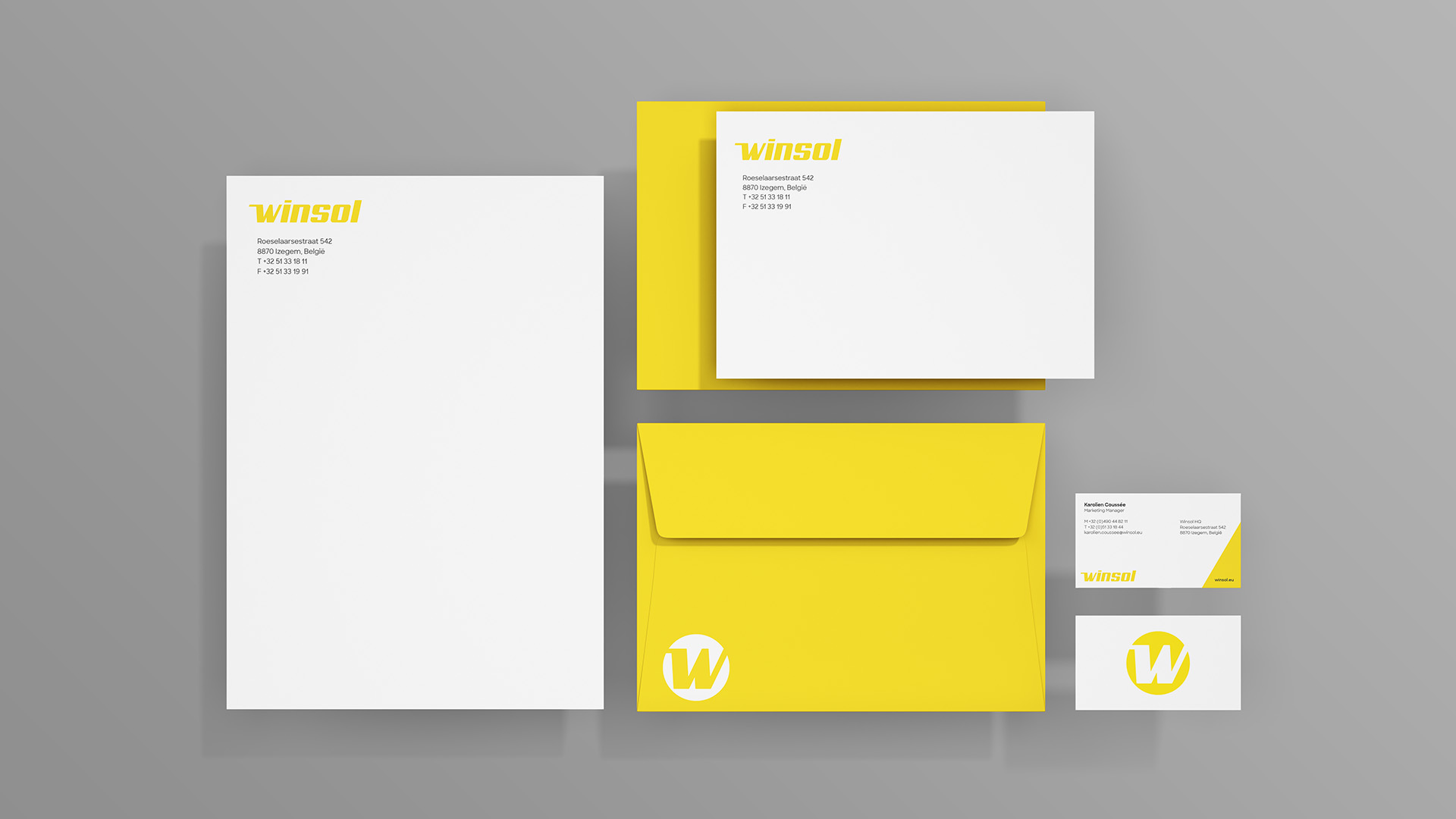
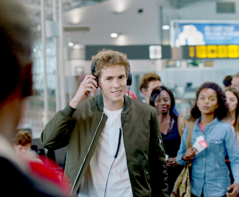
Obviously, stationery is an important part of the brand collateral. Joyous yellow plays a major role here, but we also developed an embossed logo for premium print applications. The vans of the fleet deliberately carry two different designs on both flanks. Parked in front of a house, they display a heartwarming, homely image; as for passing traffic on the other side, the focus is on the avatar and tagline. Not surprisingly, the theme for the radio commercials is ‘homecoming’, evoking various precious moments and experiences. This sense of harmony is reinforced by the sonic branding.
We think you’ll love them!

Become who you are. Use this contact form to shift and shape your brand – or, at least, to get a decent cup of coffee and an equally warm welcome.
Thank you for sharing your question