De Panne
A different perspective to change perception
Public Servicebranding, communication
branding, communication

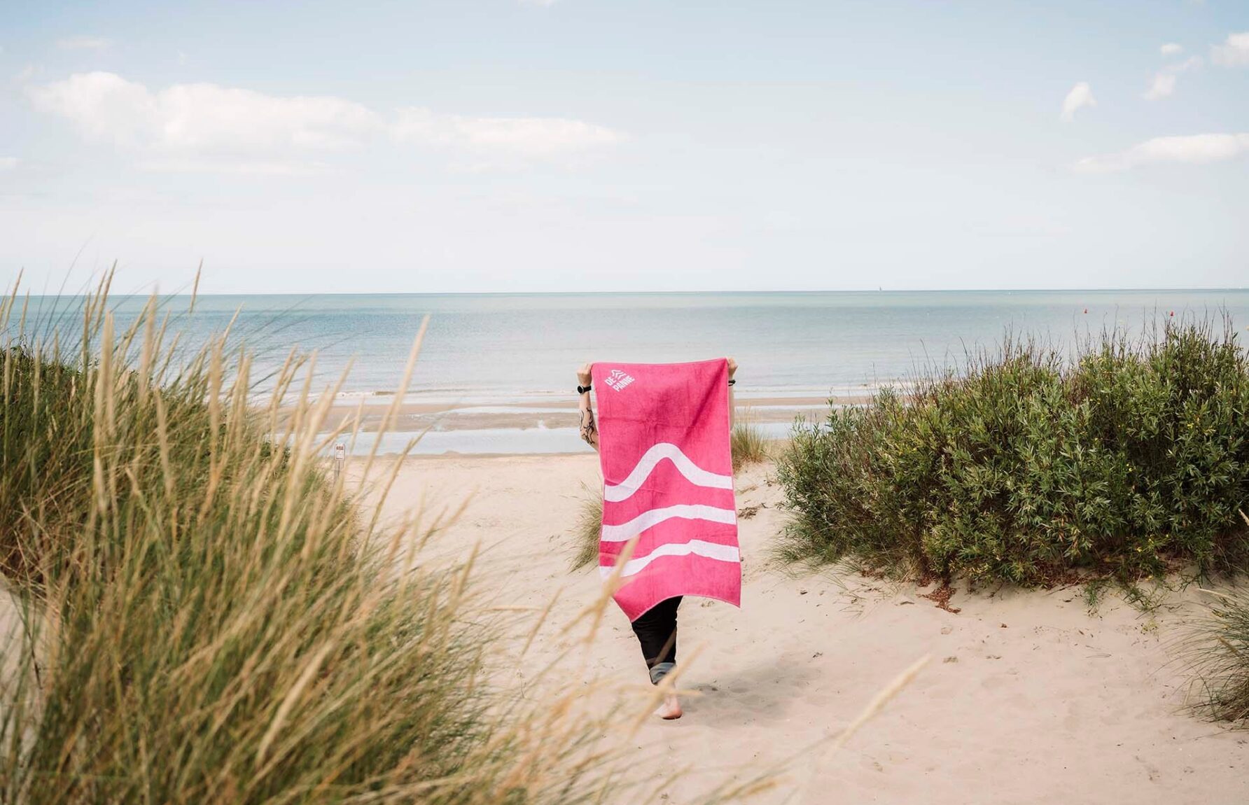
Smack in the middle of the first corona lockdown, we scooped up the pitch on the rebranding of De Panne, a seaside community in Belgium. Oh, how we were dreaming of sandy beaches and never-ending summer nights with a limitless supply of ice-creams in luscious rainbow colours. Did our strict confinement boost our commitment to this horizon-broadening project, or was it just De Panne’s unmistakeable charm and congeniality? The fact is we enthusiastically worked on positioning, personality, tone of voice, look and feel, animation, activation… A ‘frigobox’ full of fun, so to speak.
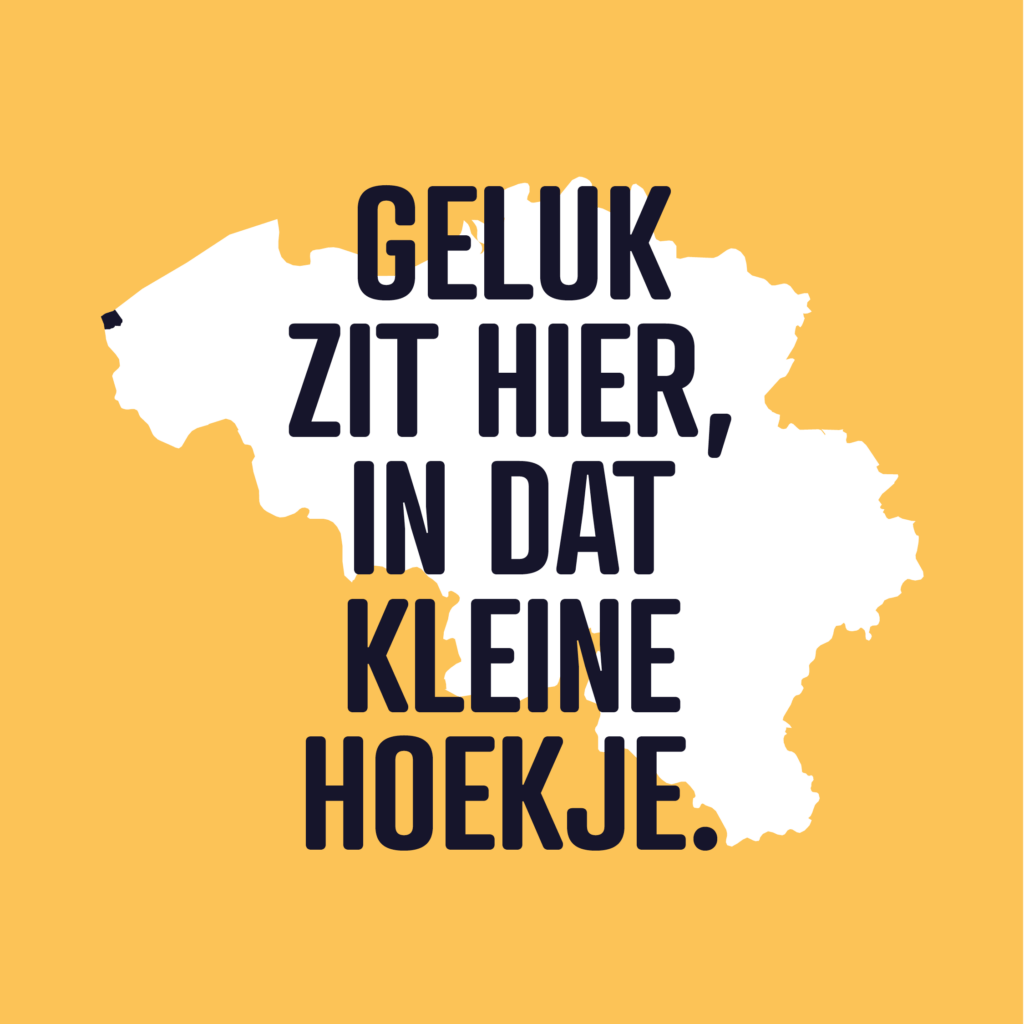
When we located De Panne on the map – just out of curiosity, and as a distraction from all the COVID updates on tv – we realised that the Flemish saying “geluk zit in een klein hoekje” (happiness is just around the corner, sort of) literally applies to this bountiful community. The sea and surrounding nature reserves offer plenty of breathing space for habitants and visitors, improving their mood and well-being. Leaning against Belgium’s border with France, in the most western tip of the country, De Panne is also a starting point. In a ‘connect-the-dots’ drawing of Belgium, De Panne would be “1”. This finding also coincides with our kingdom’s history of origin: in 1830, royal ruler Leopold I first set foot at De Panne, reaffirming the “this is where it all begins” positioning of the rebranding. Fresh air for a fresh start.
“We embrace the unique location and environment, building our brand around it.”
The town council has always been apprehensive about the location, fearing it would be too far for domestic tourists. Installing De Panne as an invigorating destination and a starting point (for a holiday, a business, a family), we change people’s perception. We embrace the unique location and environment, building our brand around it. From tagline over logo to graphic elements, every part of the identity is rooted in De Panne itself. Proud, positive and in play.
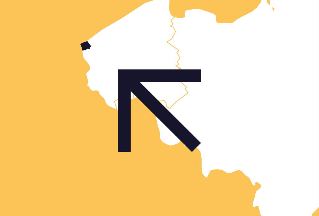
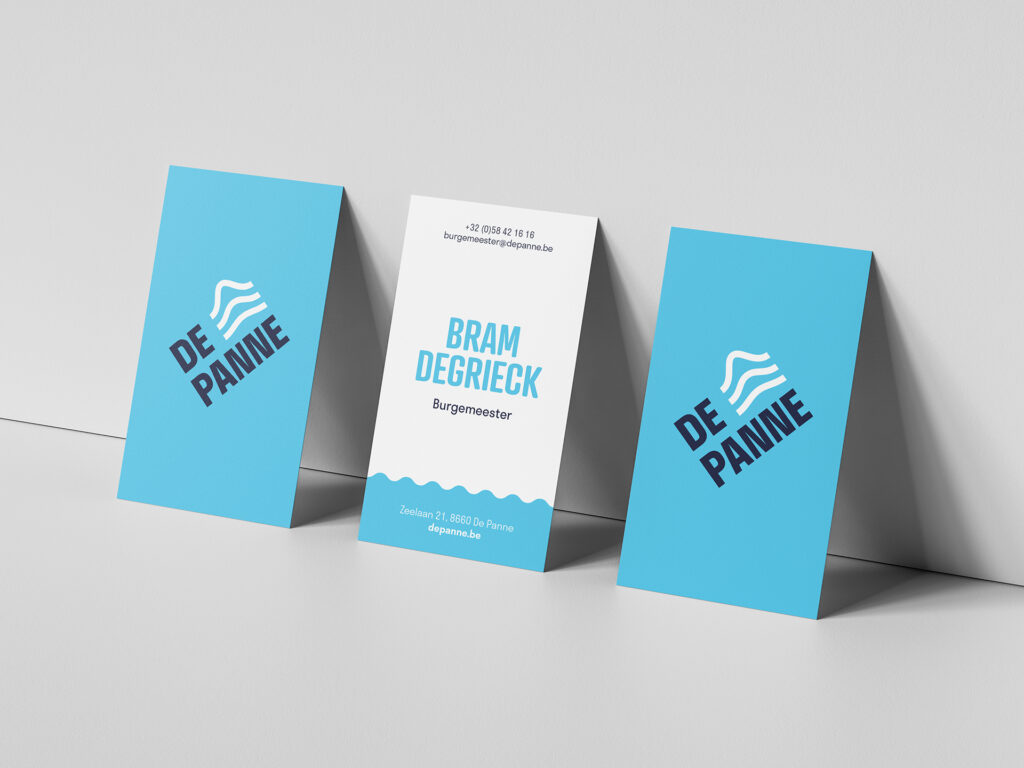
The logo, tilted in a 45° angle, directs your attention to the top left corner and that is exactly where you will find De Panne on the map. It immediately marks the seaside community as a destination. The lockup of the logotype and brandmark is a perfect square, optimising the use of space on any application.
Since winds can blow fiercely here, we selected a sturdy, storm-proof font for the logotype. Capitals do not just write “de panne”, they affirm “DE PANNE” in a self-reassured manner. The waves of the brandmark represent De Panne’s topography with, from top to bottom, the rugged North Sea, the pristine dunes and the fruitful pasturage.
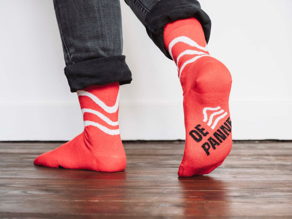
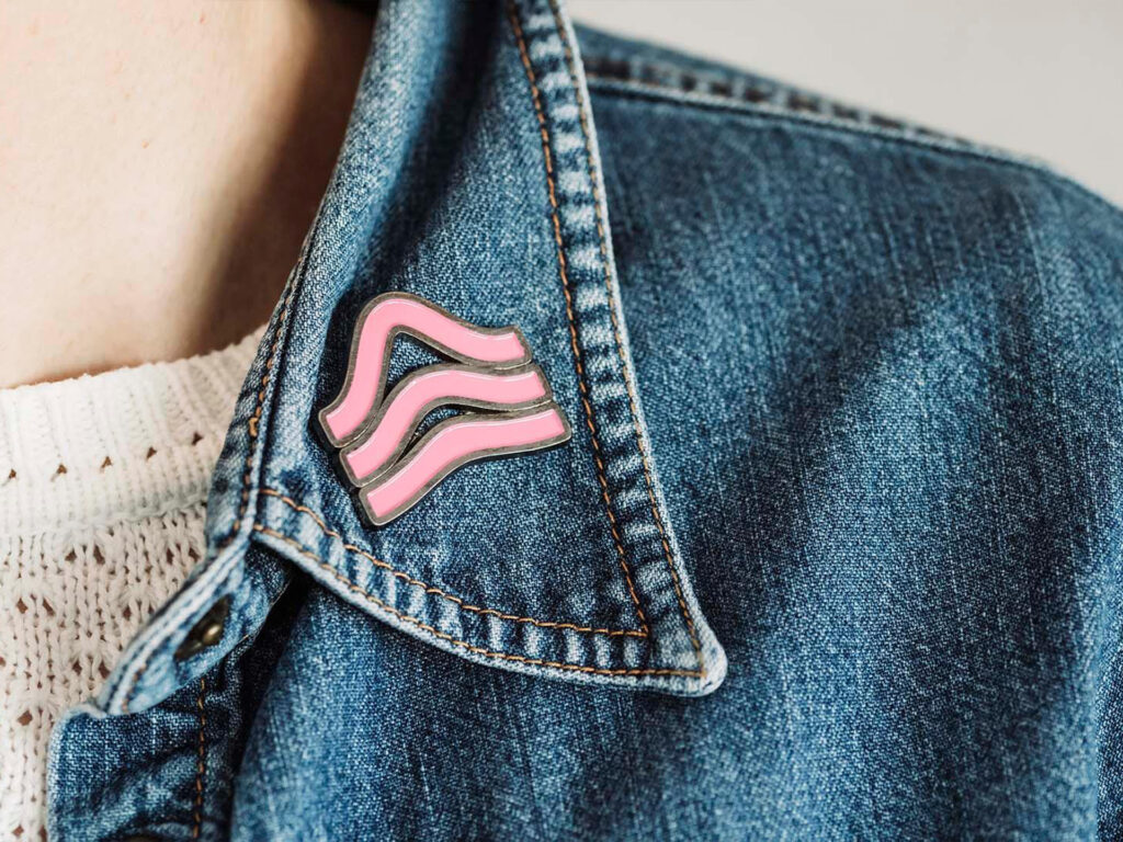
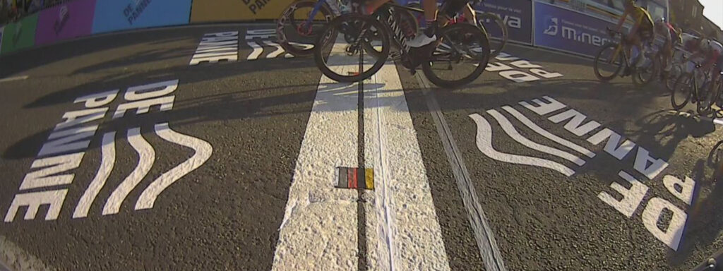
The brandmark also plays a vital role outside the logo lockup. We use it as a rolling pattern, simulating the waves of the sea – obviously. But there is a deeper meaning: it evokes the image of a royal crown, taking us all the way back to 1830, when our country’s first king Leopold I set foot on new-born Belgian soil in De Panne. This ‘crown’ definitely looks great on gadgets and in signage.
(Dutch idiom, meaning “to create fun” but literally saying “to dig fun”)
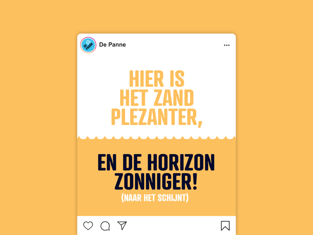
Positive and active, the tagline sets the tone. It refers to De Panne’s beach, being the widest of all seaside hotspots in Belgium. Great for sand yachting, digging clandestine tunnels to Australia or carefree sunbathing. Depending on the specific context, the tagline can adapt to express appropriate sentiments. Who wants to see “have fun” on the correspondence for local taxes?
“Rebranding De Panne was about respecting the basic dunes and don’ts”
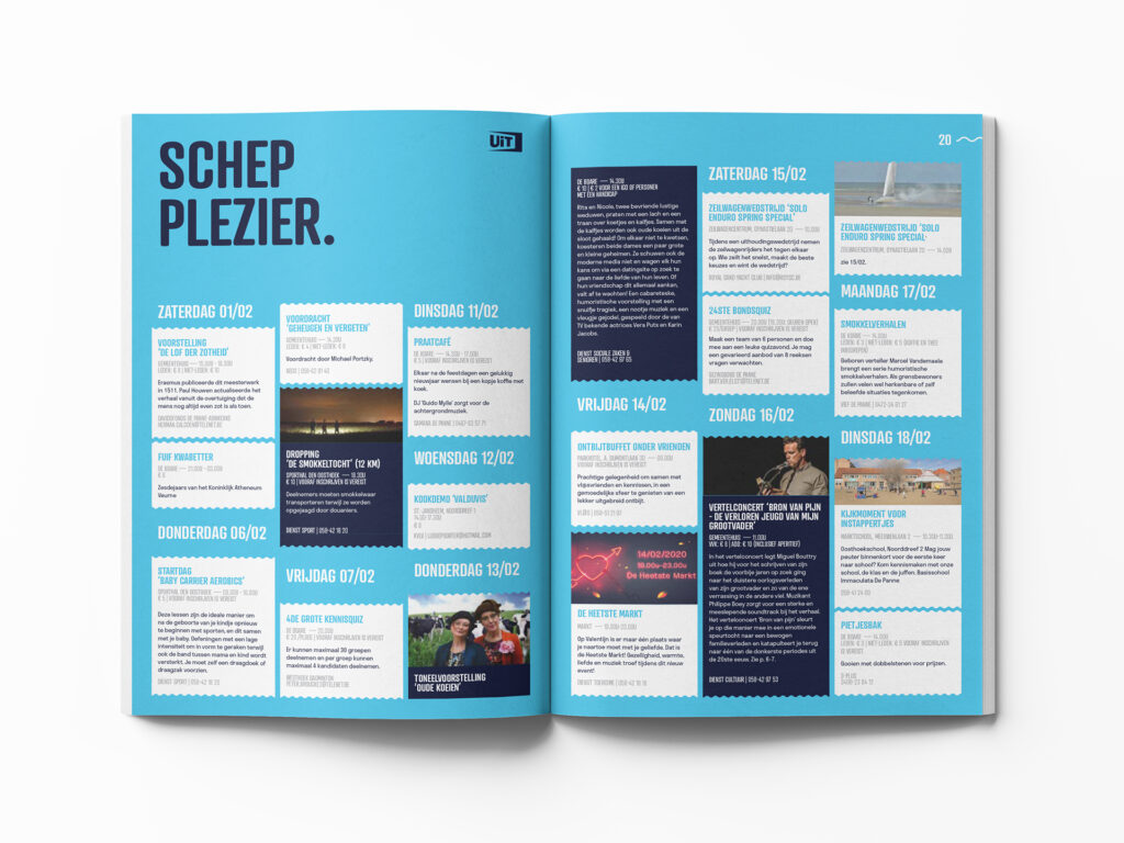
Cotton Candy Purple. Dew Blue. Factor 50 Red. We optimised De Panne’s warm heritage colours and added more colours to complete the rainbow, illustrating the wide diversity in personality, topography, landmarks, activities… This dynamic palette offers seemingly unlimited versatility in vibrant designs and contrasting combinations, ranging from neutral to playful.
The name of “De Panne” is derived from the word “duinpan”, describing the characteristic dune environment where the early village was established. Obviously, we wanted to incorporate this unique biotope into the rebranding. Apparently, a dune is not just a dune. Marram dune, parabolic dune… We nearly graduated as geography teachers doing our research, but it helped us to create various abstract shapes and patterns that reinforce the ownability of the De Panne identity. We also apply these wavy lines to the logo container, constructing a solid yet adaptable instrument for maximal visibility. Furthermore, the patterns are combined to form flexible frames that give images and messages even more panache.

“A brand so bright we included a bottle of sunscreen with our guidelines”
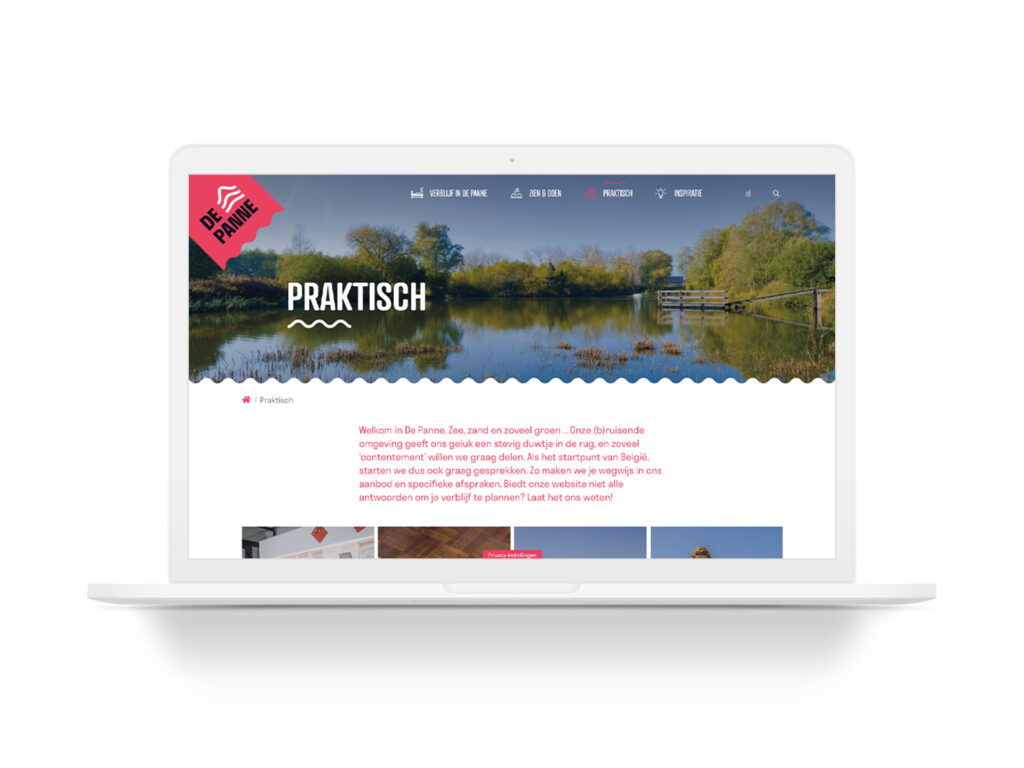
Just like sunscreen, our guidelines should be applied thoroughly yet carefully. We closely collaborated with the in-house communications department to develop the guidelines and first applications, really installing the rebrand on both a strategic and functional level.

Become who you are. Use this contact form to shift and shape your brand – or, at least, to get a decent cup of coffee and an equally warm welcome.
Thank you for sharing your question