Drunken Horse Gin
A spirited approach to sober design
Food & Drinkbranding
branding
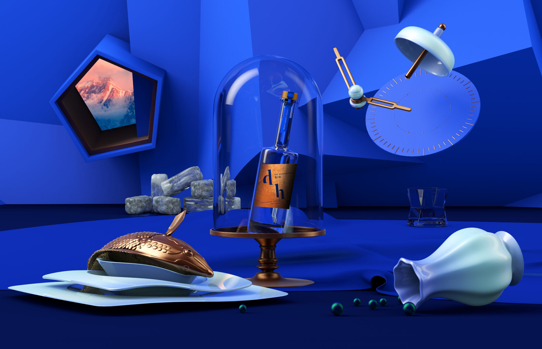
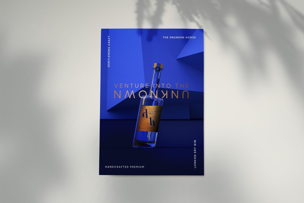
Gin is still in high demand. Besides the few mainstream brands, the offer is very varied, so how do people choose? What makes the new kid on the block stand out? The Drunken Horse Gin tickles those who desire to explore; those who look for a sip of adventure now and then. We wrapped this outspoken promise in a layered label, and created an uncommon concept to conquer our place on the shelf as well as in the minds of the curious.
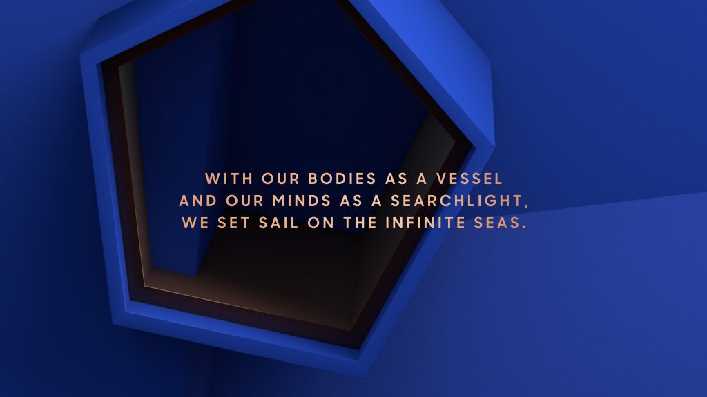
When telling a story, you don’t have to make sense. Peculiar words paint pictures, too. We have turned The Drunken Horse Gin away from the logical narrative and descriptive visuals by evoking a unique universe, harbouring a kindred world of fantastic yet familiar conceptions. Surreal yet surprisingly homely. An epicurean place appealing to escapists with a particular fascination for alliterations.
But, then again, a logo always benefits from a sober design. The lowercase initials are elegant and dynamic, with the elevated ‘d’ evoking the powerful image of a prancing steed. Down-to-earth yet uplifting!
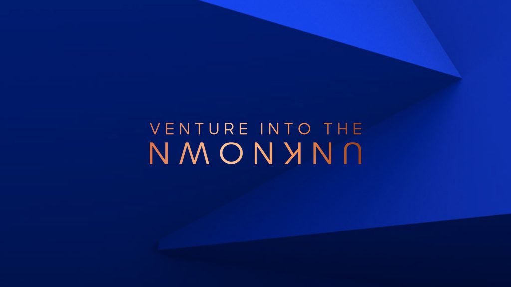
The Drunken Horse Gin distillers believe the unknown is everywhere. They even went to look for it in the Himalayas, acquiring exotic and rare botanicals enriching the elixir’s fragrance and essence. They feel life is about discovery; curiosity as a permanent state of mind. Go and explore; go and experience the exceptional.
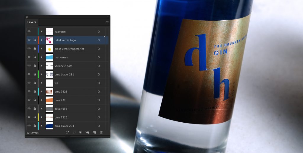
Gin should not only thrill taste buds, it has to be evenly pleasing to the eye. It took 11 layers to get the label just right. For the fingerprint texture we combined a gloss and a matte varnish, we also added an embossing for the logo and with a silver foil we vitalized the scratched bronze look. Praise to Sofie (production) and Griet (studio)!

We think you’ll love them!
Become who you are. Use this contact form to shift and shape your brand – or, at least, to get a decent cup of coffee and an equally warm welcome.
Thank you for sharing your question